

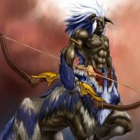
New world I am working on in the Herwin Wielink style.
 MadCartographer
Traveler
MadCartographer
Traveler
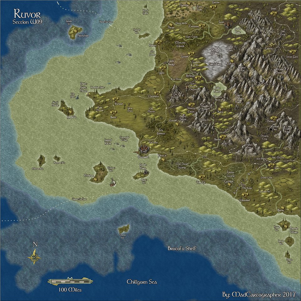
The planet I have named Ruvor, and I am doing it in sections. 800 x 800 miles each section. Here are what I have completed thus far....
Comments
The text is really hard to read, as well. Larger font size would help. Another easy fix.