

[WIP] Kingdom of Gongodûr
 Royal Scribe
🖼️ 388 images Mapmaker
Royal Scribe
🖼️ 388 images Mapmaker
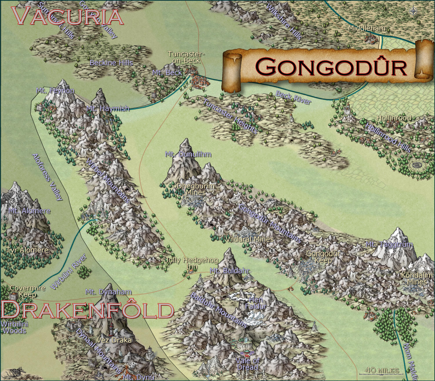
Here's a "work-in-progress" area map for the Kingdom of Gongodûr, a dwarven kingdom in the southeast corner of the Gold Coast area I've been working on (to provide a home for a dwarven mining village I'm working on). I used the Mike Schley Overland style because it has the best dwarven community symbols.
I shaded the countries outside of the borders of my dwarven kingdom, but not sure if that's the right approach. I could do proper borders for those neighboring kingdoms if that would be better.
I still need to name the places that are new to this local map but the names from the parent map have been added. I was going to do them all in Copperplate font since the font has a sort of "chiseled in stone" look, but it's such a wide font that it made place names challenging. Colors, sizes, and effects on labels remains one of my weaknesses.


Comments
You could perhaps try Avalon Quest, Cagliostro or one of the Mason Serif fonts as an alternative to Copperplate (they're all fine for Atlas use).
The river lines seem a little too regular presently, which is accentuated where the kingdom border lies alongside them, leading to some unlikely sharp corner angles in places that look unnatural as well, including the non-river angle NW of Mt Feynon.
The shading effect to highlight the kingdom looks good. It might work better if you were showing the entire kingdom on this map, as it looks a little strange to have the border heading off two map edges, suggesting this is only one small part of a much larger area. The title scroll so close to the right map edge also implies this.
When you say that the rivers are too regular, do you mean that there should be more squiggles in them? I could add more nodes to it to make it less smooth. Or are you referring to something else, like the width?
This is the edge of the 1000 x 1000 map I'm working on. I will play with the borders to indicate that the entire kingdom is on the map.
Not enough squiggles in the rivers - use the fractalization tool, set on Smooth.
When you say that the rivers are too regular, do you mean that there should be more squiggles in them?
To an extent, yes. At this scale, they don't need to be substantial necessarily, but long straight lines, and those arcing curves (those between Mounts Haymish and Beck, under the Gongodur banner, and northwest from Middleham) look artificial. They'd be fine as canals; not so much as natural rivers.
I think this is accentuated, for me at least, because many of the road lines have more natural-looking small curves and slight changes of direction along them than some of the rivers.
Actually, looking closer at the roads, that long curving line between Tuncaster to the Jolly Hedgehog clips the foot of one of the smaller peaks on the western side of the Wirbel Mountains (about opposite the Dhegburim Mines), so might be tweaked a little to avoid it, since the rest is in the broad valley there otherwise.
Here are two images of the revision-to-date, one with political borders and one without. I tweaked the rivers to try to make them a little more curvy, and changed a few of the roads, too. Decided to try out Avalon Quest for the country names but after some experimentation, decided to keep Tahoma for the other place names -- since there are so many little labels, I wanted them to be legible (so a sans-serif font that wasn't too fancy seemed best) but not too wide (I believe Verdana is wider than Tahoma).
With the political borders, there are two sheets: one for Gongodûr and the other for the other countries. That allows me to keep some of the opacity for the other countries, graying them out. I originally had it so that all the other countries were the same color. This had the effect of making the border disappear, so that it was just Gongodûr and not-Gongodûr. Not a bad effect, but the borders between other countries are probably still useful. Right now, they are all different colors (black, blue, yellow, brown, plus red for Gongodûr). I could to be one shade different of a dark gray -- I think CC3+ will then draw in the borders, even though visually they will look near-identical for most viewers?
Any other thoughts on fonts, colors, effects, borders, roads, rivers, anything else.....? (I still need to come up with names for some of the new places that weren't on the parent map.)
With Political Borders
Without Political Borders
It's coming along nicely, but where Tahoma might be an extremely tidy font, but it is also extremely thin, like writing with a micro pen. You might benefit from using a slightly bolder font so it stands out a bit more from the details of the mountains. It's a non-serifed font, so consider whether it really works with the serifed Avalon Quest.
Okay, I played around with different serif fonts. I really liked GoudyMedieval, but it didn't have the circumflex accent mark which dwarves seem to use a lot. Here it is using Book Antiqua. I also reduced the drop shadow on the non-country labels.
(I also noticed that the farmland below Travi no longer extends to the river. Fixed that after I exported this image.)
That's a nicer font, but it still looks quite spidery.
How about making the labels a little larger, or using the bold version of the font?
Do you have a drop shadow on that sheet? It may not be helping.
You could also try making the glow a little more definite?
These are all just suggestions.
Using coloured labels can sometimes be nice, but other times it's not as clear as plain black or white labels. If you go black and white (either black text with white glow or white text with black glow) there's more contrast to lift them out of the map a little - especially with a style as beautifully detailed as Mike's.
Have you considered using text along a curve to try and space out the letters of the mountain ranges along the spine of each range?
EDIT: A note here about using black and white - sometimes you might have to use the very palest grey and the very darkest grey instead of absolute black and absolute white, as the absolute black and white can interract oddly with the very black lines and very white parts of the style.
Thank you, these are very helpful suggestions. I will post an update in a few hours when work calms down a bit.
Sue's saved me having to comment about the fonts - thanks Sue! - but for the labelling in general, because there's quite a lot happening mostly in the mountains, I'd suggest thinking of moving the labels, where practical, out onto the plain grassland green areas, which might help with the font style & colours issues. I'd also be inclined to think of shortening the title scroll, and moving it too onto the plains, so it's hiding less of the "interesting" terrain it currently partly overlies.
The river lines are definitely improved now. That around Mt Haymish and Tuncaster is a little too angular in places though (Beck River). Where that same river curves towards Middleham, it may look better to have it follow the break in terrain fills, instead of cutting through them. You might find it easier to erase and redraw this river using a smooth-path river drawing tool, instead of trying to adjust it where it is now. I usually end up doing that, at least!
On the political borders version, the edge colours are very distracting, and make it hard to know where the river lines are. I suspect it would look better with just the shading effect on the areas outside Gongodur, as that'll still highlight where the borders are sufficiently, with luck. You may need to add some new shading to the areas on the east and south map edges, however. This would avoid the oddity of the mountain peaks being overlain by the border colours (though you could move those lines to a sheet below the mountain symbols instead, of course).
Unless there's a strong plotline reason, it may be worth reconsidering having the southern Gongodur border cutting through the symbol in the Valley of Dread, as presently.
EDIT: Forgot! The compass indicator probably needs enlarging, and again moving to somewhere less terrain-interesting. It's rather too well-hidden where it is now (which is naturally why I forgot it 😉).
I changed the two labels to near-white for settlements and near-black for geographical names. (Let me know if you think I should reverse that, with dark names for settlements and light ones for geography.) Playing with text-along-a-curve for some mountain ranges and rivers, and moved some to the side to make them easier to read. (For a few of them, I had to explode the text and ungroup temporarily to adjust the kerning.) Made some effects changes to the political borders but I need to redraw them to reflect the river changes. Oh, and I embiggened the compass and moved it. It also has an inner glow to make it stand out a little.
May not have more time today to work on this -- about to head out to a family function for the day. Hoping to finish it this weekend.
I think that's already looking a lot better - especially when viewed at the true export size when you click the image.
Yeah, for me the type is still a bit lost. Those style of mountains are so busy, I find I need to really make them standout. I'd increase the size again and you can add a black blur that almost acts as a label behind the black text with the white glow. The text out and away from the mountains is quite clear, however.
Need a bit more fractalization on those rivers and roads, methinks. Like a depth of 3, random seed 300 and smoothing....maybe. Not sure. I'd have to experiment.
Overall, looking nice! I'm a little confused on why the mountain ranges are as they appear, but there's a story there I have no doubt.
😊
Cal
I agree with Calibre about the fractalization, though I would use depth 2, random seed is irrelevant, I think.
I disagree about the text - it is perfectly legible.
The mountains are a matter of preference - I like what you have done, though I also understand the opposing point of view.
The rivers look a lot better now. At this scale, you really don't need many finickity curves; keeping the lines smooth, with enough curves to indicate they're not straight or canalised works well to my eye.
I agree with Calibre that some of the text on the mountains is struggling still. The font sizes are OK, I think, though a heavier outer glow might help. That can be tricky to control sometimes, however. Trial & error is your best bet.
The white text seems to have more problems overall. Again, a thicker outer glow outlining might help, or maybe changing the colour (something around the 165-166 reds, perhaps, with a suitable pale outer glow).
As we've noted before, text is one of the trickiest parts of any map to get right.
Still working on this. Text is slightly larger, and the glow is as well. Added more names, though I still have a few more rivers and settlements to do. Should I be naming the roads, too?
I am think about putting country names, settlement names, and geographic names each on a separate layer so that end users can toggle them on and off as desired. They're already on separate sheets, though, so maybe that's sufficient for toggling individually, and a single layer for all of them to toggle all names on/off simultaneously?
Another improvement.
The labels are quite clear now at forum resolution, and once you click the image and look at the full size they are good.
Looks great. I would still fractalize the rivers more, though. Depth 2, strength 40, and Smooth. IMHO.
I think too many quibble about text being perfectly legible to aging eyes (like mine) at forum level instead of the size it is meant to be viewed at, so again, IMHO, I don't think you needed to make the changes to the text you did. Sometimes what looks good at forum level looks garish at the size it is meant to be viewed at (which can now be seen in the Gallery, thanks to recent changes there - thanks, Remy). My attitude is the size meant to be viewed at takes precedence, not the forum view. Nor should the text be changed to cope with the worst vision of various viewers - perhaps an unpopular viewpoint. I realise these views are quite contrary to other strongly worded opinions, but there it is.
And I do like the mountains as they are.
Okay, the first thing I did was back another backup of the FCW in case I didn't like the fractalization and couldn't undo it. ;-)
The fractal command isn't something I've used that much, and when I tried it on this map earlier, I wasn't sure of which settings to play with. While I think the smoother map works for a map of this scale, I rather like the Depth 2, Strength 40, smooth result on the rivers. Fractalized a few of the roads but not all -- there were some where it just made the road look overly-caffeinated.
With the place names: I added names for the settlements and rivers that were missing them (let me know if I missed anything important). I've played with the Glow settings a bit. I'll post the FCW, too, if anything has adjustments to recommend.
Here it is without the borders:
And again with the redrawn borders:
Ooops, I said I would post the FCW and then I forgot to do so.
That all looks great now. I like the way you darkened the non-Gongodur parts. I', glad you liked the fractalization I suggested - it is the one I use the most for rivers. I tend to leave roads alone, but I might use a smaller fractalization in future, seeing what you have done - perhaps Strength 30, depth 1, smooth. I love the way we can always learn new techniques form each other.
Appreciate your help and everyone else's! Looking forward to getting back to city and dungeon maps for a bit after this. ;-)
A few of the labels are a little too close to the map edge - one or two seem to run slightly beyond it, e.g. Wirbilini Woods and Taggtrum R(iver) - which is another issue with text in CC, where the text's position shifts at different resolutions/export settings.
That can usually be solved by making sure you have the correct location point for the text before placing it (such as "mid left", "top right", etc.), because the text will only expand/contract away from that point, so it's effectively fixed to that spot. It can be tedious having to remember to change it every time if you're doing a lot of labels in different places, although you can use the shortcut arrow keys instead once the text is on your cursor to be placed.
You mentioned thinking of putting some elements onto a separate layer that could be toggled on and off. For this map, I think it's probably better to have both the regional borders and their labels on all the time. With just the labels, it's impossible to guess exactly what they refer to otherwise, including identifying how far Gongodur extends.
Thank you, that's a super helpful tip about text positioning. It's something I haven't really paid much attention to when the text is limited to a single line.
Tweaked the text for the ones I saw that were too close to the border. I will have the borders set to be on, but the political borders and names of the other countries are all on the same layer, so they can toggle on and off at the same time.
MUCH MUCH better! I see you used Frac on the rivers and I agree with you and Quenten that's all they needed.
Labels in the mountains lookin good! I see some of them lack the black blur. If I focus, no problem reading (consider adding the blur to them as well---though I know Quenten disagrees 😁) (Vale of Dread, I'm lookin at YOU).
Generally, I'm starting to see what you intended for this map and the artwork is looking excellent, sir or madame or whatever heh.
Now, tell me why those mountain ranges are as they are, if you have time :)
Cal
@Calibre asked: Now, tell me why those mountain ranges are as they are...
Geology! You can find an explanation for any landform that way if you hunt long and hard enough (speaking as a once-upon geologist)!
LOL
Good enough 😁
Cal
Well, I was going to make a twist of Hanlon's Razor ("Never attribute to malice that which is adequately explained by stupidity") phrased more like Arthur C. Clarke's Third Law ("Any sufficiently advanced technology is indistinguishable from magic"):
A secret grand design is indistinguishable from stupidity.
The truth is...just a clumsy attempt to recreate from a much bigger parent map that was itself derived from a much, much bigger parent map.
This is the parent map I took it from (Gongodûr is in the lower right):
And this is the section parent map that this whole 1,000 x 1,000 mile section comes from:
When I downloaded the FCW for the parent map, it said there were green mountains there, which I took to mean vegetation-covered hills and small mountains.
So no real grand design, just an over-exuberance in trying to add more detail from the parent map and slip in some mapping/adventure hooks.