

[WIP] Community Atlas - Eknapata Desert
 Royal Scribe
🖼️ 386 images Mapmaker
Royal Scribe
🖼️ 386 images Mapmaker
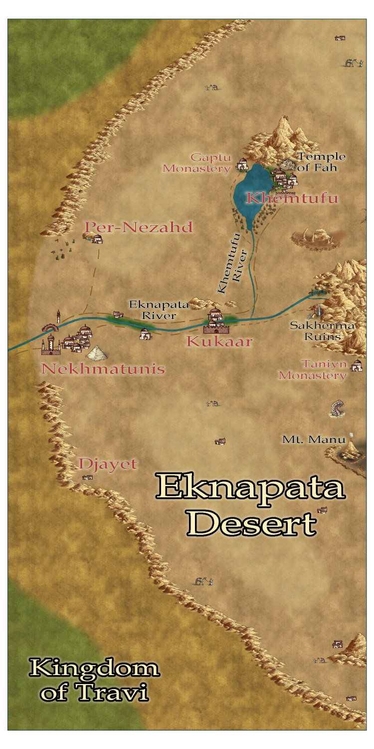
I am writing up the description for the Eknapata Desert area of Gold Coast region of the Community Atlas. It was designed using the Scorching Sun annual. Any feedback on the map before I submit it?
Tagged:


Comments
Interesting, although there doesn't seem much more here than was already shown on the main Gold Coast map.
Might be worth adding a few more smaller features (dry valleys/wadis, rockier flat areas, dangerous soft or otherwise unusual sand areas, etc.), naming all the smaller settlements, and maybe naming the nomad tribes/trade routes suggested by the led camels too.
You should definitely add a scalebar.
Not sure if the labels mightn't be made clearer as well, perhaps using a smaller font size, so the place-name labels hide less of the "interesting" terrain.
Perhaps consider making the trails stand out a little better too, and maybe green-up the watercourse and lake edges everywhere more. The Nile creates a green valley surrounded by desert, for instance, so the active river and lake here should too.
These are great ideas. Thank you!
Okay, here's the next iteration.
I tried to use blotchy lighter sands to suggest sand dunes, like the Sahara Desert, and darker blotches to show more solid, earth-packed areas. Not sure if I should try to get them to blend in more with a partial transparency or something?
Tried to make the roads show up a little more, but I can't tell if it was that successful. I liked the idea that the guys with the camels could be used on the trails roads to indicate that it was more of a general route through the sands, where most travelers would need an experienced guide to make sure they don't get lost, since a proper road would be blown away or covered with sand. There is a more treacherous area in the southern part of the desert called the Devil's Backbone, where a proper road on more solid land passes next to a 50-mile long fissure. It's a dangerous route, beset by foul creatures that creep out of the fissure, especially at night. But the road is on solid land, and without a guide, it might be a safer route than braving the shifting sand dunes. (I put a tower next to one of the villages down there -- maybe a wizard is there that the adventurers just have to visit?)
Thoughts?
Sometimes getting things to stand out more means just changing the colour or line thickness a little (or font size for text). An outer glow of some kind can help, but it can also make things look too misty, which I think it what's happening with some of the smaller text labels presently. I'm not sure that brown colouring on the labels is working well enough, and even the grey labels could be a little clearer.
The general textures seem fine, although the desert edge is maybe a bit too abrupt (very obvious where the green coloration alongside the river ends currently). That seems to be accentuated by the line of desert-edge dunes north of the river too. The more wavy edge of the dunes south of the river looks more natural to my eye at least.
Thank you, this is helpful. I’ve been sidetracked by other projects (I always have half a dozen maps going at once) but need to get this finished so I can get it ready to submit.
Yes, I find I have to be very focused to make sure projects get finished. That may be why I have projects that are many decades old that are still, theoretically, "in progress", however...
I've created an Excel spreadsheet to keep track of mine, including noting dependencies (e.g., Village 1 can't be submitted to the Atlas until Regional Maps A and Kingdom Map B are submitted).
Downside to that is remembering to update the spreadsheet, of course...
I've been futzing with the settings to try to make things a little better. Increased the line width of each road slightly. Softened the edges of the terrain a little. Tweaked the glows of the dark text and changed the color slightly. Really can't tell if any of that made a difference. (I am always challenged by getting text settings to work well.) I am attaching the FCW if anyone has recommendations on adjusting effects.
It's looking good so far.
The glows don't have to be really loud to work. As long as they make the text clear enough to read that is fine. With the labels 2 different colours this can be a bit tricky, but I assume that the brown labels are not as important as the black ones, so they don't have to be as eyecatching.
So, how about this?
I switched off the effects on the Text Outlined Light sheet because the text itself is so large and so pale it doesn't really need a glow.
You might want to make them a little more opaque, but that's part of personal taste.
A little tip: Using a ranking system of different sizes is ok, but try not to use too many different sizes if you can avoid it.
Thank you! Here's how it looks with the effects changes. And I've standardized the font sizes to three: 10 points for country names, 5 points for the three major cities, and 3.5 pts for everything else.
That's better. The labels are no longer screaming out of the map like before, but I think you may need to increase the opacity or the extent of that one glow. There's at least one label I can't easily read - the temple of Fah. I might not have adjusted it to perfection, but only enough to show you how little you could sometimes get away with.
I changed the opacity from 25% to 60%. Too much? Not enough? I also moved the "Temple of Fah" label so that it's no longer partially over the hills.
Better again.
The thing about sheet effects is they do take a lot of tweaking to achieve perfection, so you may wake up tomorrow morning and take one look at it and decide to change it again.
I don't think it's too much, but it may still be on the borderline of too little. Small adjustments are better than large ones till you hit the sweet spot between not enough and glaring. And then there will always be issues with subtle but efficient text glows where some may still not be able to see it even though you can.
The road setting could be edited to make the dashes a little smaller (not thinner, just smaller). To do this, go into the Lines menu, edit by setting the pattern length to a different figure, and see what you like best. I have been doing this a lot lately.
Also see this discussion: Command Spotlight - Line Styles and Properties — ProFantasy Community Forum
Per Quenten's suggestion, I have been playing with the Line Styles for the roads. I didn't try creating a custom one, but I did try some of the other presets, and they didn't really work. I also tried checking the Paper Scale checkbox, and that had weird effects when I zoomed in.
Here's an attempt that sets the roads to be solid and leaves the guided routes as dotted lines. I like that it makes it a bit clearer which ones are actual roads. I will also put it in my WIP gallery to make it easier to zoom in. Thoughts?
Remy did a useful section on altering line styles (for road markings) in one of the live videos which, of course, I now cannot recall... It can be tricky to get the dashed variants to look right; usually a lot of trial and error.