WIP Ruins of Charn
 HelenAA
🖼️ 19 images Mapmaker
Following my other Narnia map I am trying to recreate part of the ruins of Charn from Magician's Nephew.
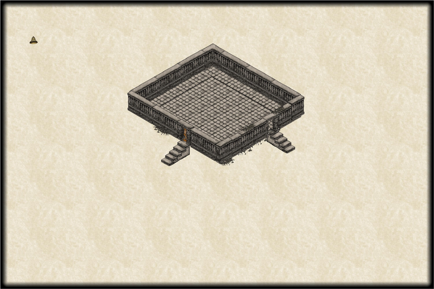
here's what I've done so far. I have immense problems with isometric maps which is why the throne room is wonky! Comments appreciated.


Comments
It doesn't look wonky to me.
When you're ready, an RGB Matrix effect with a suitable red coloration over the whole map might be interesting, to fit the setting, although the RGB Matrix effect can take a bit of fiddling to look right.
As an alternative, you might get away with a solid sheet with a suitable red colour large enough to cover everything you've drawn, set up on its own sheet with a Transparency effect adjusted so you can still see the map underneath clearly enough.
As for wonky, that's a matter of opinion, considering the state of Charn and what had happened to it by the time it features in the story.
And good luck with all those people sitting in the chairs, not to mention the table with the bell!
The left stair does appear to be slightly out of place compared to the other one. I think left one space and back one space, so the landing is under the threshhold.
Haha I wrote this post hours ago and forgot it in draft mode.
Edit yes, count the steps. You can see 4 treads outside the building on the right, and 5 on the left, showing that the top step should indeed be under the threshhold.
That must be my spacial difficulty then. :)
I'll be back here for help with the RGB Matrix thing, as I've never done anything that needs that effect. My folder that I keep the stuff I'm working on is appropriately called 'trying things out' for that reason. I'd hoped that there would have been a varicolor option as Charn was a white marble, but there isn't in Annual 10 (2016).
Mercifully there are thrones though I've only seen one direction as yet, and I've borrowed a bell from, I think, one of Sue's templates.
Thanks for spotting the misalignment of the stairs! I felt there was something wrong but couldn't work out what.
true, but this is a fantasy setup inside a massive castle so I'm imagining perfectly level ground. I'm making reasonable progress on it today, so might have something to post here later or tomorrow.
my most recent layout. I'm not going to put walls everywhere - otherwise I'd obscure some bits.
I like it. I have perspectives, but haven't really used it. (to many other maps in progress)
The floors look a bit disheveled for some reason. Maybe someone can give some insight.???
The description in "Magician's Nephew" has the floors as being uneven and pieces missing so I've not worried about placing the symbols too perfectly, @Don Anderson Jr. , and the template is essentially an isometric one rather than perspective.
The other day I blithely did a SYMSORT on a particularly uneven patch of tiles and it ended up making it 100% worse so I had to delete nearly a whole afternoon's work as I couldn't undo the command!
I'll be doing a true Perspective map another time - once my brain has recovered from the isometric one.
@Don Anderson Jr. asked: The floors look a bit disheveled for some reason. Maybe someone can give some insight.???
As Helen suggested, the book makes clear the place is almost a ruin. Essentially, Charn's entire global population and all other life was destroyed in a single, momentary event a very long time ago, leaving just one living humanoid there (the person who caused it). The buildings are all pretty ruinous, as having been left quite unattended ever since, to the point where bits simply collapse if there are any louder sounds, and some have done so already, so there's rubble in places, etc. It's all looking pretty realistic to that currently.
It won't be long, I hope, until I'll be picking your brains about the RGB Matrix effect, @Wyvern - though I'm definitely leaving that to last. Which sheet will it be on, out of interest?
My initial thought would be to have the RGB Matrix effect be one of those "Whole Drawing" effects, so not on any sheet at all, but it's also one of those effects that can take a fair bit of tweaking (not to mention a degree of luck) to find the right solution in achieving the look you prefer.
Unfortunately the only effect I can get to sort of work is the predefined sepia effect, see below, but as its 'whole drawing' effect it also swamps my map title! I sort of like it as it takes away the darkness of the floor tiles, but would love it more if it didn't impact the text...
Unfortunately, whole map effects do what it says on the can and effect the whole map; including the labels and title.
Have you considered changing the colour of the labels and title?
yes, Sue, I did, and it didn't work 😥. I'm thinking of putting something like a dot hidden under the map border on an otherwise empty sheet and doing a gigantic blur below the text sheet! might work, might not.........!
EDIT: I had to step back a saved map because none of the sheets had the RGB Matrix settings. Thankfully I tried the RGB first thing so I only had to re-place 3 symbols after stepping back.
One alternative you might try would be not using the RGB Matrix effect, but setting up a simple rectangular polygon that covers all the map on its own, new, sheet, setting the polygon to have a solid red colour, and then adding a Transparency effect to that sheet. If you move the sheet to be below the text, but above the rest of the map sheets, that might work. You'll probably need to keep adjusting the Transparency, and probably also the colour of the polygon (likely somewhere in the reds and oranges range) to get to something you're happy with. Not guaranteed to work ideally, but it should give you more control over the final colour of your text, at least.
me and my computer have agreed to stop for the day [it's 16:40 here and I've been at it all day], so will try tomorrow as well as hunting for the infernal thrones..
on a scale of 1 to 5 [1 being very naff and 5 being semi-OK] what do you think of this? Personally I hate it by the way.
the scale is awful too
It looks ok to me. Maybe there is a bit of an optical illusion going on with the floor texture making the seats look like they aren't in parallel facing rows, but that kind of thing happens in Perspectives.
What don't you like?
I'm with Sue, in not seeing there's anything so very wrong with it overall.
Maybe a shadow effect under/near the table would help, and possibly separating each of the chairs/thrones a little. Less sure about this second point.
The bell does look a bit odd, so that might benefit from a minor rethink, and repurposing some symbols to help. A quick skim through the Perspectives 3 Bitmap B options suggests one of those open stone doorways (called "Doorway" in the Wall Features symbol catalogue) scaled-down, could work for the stand, and as a bell, maybe try one of the "Dish covered" symbols from the Bitmap B Furniture catalogue, though you might need to tweak the scaling a little, using slightly different X and Y scales to make it a little more vertically elongated.
You could then draw a suitable little line as the support rod for the bell (or probably two short lines, so it looks as if the support rod passes though the loop on top of the "bell". You could though perhaps resize and repurpose the "Quarterstaff" from the Weapons catalogue similarly for this instead. For the hammer, maybe try the "Maul" from the same Weapons catalogue.
ADDED EDIT: You might also think of using an alternative stone base for the bell instead of the table - perhaps the Bitmap B "Altar Nature", the "Altar Simple", one of the stone "Pillar Base" options, or perhaps that "Pedestal sm", all from the Temple and Statues catalogue.
Not sure if it would work with Perspectives, but I once experimented with creating a top down view of a bell using the domes from City Domes (two domes on separate sheets).
I absolutely hate the fact that the bell is on its side, @Loopysue , not its creator!
thanks @Wyvern , for your suggestions. I've got effects off at the moment.. Makes it easier to see.
The final map!
All comments welcome!
Looks good, Helen :)
Impressive! I struggle so much with perspectives and isometric maps.
This is the first perspective/isometric map that I have completed, @Royal Scribe , though I had to squint at to get the right orientation of the symbols like the banner/flag thingys in the lower left room! I was going for the flags in old churches like the chapel in the Tower of London.
Now bevels on the other hand ......
They weren't so much ruins as long abandoned, as per the description in the original books and illustrated by Pauline Baynes.
Hi @DaltonSpence
the ruins are part of a massive city that, as Quenten says, was at least thousands, if not potentially millions, of years under a magical spell that was only broken by one of the children ringing a small bell in the throne room. Thanks for the compliment too 😊