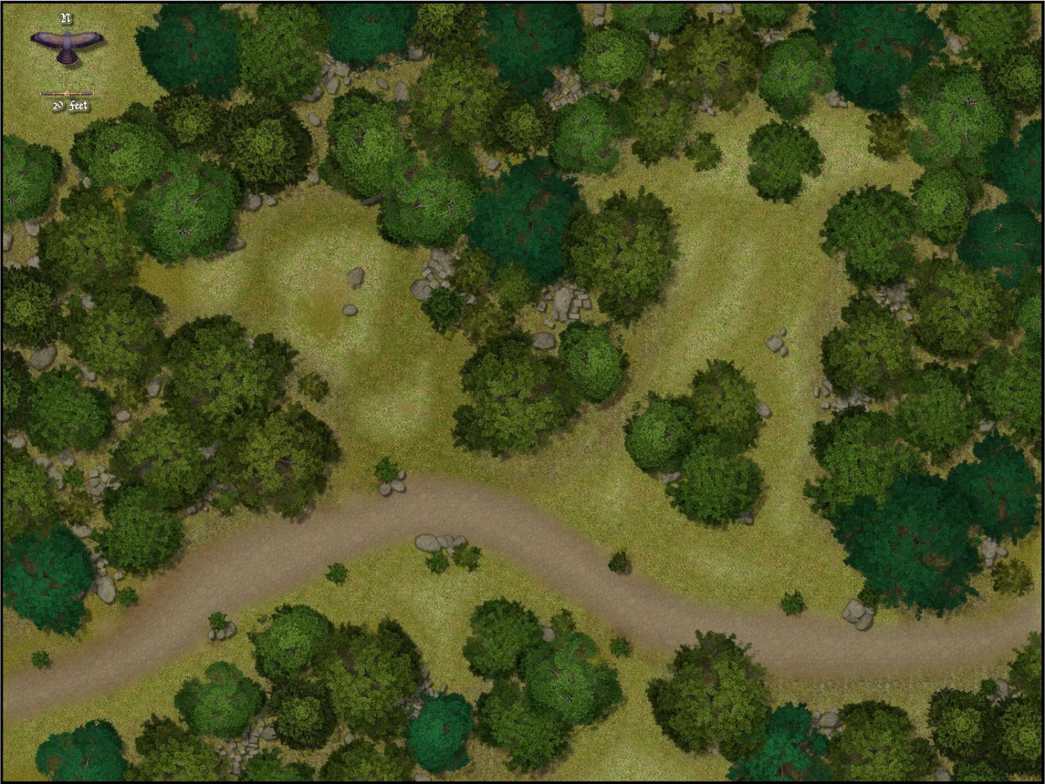
Forest encounter area - Forest trails + SS2A
I still need to work on exporting maps as jpeg but this one looks ok in the VTT environment. Using Blend and Edge Fade Inner with reduced transparency for the ligher grass areas on a seprate sheer. They pop a lot more in the jpeg than on the screen. Almost looks like an aerial view of a golf course, not what I was trying for🙄. Will experiement with transparency further.
Any guidance is appreciated





Comments
It's a good little map :)
Can you share the FCW with us? I want to check a few things that might be giving you the problems you described over on the FB Group page. I suspect the scaling isn't set for one of the textures, but can't be sure until I've looked at the file.
Hi LoopySue, I beleive I have attached the .FCW file to this message properly. If you canthink of anything, please let me know. I really like combining these two symbol sets and will probably continue experimenting with them.
I'm getting this on export. It doesn't look too different to the FCW window view when zoomed in. What part of the grass wasn't working for you?
I am likely picking nits. I agree that when I zoom in to that magnification the image is exactly what I am trying for. This is why I really like this style combination. The contrast of the light and dark blends extremely well. But zoom out to the full map (my picture above) and the transition between light and dak areas is much more stark and the light grass looks pixilated(?) There are small dark pixels that pop in the light grass when I do the Save to Rectangular JPEG that isn't there "on the screen" I am trying to figure out if this is a jpeg resolution issue, something I can mediate with transparency, blend, blur or texturize. Or if it's just my old eyes... it may just be the software I am using. This is what it looks like when I try to grab the same area of the map you have.
The image I showed above is a jpg render.
Maybe the lack of quality in your export is down to export settings?
These are mine (admittedly very high, but I'm working on something that requires a lot of detail at the moment)
What are yours like?
Note the fact that I have 33% antialiasing active. That helps to smooth out most 'grit' problems. I'm also exporting larger than you are, which forces CC3 to use the highest resolution available for everything, rather than allowing anything to drop to lower resolutions. You can tell because the trees in my export have definite leaves, whereas the trees in your export are less defined. If you are worried about MB size for any reason my export is 6.14 MB, which I think should be usable in most VTTs these days... isn't it?
The textures from Forest Trail are in some cases deliberated blurred just a very tiny fraction (0.5 pixels in the case of the grass) to help them look better from a distance, ie smoother.
That is likely the issue. My setting sa re below and you are correct about the differences. My anti aliasing is much higher, my size/resolution is smaller and I noticed you don't have the progressive jpeg option active. Using your settings my computer is rendering the jpeg very slowly now but the output is much better.
My rendering is only 2.98GB, the Fantasy Grounds VTT can accept a file that size without choking on it
Thank you. That was very helpful. I will check the Tome of Ultimate Mapping more closely for more on this.
You're welcome, EdE :)
I think the numbers that really matter are the work size dimensions. Antialiasing requires that the image is exported a lot larger in the first place to a BMP file, which is then reduced to the specified size to antialiase the image.
If the render is very slow try increasing your Maximum Pixels Per Pass to 40 million rather than 4 million.
The command for that is EXPORTSETMPPP. The default value is '4000000' if you check the command line. Input '40000000' and hit return, then try again.
This map reminds me of something I similar I did in the maps I posted in my gallery. I'm going to steal your rock placement. That looks cool.
Thank you Kevbeck, steal away. I look at a lot of maps others have drawn and I am certain I create very similar content at times either intentionally or not.
Thank you LoopySue, that was very helpful
You're welcome :)
I've just noticed how low your JPG quality settings are. That probably isn't helping the appearance of the map. The default is much higher than that and will still produce a relatively small file. Try about 85% and see if that helps.
I will, thanks