(WIP) Path to the Ruined Tower - A more realistic Forest Trails map
 EukalyptusNow
🖼️ 62 images Surveyor
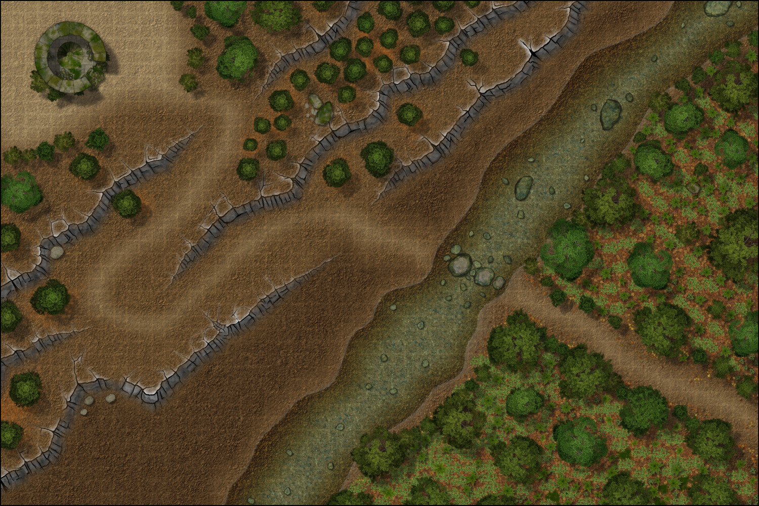
Attempting to create a more realistic Forest Trail map with this one.
Things I've noticed so far:
- Reducing the bright inner glow of the water to 50% brightness has helped the creek to blend in better.
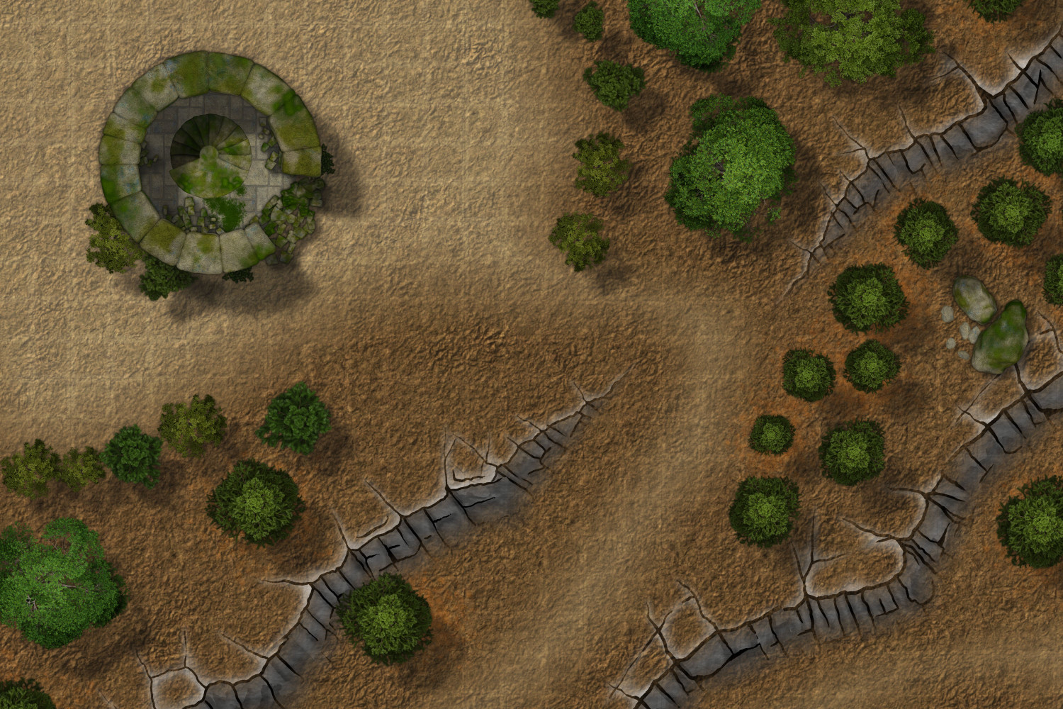
- The used City Cliffs do an "ok-ish" job with this style, but they stand out at higher zoom levels. Are there any relatively easy "Dungeon Scale" cliff solutions in other dungeon styles, that work with Forest Trails? EDIT: Silly me - Forget the WIP enhancement of this style. Looking forward to the new cliffs...
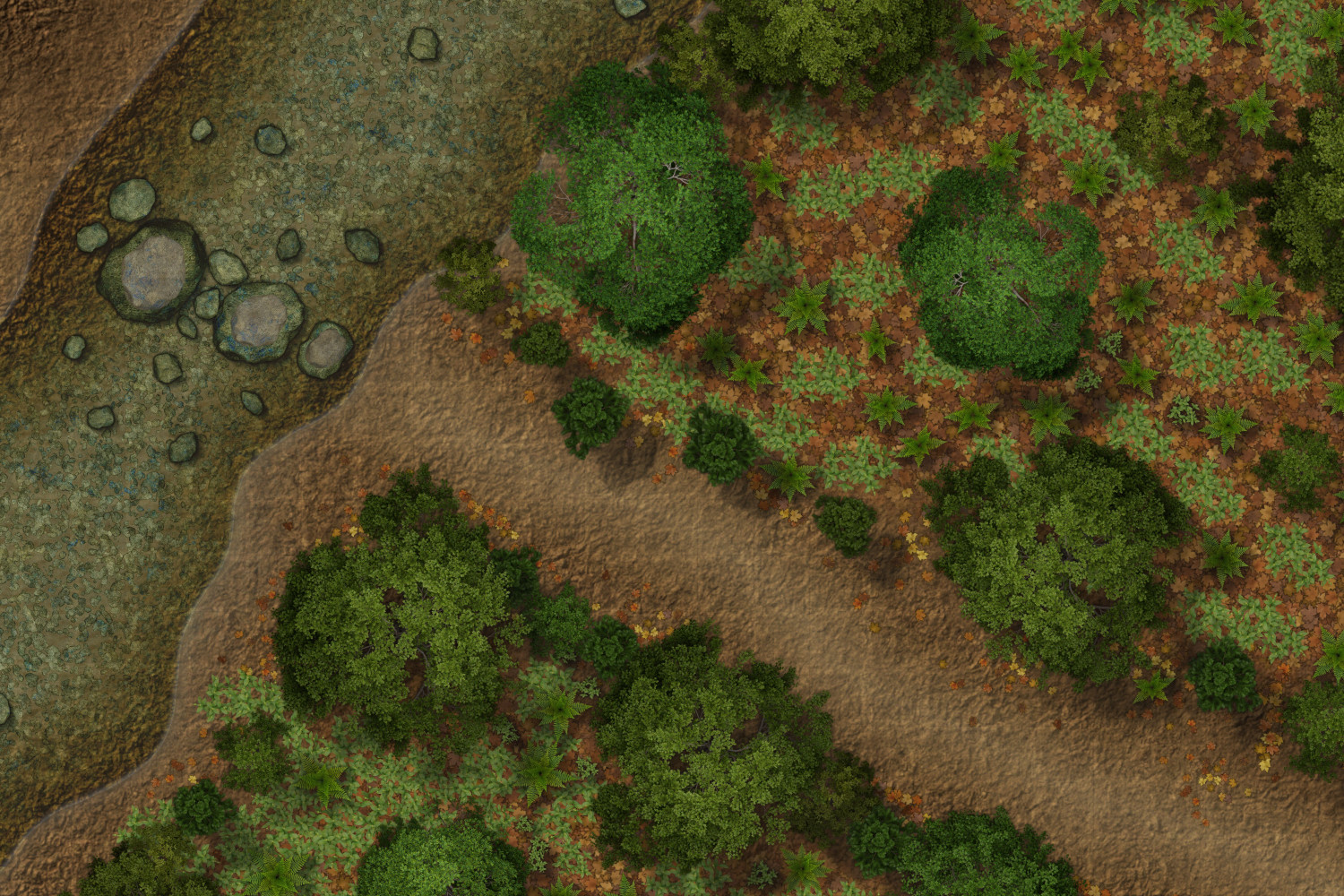
- A forest created with leaves, weeds, ferns and Trees looks very good, but I'm missing broken-off twigs/ fallen branches. So far the only one's I've found are Mikey Schley ones - which don't fit in with this style. Are there any other ones I have missed?
- The water looks really nice :-)
Some detail shots - at least the tower area is still WIP
Comments and suggestions for improvement are highly appreciated.




Comments
I like the new water effects :)
Added manual cliff shadows, grass, rock texture around the cliffs, water plants in the creek and more rocks and trees.
Tried using the grass patch symbols. Unlike the dirt patches, I do not like how their texture interacts with the regular grass texture, unless the symbols are scaled just right.
Apart from that, I'm still very happy with the style.
Looks great :)
The grass patches should be the same scale as the grass fill as long as they are set to the default symbol scale of 1. I have noticed that there are points as you zoom in and out of maps with a mixture of fill and patch that the patches sometimes 'click' to the next resolution slightly before the fill does. This shouldn't be a problem when exporting as all will be exported at the same resolution, but it can look like the patches are wrong in the CC3 window at certain zoom levels.
The other possible mismatch is if you are using the fill from one style and the patches from the other style. Creepy Crypts grass does not exactly match Forest Trail patches, and same vice versa. I personally prefer the Forest Trail grass texture and patches, but it's down to personal taste in the end.
Thank you @Loopysue
Using Forest Trail grass. I think the issue is that I tend to cluster multiple patches together (at various scales and orientations), to create organic shapes.
This works pretty well with the dirt patches, but not so much with the grass ones, because they are symbols and the "texture" difference becomes really visible, when the grass patch symbols are not scaled properly.
I'll just make my rounded grass polygons a bit more detailed.
Good luck with your Computer. :-)
Thank you :)
That was quicker than expected. :-)
Almost looks a bit too plain without the grid.
Larger versions are in my gallery. And I'm now thinking of what adventures await down the tower's stairs.