NW middle-earth redux
 whit2468
🖼️ 86 images Surveyor
hi
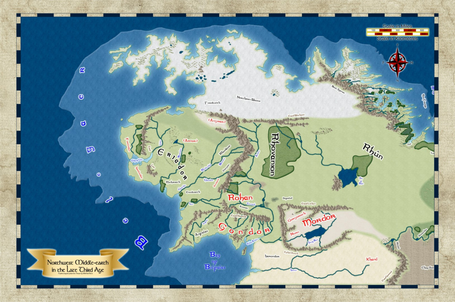
i've decided to visually improve some of my earlier maps.
After about a week of trying different styles, i settled on the Ancient Realms one. With some tweaking of the effects.
the borders been pinched from the myrr style i think. With the title ribbon coming from the banners style.
i'm not entirely happy with the look of the land fills. but they work well enough for the time being.


Comments
Looks pretty good already :)
Have you considered making the textures larger? Sometimes the detail can be a bit too small to look like anything much. And don't forget that you can also use the same texture on different sheets with different colour altering sheet effects.
i thought about layering the land bitmaps on different sheets, with different effects about 5 mins after posting. i'll play around with that later.
i hadn't noticed the issue with the bitmap scaling, so i've increased that by a facor of 3. thanks
I am not a fan of the coastal water bevel. I would prefer that you put it on the land.
this is with the textures rescaled.
i'll post one with the bevels removed, once it's rendered, to compare the differences
I like beveling, but when it is placed on the water, it gives more of a continental shelf look. I prefer it is be just on the land.
The fills look better now they give a hint of what they are supposed to be :)
That looks a lot better with the bevel on the land too. How about using an Edge Fade, Inner on that sea contour to blend the two ocean colours together just a little?
i think I'm almost at the finished map.
Fabulous work - the only reason I've made the comments below is because this looks so good. My suggestions are all purely personal and respect the creativity and effort you have put into this wonderful piece of cartography 😀
Have you tried different colouring on the fonts? I can see what you are going for, although not entirely sure why Eriador, Forodwaith, etc. are a different colour.
I think maybe some of the orientation and placing could be improved as well - especially the Shire going through the middle of Eriador.
I'd remove the kilometers part of the scalebar, use what the inhabitants would use.
And one last suggestion, Forodwaith (the region) looks a bit like a cloud that is obscuring some other detail and I think that's because the colouring starts right up against the Grey Mountains - maybe a tiny bit more separation would help (appreciate it may look different on the the fully scaled version).
Don't get me wrong, this is a beautiful map and it has inspired me to get the Annual containing the stylepack - you should get a commission 🤑.
i think this going to be the final version. though i will probably continue to play with it in the future.
updating the map above, with the latest tweaks to sheet effects, gives this map
below is the map that was converted to the new style
Mordor is supposed to be dark. The map makes it more look like a desert. Have you thought about making the land/mountains dark more like volcanic ash?
At one point mordor did have a volcanic background, but i didn't like the look of it.
but that was before the current sheet effects. so i think i'll experiment with that again and see what it looks like
You could use sheet effects to get the right shade of volcanic by putting that polygon on a sheet of it's own. Add the same Edge Fade, Inner, and maybe change the fill to something more volcanic, but also try one of the colour changing effects. You don't have to use a volcanic fill in its natural state if you don't like the look of it.
There have been times, before Sauron, that the area had a different name and was a pleasant place.