Community Atlas: Queen Mica's Scintillant Palace
 Wyvern
🖼️ 281 images Cartographer
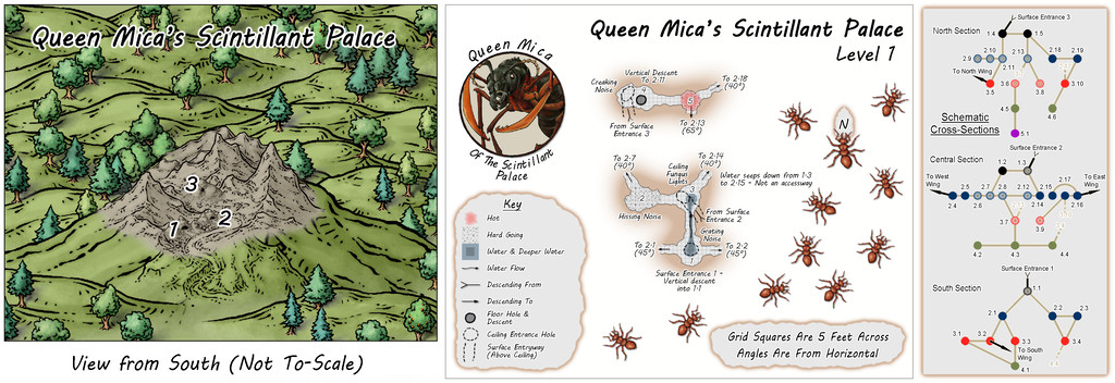
Once the Faerie City of Embra had been completed for adding to the Clack Valley map in the Community Atlas, there was one further place left there I wanted to add maps for, the fancifully-titled Queen Mica's Scintillant Palace, on its hilltop east of the Faerie Town of Dumbra in the lower Clack Vale, south of the river:
The reason was quite simple, as I'd decided some time ago that a version of The Hive maps, prepared for a mapping contest some years ago, should be converted for use in the Atlas too, once a suitable giant insect nest was located for them. Those maps had been prepared originally as just one small part of a far larger complex of subterranean insect hives, with five vertical levels and four links in more or less cardinal directions to other such hives elsewhere which were not part of that set of maps.
While a number of potential sites had been set-up for giant insect colonies across my Errynor maps during the planning and early random construction phases, it seemed there might be more potential for something unusual in one located in a highly magical region, which the Faerie Land of Errynor Map 40, where the Clack Valley is situated, provided.
Once this particular giant ant nest had been chosen, it was clear the ant queen here would have been affected by the magical nature of the place too, so the colony was going to be thought of as a great castle-palace of magical wonders. At least as far as the queen was concerned. Giving her a more intelligent personality than normal, magically-enhanced, one that made her curious to learn more about the dominant humanoids, their ways and magics, was a natural development. As the ants live on fungi they grow themselves on rotting vegetation, they are not liable to be antipathetic towards other creatures that respect their nest and the region they habitually use for foraging. Thus small bands of humanoids found wandering in that area - about half a mile, 0.8 kilometres, around the nest - would be more likely invited to the place as honoured guests than attacked, providing they respected the queen and her folk.
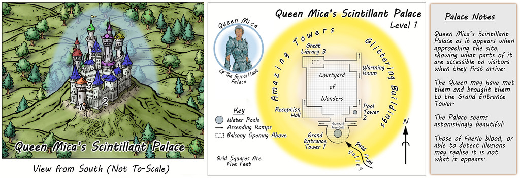
It would though be immediately obvious to the queen that both ants and their nest in its natural state were not people or places most humanoids would care to visit or interact with. So Faerie magics in the area - the ant nest already being a Faerie Portal site - would give the queen the ability to conceal the reality of both ants and the colony to outsiders. At least those less-attuned to Faerie. Thus in its illusory form, the subterranean colony would become a wonderful, glowing, magical above-ground castle-palace, the Scintillant Palace of Queen Mica, no less:
So the initial Palace map looks like this in its illusory form, which is, as might be anticipated, a little vague on details. Essentially, much of it could look as wonderful as the GM can imagine, because it's impossible to access most of it, as it simply doesn't exist.
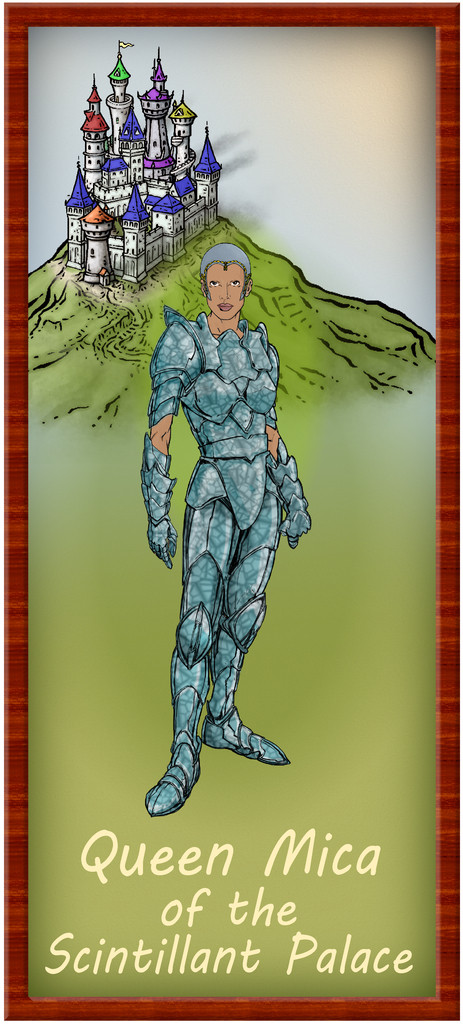
The Queen of course gets her own separate portrait map in the Atlas, linked from her torso shot in the middle section of this map:
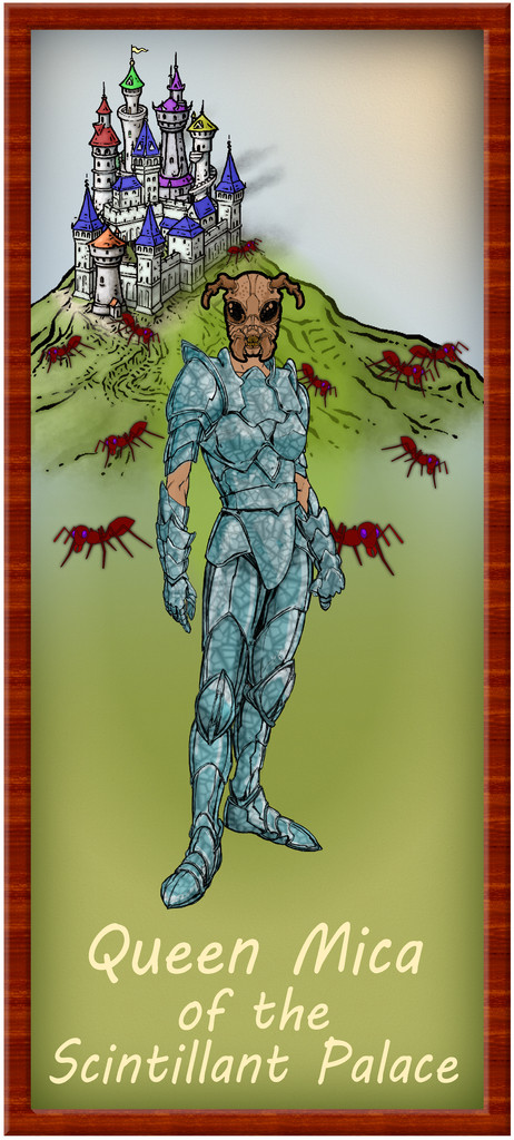
She has a fondness for the colour blue, and all her people wear it as similar crystalline armour, although even the guards don't carry weapons. Well, they do, but not the kind humanoids would expect of someone in this form. None have any body hair of course. And all her people have a curious facial resemblance to the Queen. She never leaves the Palace, though she can appear anywhere in the foraging area, either as an illusion that can still physically interact with things there in a limited way (Faerie magics allow the twisting of reality, after all), or projected onto one of her folk, using them as a physical avatar. A toggle in the FCW portrait map may help begin revealing the reality here:
The limitations of what's readily available in CA3 meant while a full-blown upright giant ant figure would have been ideal, the head starts to suggest things are ... different here at least. Plus the original CA symbol options have some handy giant ants, which in the background and a little blurred work quite nicely here. The Palace look has been retained intact for all this, because this version of the portrait then becomes a sort-of halfway point in seeing through the illusions. There should be a "Reality" toggle for the Palace's Level 1 FCW map though, which strips away all the illusion:
Still impressive, if perhaps rather less inviting now. The central part of the map repeats the first underground level of the earlier "Hive" maps, as does the cross-sectional diagram, though both have been amended in places to fit the Palace concept as now developed. All the features of this version of Level 1 have their equivalents in the Illusory version, and of course, there are PDF and text file descriptions to assist those wishing to make full use of the setting.
The original "Hive" was constructed randomly using the Carapace Pay-What-You-Want booklet by Goblin's Henchman on the DriveThru RPG download site, something that remained unchanged here, so the earlier Forum notes regarding that still apply. However, the connections to other hives were changed here to become four separate Wings for the Palace, and fresh maps had to be devised for those, though not using the same "Carapace" mechanism. We'll get to discussing what that was subsequently.
The main mapping style is that used for the original "Hive" maps, the CA07 Caves & Caverns one, while of course the ever-superb artwork of Mike Schley made possible the accompanying surface sketch views!






Comments
The central, main, part of the Palace complex, consists of the Level 1 map(s) above, and the other four earlier "Hive" maps, with suitable amendments:
One major change was the original "Hive" was a single map, with each of the five levels set-up on a separate Layer in that FCW file. Here, each Level is in its own separate FCW file, as that seemed easier to try to keep things properly organised for presenting in the Atlas (although the Level 1 map still works that way, for its variant "Reality" and "Illusion" versions).
As the accompanying descriptive files suggest, the illusory nature of the Palace might be continued for some visitors, as GMs could prefer, throughout an entire visit here. Although no further illusory versions of the maps are provided, the idea is the level maps would be simply inverted, so as to seem that deeper levels below ground were actually higher buildings and towers, with suitable illusory views across the surrounding countryside and neighbouring parts of the Palace. Naturally, none of the locals are deceived by any of this, and now tend to give the place a wide berth, though less because it's really a giant ant colony than because the Queen, while respected as a powerful Faerie creature, isn't the greatest company over any length of time. Plus honey fungus for a meal or two is fine, but not on its own as a regular diet. Unless you're a giant ant, that is.
As mentioned, the four Palace Wings were based on a different option than the "Carapace" booklet's system, hence none of these maps have schematic drawings beside them. Each was instead based on images posted by various people on the Dwarven Forge Discord, and from layouts shown in several official company videos available on the Dwarven Forge YouTube and Twitch channels. All used items from the cast modular terrain "Burrows" pieces made by the same company.
The nature of such modular terrain items does make for more rectilinear layout patterns than those generated by "Carapace", although this would make it possible to set-up layouts on the tabletop, for those owning such Burrows pieces, that are similar to what appears in the Palace Wing layouts overall. However, alterations were made to the sizes, shapes and orientations of the tunnels and chambers at times as shown in the final maps here and in the following posts, so exact matches would not be possible.
Despite this change, the nature of each chamber in the Wings was again randomly decided using the Appendix 2 tables in "Carapace", with occasional amendments, since these offer the potential for a number of interesting variations and features.
The selected layouts were combined and chosen to loosely match the look of the outlying parts of the Palace on the Illusory Level 1 map, meaning the layouts delving deeper were placed in the western and northern Wings, representing the parts of the surface sketch where the taller buildings and towers were.
First then, the West Wing, comprising three main vertical levels:
All the Wings have just a single connection to the outside, in each case by a link back to either Level 2 or 3 of the main Palace. In this Wing, that's on Level 1 of this trio, where Tunnel W1.1 leads back down to Chamber 2.4 on the Palace's second Level. This layout was based on the extensive, multi-level "Demonic Depths" Build of the Month video from May 2020 by Dwarven Forge.
The idea is that the Wings are generally less-used than the main Palace, so few of the areas in them have suggested-use labels on the maps (albeit some additional comments are provided in the accompanying separate notes files).
Circling clockwise from the West Wing, the North Wing is the most vertically-extensive of all the Wings, with five separate Levels, just like the central main Palace structure. The layouts here derived from a mixture of images on the Dwarven Forge Discord, and one of the official weekly "On The Anvil" livestreams on Twitch from January 2021 that featured another extensive Burrows build (go to 2h15m or so to see the final design). This combination led to an interestingly complex grouping of tunnels and chambers that, because of the way maps can be linked in the Community Atlas, meant both the small first two Levels were placed on the same map, as Level 1 here connects with both Levels 2 and 3, while Level 2 links back to 1 and on to 3 as well. This also resulted in a means of linking into Level 1 from the Palace by a tunnel that passes above the ceiling of two chambers on that Level, before dropping vertically into one of them. Thus, the North Wing:
Some particularly unusual random items were rolled-up for Level 4, adding extra interest to this part of the colony beyond its verticality.
The East Wing runs to a mere two vertical Levels by contrast, based on images of a couple of layouts on the DF Discord, combined here with the usual additions and amendments, for all the final plans are much simpler than for either of the preceding pair of Wings, and clearly show their rectilinear original forms rather more. This was though quite deliberate, as part of the concept of the various Wings was to show differences between them, suggesting they could likely be put to different uses, and that this area was probably still largely under construction. Plus it wasn't only the layouts that had been getting figuratively tied in knots with some of the other maps!
Simplicity only counts for so much though, so the entryway from the Palace this time isn't on Level 1, but on the lower Level 2 (which is also a somewhat larger map than the others):
Which brings us round to the final South Wing, presented as just a single Level. More or less, anyway, as there are a couple of places where the tunnels pass over and under one another, which again helps give a slightly variant appearance to this map. This time, the base layout came from the DF video that actually launched the very first Burrows pieces, as part of their "Dungeons of Doom" KickStarter campaign in June 2017, "Encounter 14: Khri Colony". The Khri are DF's giant insectoid monsters that make such burrows, incidentally. The final amended layout is thus:
A lower height range seemed suitable for the southern side of the Palace complex, given how the surface view sketch was drawn.
So that concludes the extra maps to go with Errynor Map 40, and by the time you read this, I expect I'll be off mapping some far-flung corner of the region or other. Or is it ALL just an illusion...
Just unbelievably awesome. How did you get the castle with so many different colour towers?
Thanks Quenten.
The castle's simply Mike Schley varicolor symbols! As noted, his (like Sue's) is ever-superb artwork!
Them ! a movie about giant ants.
Blast from the past there, Jim!
"Them!" (IMDb link) was one of the 1950s nuclear fear monster movies, and I think (as confirmed by Wikipedia - make of that what you will 😉), was the first to feature giant insects as the protagonists. And yes, giant ants can never escape from all of that for those in the movie-know!
How did you get all the different colours on the towers though? Even with varicolour. Or did you combine symbols
Never saw "Them!", my memories instead goes back to the 1989 CinemaWare classic "It Came From the Desert" computer game. (Which a google search also revealed was made into a (bad?) movie in 2017). Was an entertaining game back in my teens, and I think it was inspired by "Them!" in particular.
Yep, there are a number of different symbols involved, which are all just different colours of the varicolor symbols. The symbols are simply added in an appropriate cluster, and stacked to look more or less like a castle.
Wyvern's new holiday location is now alive in the atlas. Thanks for contributing these interesting maps.
Thanks very much Remy!
Slightly shocked on doing a quick tally-up today, while downloading the latest Atlas version, to discover this makes 140 maps of mine now in the Atlas! I'd forgotten quite a chunk of the earlier materials I'd done, looking at the list.
Still some way behind the great leaders of Quenten and JimP of course, but not doing too badly by comparison 😊
Plus, I think once the contributions from the recent mapping contest are added, this could take us over 850 maps in all!
And I'll be yet further ahead of ya young one when Monsen gets my 24 maps onto the Atlas.
Bwhaha !
@Wyvern sounds like Jim threw down the gauntlet for a map creating challenge.
Don't rule me out yet! 😁
Sounds like we have a three way mapping race now
I am neither a tortoise nor a hare.
Nah, no point in racing. Map-making needs inspiration too, and sometimes that just won't be hurried 😊.
I currently have 170. So 170 + 24 = 194.