

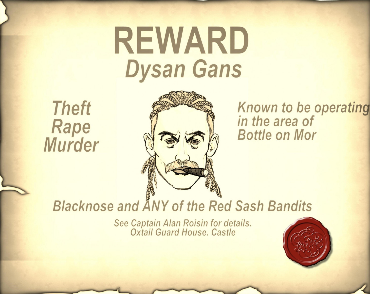
Dysan Gans Wanted Poster
 Glitch
🖼️ 33 images Surveyor
Glitch
🖼️ 33 images Surveyor
Saturday night - hockey back on TV, some scotch and next week's gaming session starts to take shape.....


 Glitch
🖼️ 33 images Surveyor
Glitch
🖼️ 33 images Surveyor
Saturday night - hockey back on TV, some scotch and next week's gaming session starts to take shape.....
Comments
Love this. Just a few comments. The Known to be operating bit should be made into 4, not 3 lines, so it isn't so close to the edge (a mistake I am quite guilty of myself - it seems worse with Centre alignment as you zoom in and out)
Second is the closeness of the Blacknose and ANY line, which touches the hair of the villain. Again, something i do from time to time, just a stylistic point.
Thanks - updates made.