[WIP] Panorica | Ilha Rasa: The Village of Lilia
 Mateus090985
Traveler
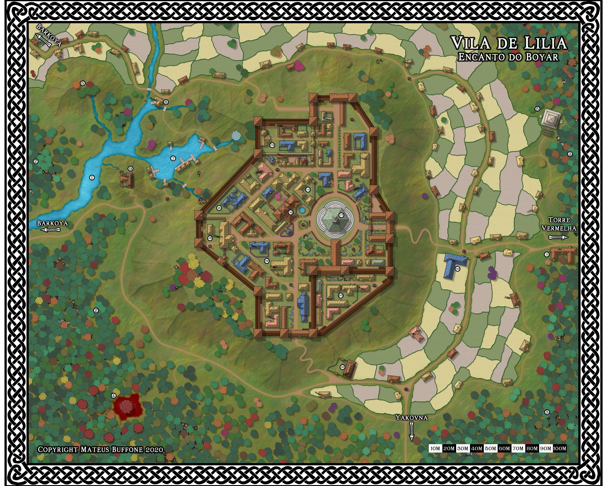
Helloooo folks! Now I am trying to draw one of the settlements presented in my latest map (this one).
There are maybe 3 years that I do not touch City Designer and I never was good with it... My question is: if I want the option to have the map as a over the top vision (roofs, for example) and also the interiors of the buildings I should mark "multiple levels"?
Here is just a close of the part that I will map now
Edit: Here is the newest version
Edit: Click for high-resolution version


Comments
CA40 is the Black and White Cities annual, so it would be fairly surprising if any of them were varicolour.
Maybe you were using a similar vector symbol set - a different annual?
For myself, I'd probably either use separate maps, or more likely separate sheets within the same map, to allow you to "remove" the building roofs to show the interiors.
For the possibilities of changing symbols to varicolor ones, see the Tome of Ultimate Mapping PDF, beginning on page 111. The discussion is all about creating symbols in both vector and raster formats, but it applies equally to altering existing symbols. If using artwork produced by someone else, there may be restrictions on what you can do to change it as set out in any Licensing Agreement that came with the art, though as long as the final symbols are only for personal use and not redistribution, this may not be a problem (check the EULA first to be sure!).
Your map looks fine to me. It's often the case that early work on a map doesn't look quite how you expected. Sometimes that helps you see sooner what you need to change, or draw differently. Sometimes, it's just because the map's still incomplete. With some styles, turning on the Sheet Effects makes all the difference. And I do like your map scale particularly!
Now I am drwaing the forests. The scale is not 100% what I wanted but I figured that trees a bit oversized would look better.
I really like the trees you have chosen. They go really well with the map - not too much of a contrast with the rest of it. Which set are they from?
I looked it. CA113
You should either set up a proper rectangular snap grid for your map, or you should turn off snap and use the endpoint modifier when placing the nodes instead.
As an example: one time I wanted a 10' square grid, and the software suggested 20'. I changed it to 10'.
I think I mentioned there were symbols for what you describe over on the FB Group page. I hope you have found them by now
It's coming on really fast. Much faster than most of mine do.
Maybe add them closer to the end, so you have a better idea of how visible they are going to be in the final render?
Here is another improvement.