Atlas Ferraris development
 Loopysue
ProFantasy 🖼️ 41 images Cartographer
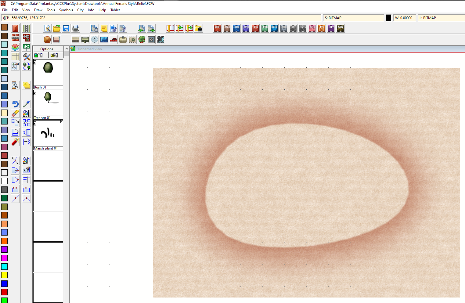
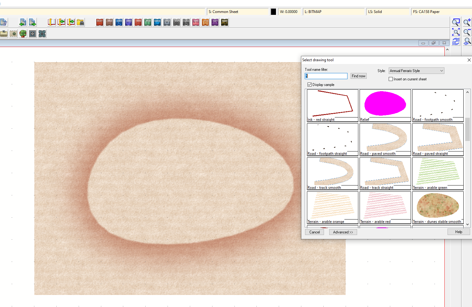
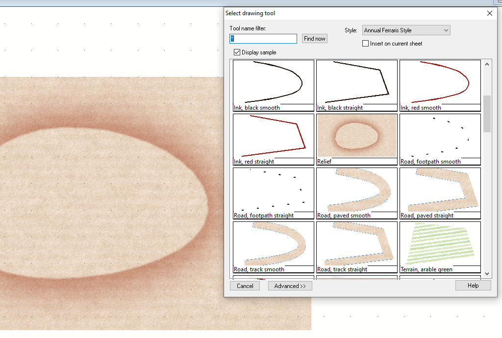
This is a thread that contains all the work done on developing a style similar to the Atlas Ferraris style in the thread of that name.
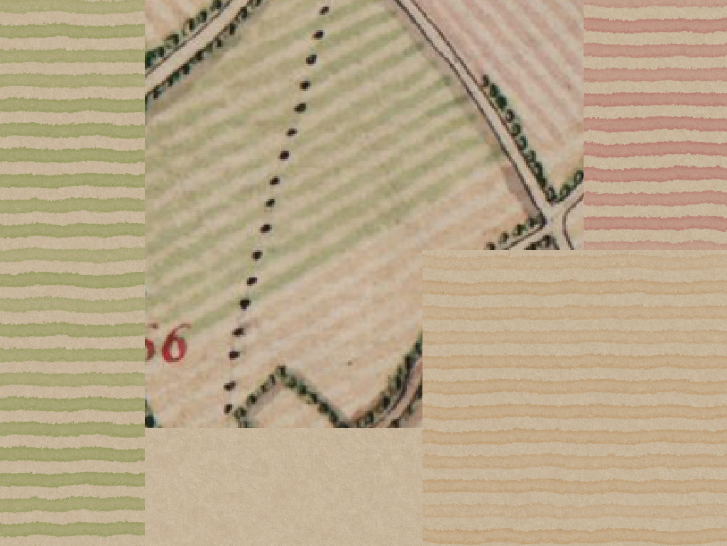
This is the state of play with the first 4 textures - the paper and three of the more common field types.
[Image_13266]
It is difficult to see the exact nature of the painted lines on the extract of the original in the middle, but the original image has been reproduced several times over and is also fairly pixelated - therefore blurred. That is why I haven't bothered to further blur the new textures.
Before I go any further I want to be absolutely sure that I am not about to breach any copyright on this style by copying it. I'm not sure who the owners of a 300 year old map would be.


Comments
Those look great!
I agree, there is more work to be done, but I would like to get a rough draft of the full set before going back to them right now.
I'm used to working in feet and miles, but this one seems to be best at metric city scale.
How many pixels per map unit for symbols and fills at city metric scale? Is it 40, or something else?
And 1 map unit is 1 metre?
Sorry I forgot to ask!
I now have to sort out the fills so they don't look like a mass of redundancies at the imperial scale.
Quenten - imperial measurement systems are part of RPG, not countries. Our system, thanks to the EU, is a total mess now that its half imperial, half metric. That makes no sense at all.
First is the extract I chose from one that Khornishman showed on his request thread
[Image_13304]
And this is the copy with elements of the style under development so far
[Image_13305]
I'm not really doing anything special except using my colour eye to get a good match. Most of the job has already been done by whoever actually designed the Ferraris style. I doubt that was the count himself. He would have employed a whole army of cartographers to get this done. The entire map is simply vast, and something that no one man could have accomplished in a lifetime back then. There's a zoomy version of it here:
Belgian Ferraris map
And your war quote is more appropriate than you think, Mike. The Ferraris map was used by Napoleon.
It looks very good.
If the meadows are symbols, that's quite a lot of variety or just the opposite. I'd think that the placement of hedge symbols, or perhaps as a line of hedges being drawn much like roads, could be used to outline any fills that might look "off" from being cut at the edges.
But, that is only my thought on the matter.
Maybe, but you will get both anyway. I have to hand draw the patterns as separate entities from the fills, so I can make a meadow fill with the drawings added to it, and also provide the separate drawings as tiny symbols.
The hedges I think I may already have solved, though these are still only draft bushes. I need to make them a bit more messy (I think) and I have a bit of an issue to sort out with those strange shadows that don't seem to follow any lighting rules.
Don't sell yourself short, this is a very well done sample of a style that many wargamers, such as myself, have dreamed about using/seeing for our hobby.
In fact, you've inspired me to go back to my gaming blog, which I've not posted to in a while, and re-engage with it, knowing that I'll be able to eventually create my own maps to showcase there.
I look forward to buying the annual this presents in, that is for darn sure.
It's only half baked at the moment, and I noticed after I posted that last shot that the bushes in the bottom part of the map are actually upside-down. Those are the ones that look top-heavy and appear to be lit from below. I must have hit SHIFT when I was pasting them and accidentally rotated them by 180 degrees, then carried on pasting without realising I'd done it.
The Ferraris style is currently set to be published in February next year as long as I don't hit any really big problems on the way. That will be the 2020 annual - issue number CA158.
[Image_13309]
Its pretty hard to tell without seeing how crisp or smudged they are on the original map.