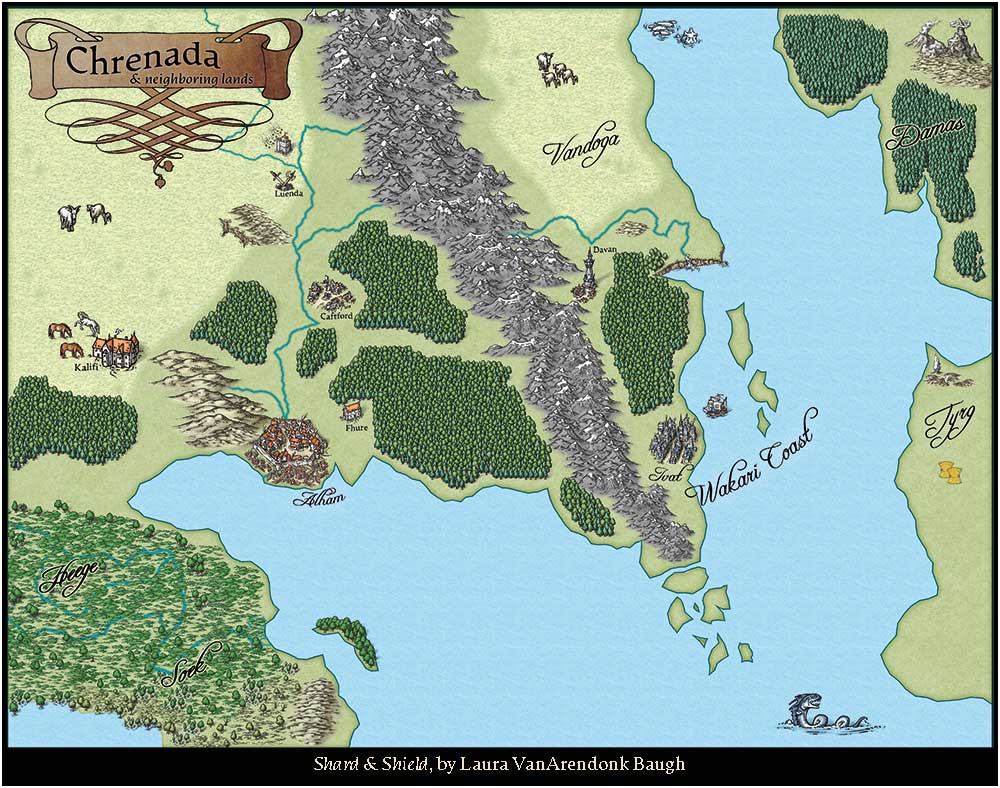
Chrenada & Neighboring Lands, map for epic fantasy series
Hello, all! I'm very new to map-making and would like first to thank those of you who have shared tutorials and tips here on the ProFantasy site and across the internet.
I jumped right in this spring to produce a map for my new epic fantasy series, as it is Required By Law ;-) to include a map in epic fantasy novels. I had a surprising amount of fun doing it, too! The first novel is doing very well so far and thanks to CC3+ and online guides, I was able to supply a b/w, weathered map in the books, a full-color map on the website, and a full-color poster for giveaways.
The second installment comes out in two weeks (whee!) and I haven't decided if I'm going to update the map a bit; I don't want it to get too cluttered.
Thanks!


Comments
I like the map. It is not too detailed, which is great for a map for a novel. I like to refer to the map as I am reading a book, and too much details just tend to make everything too cluttered and difficult to follow. I quite agree with your last statement that you don't want it to be too cluttered.
One thing I would critique in this map is your choice of font, a lot of the text in the map is a bit difficult to read.
And congratulations on your success with the novel, it is nice when you find that all that hard work was worth it.
Lovely map. Great coastline
A note for the future - a couple of lose trees around the fringe of a forest can make them look less like they are man made plantations, but other than that (and I agree with Monsen on the font front) very well done