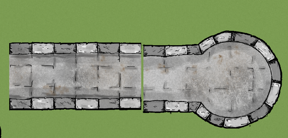
How do I line up bitmaps seamlessly?

So I just got CD3 recently and have been scanning the documentation and fora without any luck.

How do I seamlessly join two bitmap symbols easily?

For instance, I want to use the "walls" sections in the bitmap symbol catalog. I cannot find a way to get them correctly aligned without zooming in. This is very clunky and I suspect there is a better way. Thanks!

Comments

  • LoopysueLoopysue ProFantasy 🖼️ 40 images Cartographer
    I'm not familiar with these particular symbols, having never used them, but normally symbols of this type (where alignment is desirable) are designed to be a specific length, like 5 or 10 feet long. If they are a specific length it then becomes possible to use the snap grid to align them. If it works that way with these symbols you will need to align a whole string of them and group them together then rotate them if you want a wall that is other than horizontal or vertical.

    I may be way off track with all of that Because I don't know these symbols I don't even know if they are 'smart' or not.
  • I have had to sometimes turn off snap, and just use Drag to move something like that crenelated wall to the rest of it. Zoom in as well.
  • MonsenMonsen Administrator 🖼️ 81 images Cartographer
    Most of the time, snap is the best solution, but those particular symbols are not very well-aligned. I found that with a snap setting of 5' with two divisions, they work reasonably well, but not perfect. I suspect the original artist of those particular symbols didn't have grid snapping in his mind when he made them.
  • <blockquote><cite>Posted By: Monsen</cite>Most of the time, snap is the best solution, but those particular symbols are not very well-aligned. I found that with a snap setting of 5' with two divisions, they work reasonably well, but not perfect. I suspect the original artist of those particular symbols didn't have grid snapping in his mind when he made them.</blockquote>

    I messed with the grid some more this morning and discovered the same thing. It's a shame, too, as that style of wall illustration works a lot better for my needs than the vector-and-effects approach.
Sign In or Register to comment.