Isometric town symbols - further developments
 Loopysue
ProFantasy 🖼️ 41 images Cartographer
Hi Everyone 
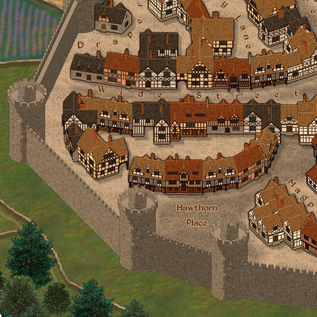
This is an extract of the current rendering from the Corvallen map, which is the sample map contained in the February issue of Profantasy's 2019 Cartographer's Annual.
[Image_12208]
While I am generally pleased with the overall effect, there are a few things I wish to redress - even though the annual is about to be published even as I write this.
I will be working on some of the symbols and sheet effects to make everything look better, with the aim of producing some kind of update package for Profantasy to issue not too long into the future.
I welcome any comments/suggestions/requests while I am still working on the improvements.


Comments
The first thing that I want to tweak is the shadows. There is already a Wall shadow, Directional effect on the building symbols in the town, but the direction of the global sun means that the chimneys are casting shadows on the roads behind them, which doesn't look right if you are zoomed into the map.
To cure this I have replaced that effect with a drop shadow set to 270 degrees (meaning the light is coming from due north and casting the shadows due south).
I then had to hide the ROADS Town sheet which added detail to the streets in the town, because the new shadow effect and the details were starting to get confused.
I have copied and pasted both the drop shadow and the glow effect onto both the wall sheets as well, even though doing this has caused my hand drawn shadows to vanish and the walls and towers to look comparatively flat. I have a memory of trying this before in the early stages and rejecting the idea in favour of hand drawn shadows, but now I'm not so sure. I think maybe I should have adjusted the actual wall and tower symbols to make them work better with the same shadow effects as the rest of the town.
What do you think?
Rob
In the Corvallen map I believe I grouped each section of wall once I got the ordering right using the bring to front and send to back operations.
If that is copied from the Corvallen map the grouping must have been broken somehow. Try grouping them where they are on the map and then copy and pasting them?
Unfortunately this doesn't work very well if you also include the towers, since the towers are much taller than the walls and are invariably sent to the back!
I remember now that I sorted the walls and grouped them into their respective lengths, then used the bring to front and send to back buttons to arrange the sections relative to the towers.
Some of it wasn't obvious to me.
In fact I really didn't like isometric view at all for many years - being a landscape painter and all. Its just far too useful where mapping is concerned.
But do you have any landscape paintings to show?
Maybe a link to a homepage or such?
Jim - I'm glad to hear it
Plus, I don't think it'll be possible to get the chimney shadows to look perfect under any circumstances, given some should be casting shadows on the roof of the building they're on (so a few look maybe a little flat, though the colour contrast in most cases helps in this).
If you're looking for ideas for extra symbols still, maybe some city gates and/or gateway buildings? And perhaps a water-wheel for the mill?
As far as I know, although Ralf has kindly agreed to help us here by allowing an update to the annual once I've sorted out those walls and whatever else people report not working all that well, I don't think that offer included adding any new symbols to the existing February issue.
I have plans to treble the size of the set at some point, but still need to work out how to do that, since 3 x the symbols would definitely be way too large for an annual. Its something to be discussed.
Even though this style has nothing at all to do with dungeons, it seems to have worked!
I'll let you all be the judge of it though
As for extra symbols, well, you know us mappers are never satisfied with less than an infinity of symbols to work from ;D
Having sorted the shadows out I wanted to add shadows to the walls the same way and do away with the need to draw them on by hand. That was when the real trouble started :P
I'm more or less happy with the new dungeon shading on the towers and walls. Just a few more adjustments to do to them so there's a bit more definition between wall and tower...
This is the previous WIP image...
[Image_12220]
And this is the new one...
[Image_12221]
Profantasy - you are the best!
If you purchased and downloaded the February issue before this morning, to get hold of the update you will need to download the February issue again (sorry - my fault for not getting it right first time!) and run the installer.
That will bring your walls up to scratch
If you look at both the two example drawings for this style, you'll see that they do make a complete city wall using only the included walls.
Yes, there *are* a lot of walls in this set aren't there
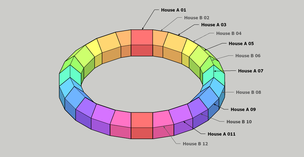
The A set is for long straight walls.
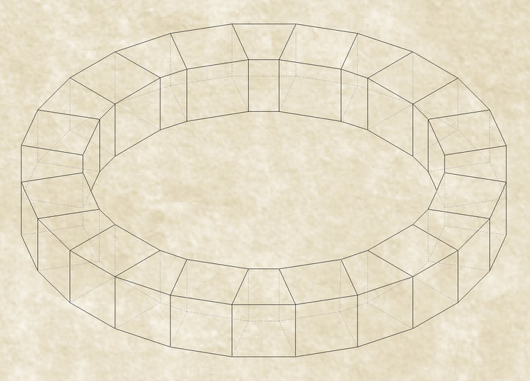
The A and B sets used together form a regular ring where the B set has Inwardly chamfered ends to 'turn' the direction of the wall between each of the A directions and the next.
There are no C walls. The D walls were originally called C walls, but I discovered that calling any symbol "symbol name C" did something really strange to CC3, which then treated the symbol differently to the way it was meant to be treated and wouldn't even show the symbol, never mind allow anyone to use it. So, the C walls became the D walls, and the alphabet as far as the Isometric Town issue is concerned goes "A,B,D..."
The D set has ends that are chamfered the opposite way to the B set. The D set is to allow people to have wiggly walls that follow a contour, or dodge around immovable objects, such as ravines or world trees.
Here is a picture showing the arrangement of A, B walls, and the use of D walls.
I hope that explains everything. Please tell if it doesn't. I have all the original artwork on my PC, so I'm not sure I would really know if the annual issue was lacking a few of the walls or not.
The B and D sets may look similar, but they are not identical. If you look closer, the angles at the end are different allowing you to create wall angles in both directions.
As for posting symbols, while you can't post just the symbol (would be a breach of the EULA), posting example drawings containing the symbols are absolutely fine, the only thing that isn't allowed is the distribution of the actual "raw" symbols themselves.
Edit: Ninjaed by a little mouse sneaking out from the shadows.....
I have at long last managed to ninja the great Master himself :P
Ahem....
Sorry Master!