[WIP] The World of Runimar
 MarkOlsen
🖼️ 6 images Traveler
Hi all!
I just bought CC3+ about a week ago and have been diligently reading the forum and watching videos.
Just wanted to share my first complete map and hopefully get some feedback on it.
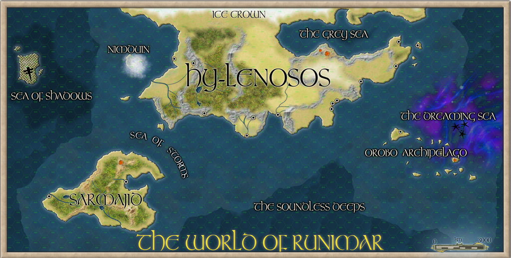
This is the world of Runimar, a fantasy setting for D&D 5e. The map is about 99% in the 13th Age style, although I played a bit with the sheet effects and added some special effects of my own design. The kingdom of Nimduin is the ancient Elven homeland, but in the current era it is hidden behind a perpetual magical fog, the Dreaming Sea borders closely on Faerie and sailing in the wrong direction at the wrong time can take you to another world, and the Sea of Shadows is has a similar effect but you might end up in the Shadowfell. I created my own symbols for Nimduin's fog and the Dreaming Sea's faerie lights and am pretty happy with how they came out.

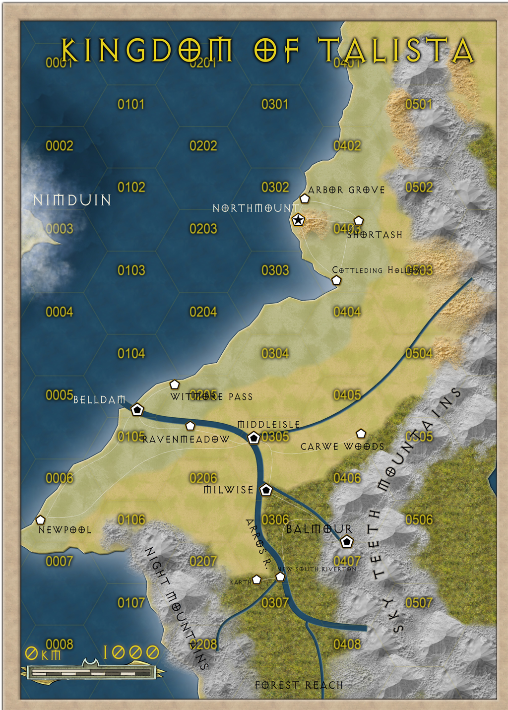
The Kingdom of Talista is where the PCs begin their adventures and where most of them are from. It's one of the most settled and civilized places in the world, except for Forest Reach, the wild section of woods to the far south, which is where the early adventures take place.

I'd love to hear what people think and any tips or constructive criticism anyone has.
Thanks for looking!
Mark
I just bought CC3+ about a week ago and have been diligently reading the forum and watching videos.
Just wanted to share my first complete map and hopefully get some feedback on it.
This is the world of Runimar, a fantasy setting for D&D 5e. The map is about 99% in the 13th Age style, although I played a bit with the sheet effects and added some special effects of my own design. The kingdom of Nimduin is the ancient Elven homeland, but in the current era it is hidden behind a perpetual magical fog, the Dreaming Sea borders closely on Faerie and sailing in the wrong direction at the wrong time can take you to another world, and the Sea of Shadows is has a similar effect but you might end up in the Shadowfell. I created my own symbols for Nimduin's fog and the Dreaming Sea's faerie lights and am pretty happy with how they came out.

The Kingdom of Talista is where the PCs begin their adventures and where most of them are from. It's one of the most settled and civilized places in the world, except for Forest Reach, the wild section of woods to the far south, which is where the early adventures take place.

I'd love to hear what people think and any tips or constructive criticism anyone has.
Thanks for looking!
Mark


Comments
Some comments (mostly on the detail map):
- The line representing the river can be clearly seen in the ocean outside of Belldam. You should trim it to the edge of the coastline, or perhaps, since it runs under the city symbol, just end it under the actual symbol.
- Likewise, the wide end of the river just magically appear up in the mountains. It is a bit more difficult to hide it in this style, since mountain symbols are seen from straight overhead, but as a start, it should probably start as a thinner line up in the mountains and gradually widen as it goes to the sea and is joined by more tributaries. You can accomplish this by splitting the line into multiple parts (use the split command) and subtly change the width of each segment. Good splitting points is where it is joined by a tributary.
- Mountains at the coast looks a bit weird with parts of them extending into the ocean beyon the coast line. Either move the mountains a bit, perhaps rotate them slightly to fit better, or just edit the coastline to fit the mountain shape.
- Unless you really need them, I recommend not adding number labels to the grid, they really disturb the visuals of the map. If you want them, consider addign effects to them to make them much fainter. Your grid is almost invisible, no reason the number labels should be that much more visible.
Great map by the way! good job
Best, jensen
If this is your first, then I'm looking forward to the rest
@Monsen - thank you for the critique and the tips. I'll play around with the rivers per your advice. The player version of the map doesn't have the numbers or hex grid on it, just my version. I probably should have posted the one without the grid, because I totally agree that the numbers spoil the effect, especially on the zoomed in map.
@Jensen - thanks! It was pretty simple to make. I used a program called FilterForge to create a couple of energy-type effects (nothing complicated, I just layered a couple of the filters that come with FF over one another in Photoshop). Then I used the layer blend mode to fade out the black and finally used a small, very soft and transparent brush to paint out some of the edges and interior detail. In CC3+ I put them on their own sheet and used a multiply blend mode in the sheet effects.
I spent my afternoon today mapping out the town the group are in right now. I was sort of stuck with part of the layout since the prior GM had already shown the player's a map he identified as "the city of Karth." It was way too small to be a city (just the part I have labeled on my map as "The Old Keep") so I ret-conned it down to a town, added enough housing to turn it into a decently-sized town and expanded the surrounds with some old mines and farms to make it look a bit more realistically lived-in.
I've been continuing to tinker with this world and after a long time of trial and error have settled on a style I really like and thought I'd share an update!
I recreated my map in Fractal Terrains and used Wilbur to add some more realistic erosion following the tutorials in The One Day World Builder from the 2019 Annual. After playing around a bit more with the climates I have been exporting it back to CC3+ where I have come up with my own style using a bunch of assets from CC3+ and various annuals and some heavily customized sheets and layers.
The compass rose and the mists covering the island-nation of Nimduin were made in Photoshop then imported to CC3+ as PNGs. The banner on the compass reads (more or less) in one of Tolkien's Elvish scripts "Under a broken moon, a new age of heroes begins" which is sort of the mission statement for the setting. The shields for the various nations were made in CC3+ and a paint filter was applied to them in Photoshop then they were brought back to CC3+ as PNGs.
This is the full world of Runimar as it currently stands:
This is the nation of Talista, the main region of my D&D campaign:
You can see how dramatically they have both evolved from my early maps in the first post of this thread!
This is the small nation of Sintierre, Talista's closest neighbor and ally:
And the latest addition, the nation of Kir-Nith. This one is a WIP; if you look at the larger version you will likely notice that many of the towns are just named "Market Town" and there are spots labeled "Geo Feature" and rivers that are just alled "Water." ?
I like the shadow effect you've made for the Sea of Shadows. The silhouette reminds me of a cross between the Shadow Vessels of Babylon 5 and the Reapers of Mass Effect; if that's not effective as nightmare fuel, I don't know what is.
Thanks!
The island kingdom of Tenebrae, which is partly surrounded by the Sea of Shadows is run by a mysterious group called The Invisible Princes who have spent centuries trying to bring about a prophecy called The Last Hour (no one knows anything about it other than the name except them since they have removed or destroyed all references to it) and as a result they've been ripping open holes to a dark dimension that has warped that whole region - so nightmare fuel is exactly what it's suppposed to represent. ?