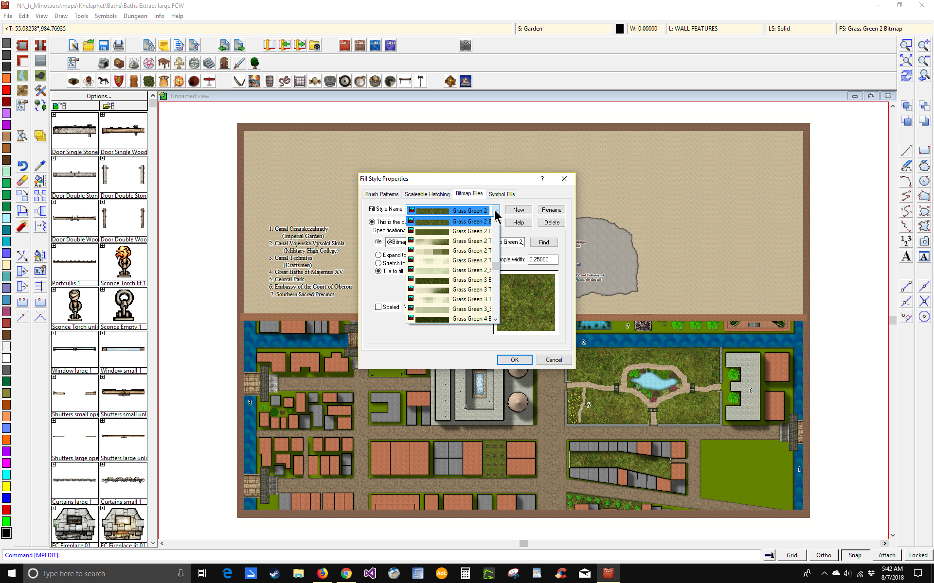
Width of Dropdown Combo Boxes

Is there any way or is there any plans on expanding the width of combo boxes. When selecting a Fill Style for example, only part of the texture name is displayed and it is very difficult to know that you are choosing the one that you want. Attached is a screen shot showing an example of what I mean.

Comments

  • LoopysueLoopysue ProFantasy 🖼️ 40 images Cartographer
    I think this has come up before in another thread, and I think the answer was no.

    Its one of the reasons I try to keep my own texture names as short as possible ;)
  • GThielGThiel Surveyor
    As a programmer of many years, who worked extensively with thus sort of form, I know it is possible. Step one, extend the width of the pop up box. Step two widen the combo drop down box. Step three re-align any other elements on the pop up that need it. Save, compile, and schedule it in the next release. Easy, right??? ? Later, since. Have the tools on my pc, I can create a couple pics of the "fix" before and after. I am not trying to insult any one at PF, I am very impressed with all that the program can do. It's just so frustrating trying to match textures when I can't see the whole name.
  • LoopysueLoopysue ProFantasy 🖼️ 40 images Cartographer
    Of course - I may be wrong. It might be on the list.

    I am sure that someone will be along shortly to clarify things a bit :)
  • LoopysueLoopysue ProFantasy 🖼️ 40 images Cartographer
    Personally (and if it was down to me) it might be easier to rename those textures (not the files themselves, but the way they are named in that very dialog). I'd probably shorten them to "Grss Grn 1 T", or something like that. Take the vowels out.
  • ScottAScottA Surveyor
    Some sort of "fix" to those dropdowns would be awesome, and that has always been probably my biggest gripe with the PF programs, which I otherwise just love.
  • GThielGThiel Surveyor
    edited August 2018
    LoopySue, there are way too many textures to rename and when I next have to re-install, I would suspect that I'd have to redo it all over again. This is one of those issues that the programmers should never have allowed to get out into public.

    Here are some pics of one of my own apps used for my Game
    Pic 1 shows the design screen where coding changes are made
    pic 2 shows that screen in use with the drop down
    pic 3 shows the design screen with the width of the combo drop down changed from 151 to 50
    pic 4 shows that screen in use
    pic 5 shows another screen in the same app where I can create NPC with a name and physical appearance and an area where I can copy from the screen and paste into something like Realm Works
  • MonsenMonsen Administrator 🖼️ 81 images Cartographer
    Posted By: GThielThis is one of those issues that the programmers should never have allowed to get out into public.
    Well, remember that that dialog is pretty old by now. Back when the dialog was new, there was plenty of space in it, because file names (which is what those fill names are usually based upon) tended to be shorter, and there was a much smaller variety of bitmap fills, reducing the need for long names to differentiate it. So I'll claim the programmer did do his job when this was initially designed.
    Of course, times change and needs change. Today, we typically use longer file names, and the abundance of fills also means longer names are needed to keep them unique and understandable, making this drop-down a bit on the smallish side today.

    Changes are continually made to CC3+ to improve things all the time though, but not everything can be done at once. The list of "simple" changes that can be done is rather long, but doing them all takes time. Note that changing a dropdown in CC3+ is not quite as simple as you show in your example either, it is a bit more to it than just changing the width setting in a property box, the drawing routines for the elements in the list also needs to be updated to render properly in the larger box.

    All that said, I too do hope they one day extend the size of that list. This was more a comment on the fact while not necessarily a difficult task, it is still actual code changes that needs to be changed and tested, and take a bit of time to do like everything else.
  • GThielGThiel Surveyor
    I want to reiterate how much I do appreciate the effort that the programmers have done on CC3+. Until I retired, I was a programmer who worked at the same company (medical billing) for 30 years and so I understand the fact that there are always more user request for change than programmers can ever get to. I just brought this up again, as I do remember a previous thread where it was mentioned, as a way to nudge it up the priority list a little (OK, a lot).

    And a quick comment on how things have changed. When I began programming as a profession, I was programming in BASIC and variable names were limited to 2 characters and the external hard drive in the corner behind the computer measured 3 foot tall x 1 1/2 ft wide x 1 1/2 ft deep and held the massive amount of storage of 30 Megabytes!!! User interfaces were on a screen that measured 80 columns wide by 24 rows of which only 23 were actually usuable. Everything was text based with no graphics. I much prefer today's systems and languages.
  • MonsenMonsen Administrator 🖼️ 81 images Cartographer
    Posted By: GThielI much prefer today's systems and languages.
    You and me both. I guess you've got some years on me. I did learn programming a little over 30 years ago, BASIC on the C64, but I was just a kid back then, finding programming more fun than the games at that time. Been mostly a hobby for me over the years though. Took a master's degree in software development in the hope of finding myself a good programming job, ended up as a professor at the university instead, teaching it.

    As for modern languages, the CC3+ codebase is based on some pretty old code, which is why doing some things are slightly (or a lot) more complicated than you would expect. (Although it makes other things easy because you can draw on existing functionality)
  • Even a "tool tip" with the full name of the current moused over name would be a huge bonus/benefit.
Sign In or Register to comment.