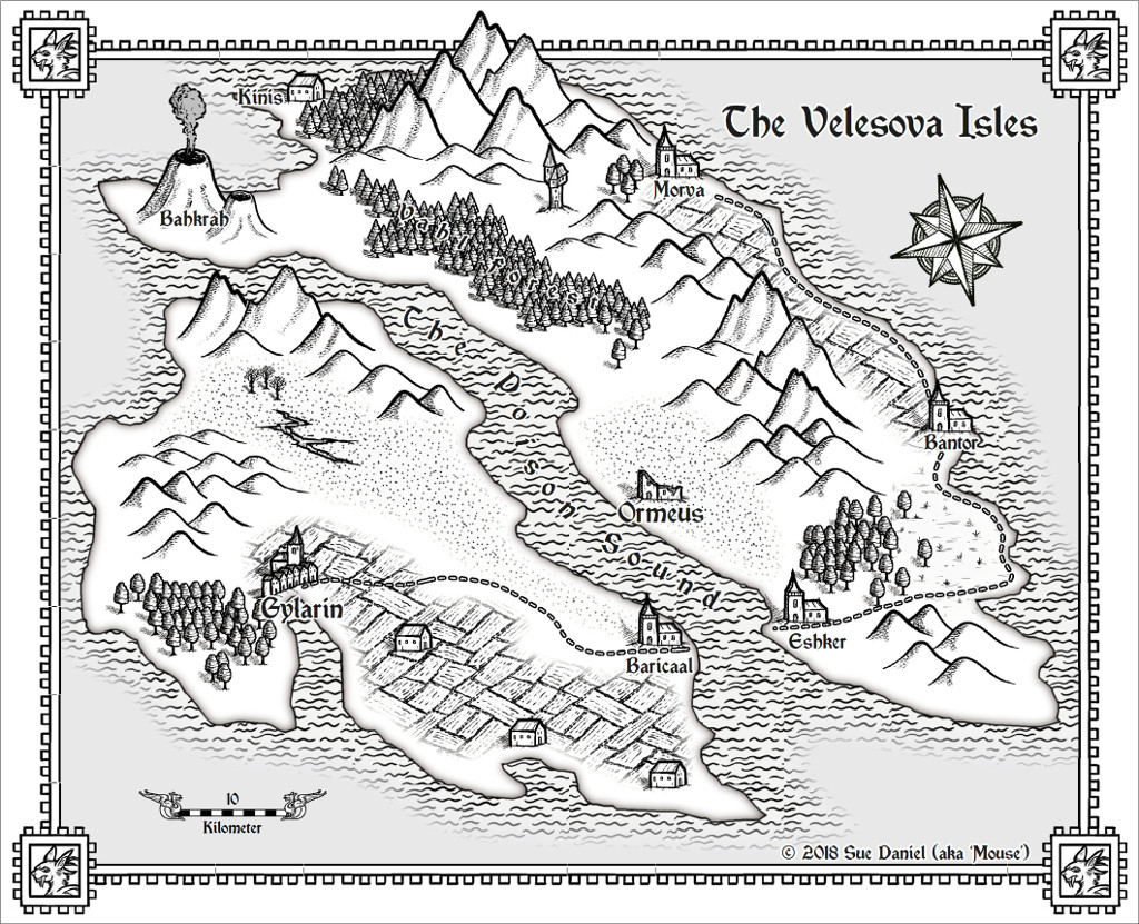
The Velesova Isles
 Loopysue
ProFantasy 🖼️ 41 images Cartographer
Here's just a quick map I made this evening with the January issue of the 2017 annual - the Black and White Fantasy style by Par Lindstrom (and I've no idea where to find all the special characters for that rather special name)
I scaled the trees down a bit compared to everything else, and I adjusted a couple of the effects around the coast, but apart from that its all 'as-is' in the annual
[Image_11007]
I scaled the trees down a bit compared to everything else, and I adjusted a couple of the effects around the coast, but apart from that its all 'as-is' in the annual
[Image_11007]


Comments
It's a really easy style to work with
Those waves are a fill
No - Velesova is just a place I dreamed up last night while I was playing with the style.
This is a remarkably fast style to work with. If I had done this in HW (my favourite style of all time, and the one that caught my eye and caused me to buy CC3 in the first place) it might not have gone as quickly. Maybe that's because its a black and white style and I don't get to spend hours and hours messing around getting 'just that particular shade' for each sheet. (I have an addiction to the rather heavy use of HSL sheet effects!)
I think one of the Team might be able to give you a definitive answer to that question, but I've used numbers as high as 150, and the only reason I've stopped there in the case of the Hue value is because eventually you end up going right around the colour circle back to where you started. I still don't know whether that would be 255, 300, or some other number. I usually get the Hue I want before I get that far, though
As for Lightness, that one is self controlling, since if you go too far either way it just turns everything black or white.
Saturation I still have a bit of trouble getting my head around, since in my personal reality increasing the saturation (ie using a positive number in that box) should make the colour brighter. But it has the opposite effect in the CC3+. If you want your colours to be more vivid, you need to enter a negative number. That ALWAYS gets me - every time! LOL!
I click apply and judge by eye.
The only thing to be really careful with is sending everything too dark or too light. There's plenty of leeway with most of the fills, but if you end up with lots of pixels that are pure white or pure black as a result of the HSL effect, it can cause a lot of transparency acne when used in combination with bevel and edge fade inner effects.
The only way to know for sure is play around with it.
If, however, you really want to send something to nearly black, or nearly white, and still use a bevel or edge fade inner, you can use an RGB Matrix instead.
They take a LOT more thinking to operate, but I've used them in Sanctuary to unify the basic colours of all the stone objects (walls, roads, cliffs), and simultaneously done away with a transparency acne problem I was getting on the cliffs when using an HSL effect to try and achieve the same colour.
If I'm matching a particular colour I will adjust the hue first, then the lightness, and finally the saturation.
The hardest colours to do this with (unfortunately) are greens, since green reacts very strangely to how much grey it contains (saturation). Instead of just becoming less brilliant it seems to shift towards blue if you add more grey, and towards yellow if you increase the strength of the colour (all using the saturation control).
It may take some time to achieve, and you may have to go back and adjust the hue and lightness again when the saturation causes it to shift either yellow or blue, but you'll get there
A lot of it may be down to the way our human brains have evolved to interpret the light we see, or in the way that colours are depicted by computer screens, but there are times when yellow is green (when you add black), and green is yellow (when you add white and increase the intensity of the colour). Its all a bit mind bending - even for me!
Not sure I like this one as much as the first.
I just had to try it in my favourite style - just so I knew.
The first version also has the added advantage that the map was designed for that style
My only nitpick.. on the Weilink map, your dark strip inside border goes in front of your highest mountain... darkening it as well. I think it would look much better, if the mountain was in front of the border.
That's actually a really good example of an optical illusion - since I can't stop seeing it now you've told me its in front.
But it isn't really.
Look - here is an enlargement.
[Image_11009]
Damn! That's actually such a good illusion that I can STILL see the strip in front of the mountain! LOL! But its not :P
To put that right I would have to increase the contrast between the strip and the mountain by making it either a bit darker than it is, or a bit lighter than it is. Its the same problem that you get with text when the text colour isn't sufficiently separated from the background by a decent contrasting glow.
If there's a peculiar thing that can happen, it happens :P
That's the charm of the annuals - just a small style. I quite often find them easier to work with than styles with a million fills and symbols.