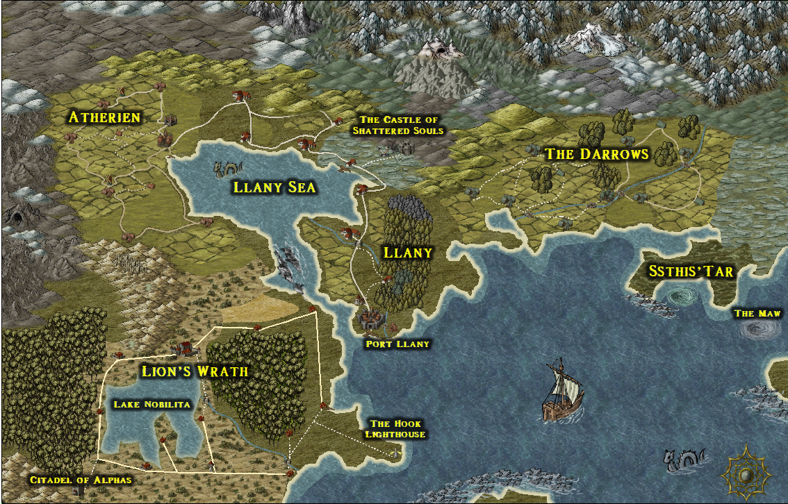
The world of Londar - Llany Province
Hi folks!
First timer here. I brought the CC3+, DD3 and CD3 bundle a while ago, and have just today started to use it. I'm kinda pleased with my first attempt at a campaign map so thought I would share it with you.
Comments and Critique welcome
Martin
First timer here. I brought the CC3+, DD3 and CD3 bundle a while ago, and have just today started to use it. I'm kinda pleased with my first attempt at a campaign map so thought I would share it with you.
Comments and Critique welcome
Martin


Comments
Things in the bottom left looks a bit square/straight though, both the roads and the edges of the lake. Looks a bit out of place.
I would also recommend using fading between the light and dark sea, right now the edge is a bit sharp. This is also true for some of the terrain transitions. To make the terrain transitions better, you should consider using multiple sheets, as you cannot fade between entities on the same sheet.
Welcome to the community.
Thanks for your comments.
The roads are meant to be straight - that area is home to a roman-esque chapter of knights
I see what you mean about the lake though, and the transitions. Would it be better to place each terrain type (Farmlands, scrub, marsh etc) on it's own sheet?
Ye gods - this is addictive!
If you need it, I guess. It creates a bit of extra complication, so it is not something I do by default, but whenever it is needed to get proper edge transitions, then yes.