Cartographer's Annual 2018
Hi folks!

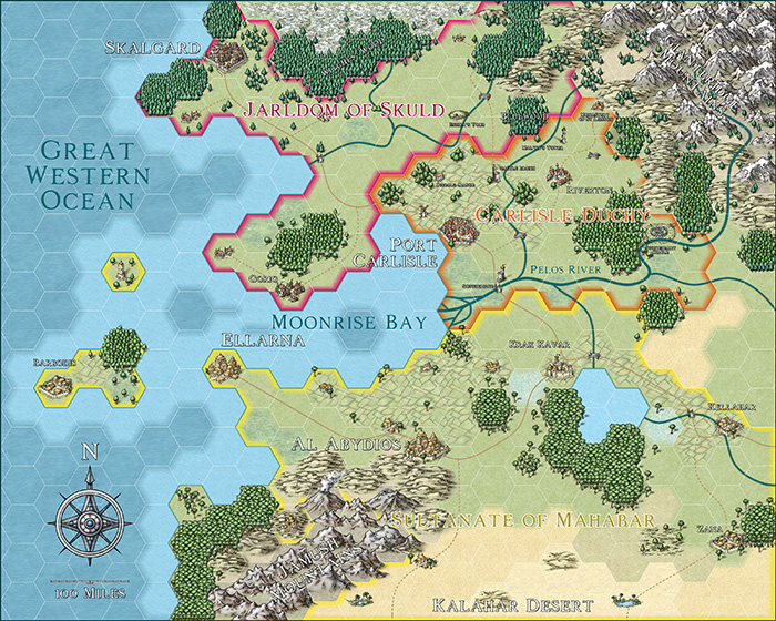
The January issue of the Cartographer's Annual 2018 is now available! Check out the hex-mapping style based on the Mike Schley symbols from CC3+.

Comments

  • LoopysueLoopysue ProFantasy 🖼️ 40 images Cartographer
    edited January 2018
    You know, Ralf, I really don't like hexagon grids - or any grids at all for that matter. They play absolute havoc with my aspie pattern-seeking brain.

    But despite it all this style looks really quite yummy :D
  • MonsenMonsen Administrator 🖼️ 81 images Cartographer
    edited January 2018
    Posted By: Loopysueor any grids at all for that matter.
    I kind of agree with this. Grids tends to put artificial limits to your mapping. I always hate seeing battle maps where everything is neatly lined up to fit the grid. Same goes for using grids to divide up maps into sections for detail mapping (which is why I am not particularly fond of FT3's multi-file export).

    Hex maps have a long traditions though, and this is indeed a very nice implementation of that concept. They are also very helpful during gameplay, very easy to make good estimates for distance on, and easy to determine what terrain players pass through. And not to forget, they are very quick to make (and change), perfect for the DM without unlimited mapping time :)
  • As an Avalon Hill war-gamer from the 80's I have to say that I love hexagonal maps!

    For turn-based movement, there is nothing better!

    This looks like a very playable map. Great job.

    -dennis
  • First mapping paper I used was either 5mm hexagons or grid paper. I have been known to put things in at an angle, so it crosses the grid...
  • I was never much of a fan of the hexagon map style used in the old D&D Gazetteers, but this I like quite a lot.
  • Posted By: Monsen
    Posted By: Loopysueor any grids at all for that matter.
    I kind of agree with this. Grids tends to put artificial limits to your mapping. I always hate seeing battle maps where everything is neatly lined up to fit the grid.
    In most published maps, or map tiles, nearly everything, buildings, sewers, catacombs, geographical features, caves, everything, happens to be rectangular, eight units wide to ten units tall, more or less. Or square, in the case of map tiles. Such an odd world our characters live in.
  • Cool, thanks Ralf. Great looking annual!
  • ScottAScottA Surveyor
    I'm not a fan of the hexes (or square grids, for that matter), either, but I like having them just in case. I just hate to see anything that takes away from a beautiful map -- I'm even really touchy about labeling as it obscures parts of the map! LOL!
  • Personally, I rather enjoy working with the constraints such grid maps can enforce. I really like the simplified CA43 Hex Overland style for this, as it makes you think more about what's really important to show on a map like this at typical hex-map scales. It's easy to get sucked into trying to make ever more "realistic"-looking maps, which can obscure what the real purposes of a map are meant to be sometimes - clarity and precision. Luckily, I tend to agree with ProFantasy that there's a place for all such styles! And this latest addition is a particular delight, mixing both artistic impact with hex-grid precision.
  • MonsenMonsen Administrator 🖼️ 81 images Cartographer
    edited January 2018
    Posted By: WyvernLuckily, I tend to agree with ProFantasy that there's a place for all such styles!
    One of the strengths of CC3(+). The program itself puts little constraints on the possibilities, it is not limited to a single type/style of maps. Allows it to be a nice software for anyone, regardless of preferences.
  • I for one simply love hex maps and am so excited to see this one...time to get back to work on my flintlock fantasy "new world" map. I was working on creating my own hex map style, but this is going to push me way forward...going to convert what I have done to this.
  • LoopysueLoopysue ProFantasy 🖼️ 40 images Cartographer
    That's going to be something worth watching, Skycast :)

    Most usually I find hex maps a bit 'samey' in layout because the hexagons are too large for the coast to look natural, but yours are small enough (or many enough) for you to dictate to them what shape the world is going to be instead ;)
  • Love that hex map, Skycast. Love to see updates etc.
Sign In or Register to comment.