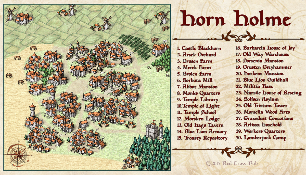
Horn Holme
Hi everyone!
I am very new to CC3+, and I am still struggling with the learning curve, but I am also loving it. I already started to make some maps, an Horn Holme is a small project for a homebrew campaign.
Even having CD3 at my disposal, I wanted a look similar to some historical medieval maps, but keeping a fantasy touch. So, what better than the new CC3+ style?
The map key is still missing because I am trying to create it in CC3+, instead of using Photoshop, and that is being a issue for now.
Anyway, I shared this on ProFantasy Facebook page, and the admin advised me to post it here.
So, what you guys think of it? I would like very much to get some tips and comments.
Thank you!


Comments
And the key on the right is great! One suggestion I do have, however: Using number labels to match up to your key. If you open cc3+ on the right hand side of your work window, there is a button that has numbers on it. This button is for creating number labels. Right now, I can see what all you have in your little city, but I can't tell which building is Castle Blackburn, for example, because there is no number label coinciding with the labels on your key.
It is, however a beautiful map! Really nice for a first map. I hope to see many more!
As far as the key....one thing that may make it a bit easier is not having quite so much on it, making numbering your town a bit easier. As someone with a lot of experience providing town and village maps to my players, I find it really isn't necessary to label all the buildings you've named and prepped. Really they only need to know where exactly "key" buildings are.....an Inn, any municipal buildings, key plot point locations - chances are your players aren't going to be going to all those buildings - and unless they've actually been to this town before sometimes NOT having a location on the map forces them to actually ASK someone and interact with a potential NPC in your world
Keep up the good work.....and maybe consider contributing a map to our Community Atlas
First of all, thank you for all the compliments, I am happy to see I am on the right path
Anyway, about your comments: Well, this is exactly what I was trying to do inside CC3+, instead of exporting the map and putting the labels with Photoshop. Anyway, I will soon provide a new version with all the labels. What color do you guys think will be better for this? I think red or white will blend too much with the map because the building walls/roofs. So, black? I didn't ever saw that technique, but nice to know someone created one. So far, the only thing I looked into is the CC3+ manual, and to tell the truth, I saw a lot of Medieval Maps while going through my Bachelor's Degree in History, and a lot of 13-17th century maps are built using those principles, being drawn in a "isometric" way. Anyway, I will search for Tony's tutorial
About this, I usually create a very detailed map for myself, as DM, and a simpler version for players, offering only the most important/noticeable areas. In this case specifically, I am planning to build a module around this city, fully populated with areas, NPCs, encounters, conspiracies, etc, using some ideas I have, plus what players will do on the adventure I am planning as a background for future events on the area. In the future, I plan to publish these things, in PDF/Fantasy Grounds modules, and this is one reason why I bought CC3.
Hey! I will keep working on this kind of stuff from now on, and it would be an honor to contribute with the Community Atlas. What kind of maps are most needed? There is a link where I can find specifications?
Thank you again