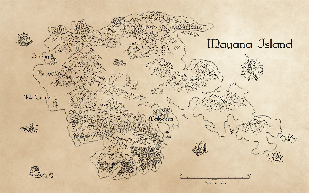
Mayana Island (source file attached)

This is more of an experiment than an actual map.

I was trying to work something out after Storm said something over at the Guild about wishing for transparent Schley Ink symbols, instead of them having a white background.

I think I've tried a lot of things in the past and given up, but I thought I'd apply a PS trick and see if it worked, and it did.

Basically you turn the map inside out by putting a background sheet of a suitable parchmenty fill on top of the map, and use a Blend Mode Sheet effect set to Multiply at 100% opacity.

Comments

  • Like it, heaps. Pity Profantasy can't get an easy way to change B&W symbols and standard fills to transparent (rather than using Transparency effect). I would make extensive use of this
  • LoopysueLoopysue ProFantasy 🖼️ 40 images Cartographer
    edited November 2017
    Its not a transparency effect, Quenten. Its a single and very simple Blend Mode effect. The transparency setting is 100% opaque. There are no other effects in play on this map - its a one-Effect map :)

    Have fun :D

    EDIT: I tell a lie. There's a white glow on the text sheet to knock out the bits of map immediately around the text, and a black glow around the land mass (which is a solid white polygon), but that really is all ;)
  • LoopysueLoopysue ProFantasy 🖼️ 40 images Cartographer
    Thanks Scott :)

    Its ever so easy!

    Making the symbols transparent is something I could do for myself, and I almost set about that very task, but.... if you think about it transparent symbols wouldn't work because you would be able to see other symbols through the transparent bits. This way you allow the white in each symbol to do its job of knocking out the bits of the underlying symbols, and then the 'background' is imposed on everything (including the text) from above the whole lot in one go.

    If you also wanted to add tints of colour to the map you could do that by adding further sheets above the background layer and setting them up with their own Blend Mode effects - probably Multiply is the best, as that would make the colour tints look like faint watercolour washes over the map. You would only need to draw simple solid colour polys on the tint sheets ;)
  • Sue, that's actually perfect! Can I see your fcw to see how you set it up?
  • LoopysueLoopysue ProFantasy 🖼️ 40 images Cartographer
    Of course you can :)

    I just need to know if this file:

    "Bitmaps\Backgrounds\Parchments\P3B Parchment Background_VH.PNG"

    is part of the CC3+ graphics or one that I made (I've got so many I've forgotten which is which!), or you will end up with a large red X as the background!

    Please can someone check for me before I upload the FCW?

    Thanks :)
  • LoopysueLoopysue ProFantasy 🖼️ 40 images Cartographer
    edited November 2017
    Ok. I have to go out now, so I've swapped out the parchment for the Schley desert fill, so I know for certain that you won't see any red crosses when you open this.

    I've also added a colour overlay sheet to the map, to show how I would add colour stains to the map. I've added a green and yellow stain on the same sheet, but I would recommend using a separate sheet for different colours to avoid any hard edge problems where 2 different colours meet.

    This is what it looks like now

    [Image_9627]

    And this is the FCW
  • Wow, that's a great idea, I'm going to have to try that out too! I love the black and white Ink symbol set, makes for some great looking maps.
  • LoopysueLoopysue ProFantasy 🖼️ 40 images Cartographer
    When you download the file, you can change the fill of the 'background' (which in this case is actually on top of everything else) to a fill of your choice. I have noticed that the Schley desert fill is just a tiny bit too bright compared to the parchment fill I was using before. The whitest pixels in that fill are causing a weird side effect on the labels if you look really close.

    Remember - anyone who uses this file (or a facsimile of it), you will need to work with the effects turned on. Also, when you first place the symbols they will look white. You need to refresh the screen to get the effect ;)
  • LoopysueLoopysue ProFantasy 🖼️ 40 images Cartographer
    edited November 2017
    I also forgot to explode the text, so anyone who downloaded the file before I made this comment probably won't be able to see the labels. A minor point, I know, but it was annoying me, so I fixed it. The labels in the FCW above are now exploded for you.
  • I don't know if this is what Storm is looking for or if it comes with an Annual or the standard cc3+ set, but there is a set of symbols that are transparent "Line" symbols - I did my Desideri map using them. Of course, they are not as nice as the Schley Inks ;)
  • This is a beautiful map. Thanks for sharing how you did it!
  • LoopysueLoopysue ProFantasy 🖼️ 40 images Cartographer
    Thanks Lorelei. I'm sort of working in the dark as well. I decided to just answer one of Storm's several questions, but I thought it might be useful for other people too :)

    Thanks Jensen :)
  • This is very clever. I can see this technique being perfect for handout maps.
  • LoopysueLoopysue ProFantasy 🖼️ 40 images Cartographer
    I've looked at this problem so many times and come back empty handed. I'm just relieved that I finally managed to trip over the solution - and I deserve to scrape my knees on it too. Its so incredibly obvious when I think about it! I've been doing this in GIMP for the past several months. It should have dawned on me long before now!

    *palm face*

    Have loads of fun with it :)
  • The best way to explain what I was trying to go for, was a 'color washed' map... where the colors are more hinted at, then actually there. Of course, I was originally trying to do it with no textures either, making it look like it was hand drawn, even though it's cc3+. I do, however, think that using a parchment background is an excellent compromise!
  • LoopysueLoopysue ProFantasy 🖼️ 40 images Cartographer
    A colour wash is only ever going to look realistic on a piece of paper, Storm. It just doesn't work floating around in thin air with a brilliant white background. Doesn't look real. The colours are too eye-burningly bright.

    The file I've given you uses the Schley desert fill as the parchment. That's because I wanted to make sure no one got any red Xs. You can swap it out for any paper texture you want, but that sheet is the only device that's going to allow you to colour the symbols the way you describe.

    Transparent symbols of the kind I've seen being described on your Guild thread wouldn't work. The moment you place transparent mountain symbol A, over transparent mountain symbol B, parts of mountain symbol B are going to show through mountain A, which would only be fine if you were mapping an island made entirely of glass.
  • DogtagDogtag Moderator, Betatester Traveler
    edited November 2017
    I don't know, I think you may be able to passably simulate color wash if you use a filled background (especially if it's textured), rather than plain white, and then use the Blend Mode effect with the Overlay option. Sue's right that it will never look quite as good digitally as it does on paper — at least not without very high-end graphics tools. I'm guessing that's due to the very different ways color is perceived and blended digitally vs how it is on paper. However, the effect can look fairly nice. Blend Mode allows transparency without dulling the detail of the fill style. If you adjust the transparency enough, you can simulate a slight wash (but, of course, you won't get the intensity/saturation variations you get physically).

    Check out Joachim de Ravenbel's excellent overview/tutorial on Blend Mode/Overlay that he wrote last January. In particular, notice the subtle color on the left side of the last example on p. 3.

    ~Dogtag
Sign In or Register to comment.