Old School D&D Style
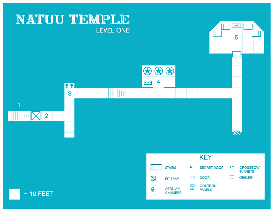
Though I have been working on a nice DD3 version of this temple, I decided to make a version of this level in the classic D&D style. Partially due to being swept up in a bit of nostalgia and also because I wanted to play around with a recently purchased Annual. There is not much to it really, but it was fun to try to emulate the old blue dungeon maps!


Comments
Simple. Authentic. Intriguing. Control panels; Aeonian chambers? What are these? Is there some technology in this temple, or are they artefacts of religious significance? Only exploration by a brave group of adventure-seeking heroes would reveal the answers - and who knows what might be uncovered!!
Well done, robotrock. This is still one of my favourite annual issues. I waited so long for the conversion to be able to use this style again - and the amount of symbols you can create in the style just serve to make it so versatile. From a dungeon master's point-of-view, this style - and your map - encourage imagination and storytelling at its best.
DMG
I see 5e D&D as 2e Redux. By 10th-level, in my current campaign, my players had discovered an extra-terrestrial race had infiltrated, and were controlling, their society. Now, at 15th-level, just as they think they've resolved the world's problems, they're about to face the Independence Day-like invasion of The Thydd!
I love mixing sword & sorcery with technology, and in this case 5e has allowed me to pull out my old Spelljammer stuff and mix things up a bit
DMG
Farmer's Tiers of worlds, and a certan part of the Known universe.
This one is a bit more dense, as it is the primary living area for the residents of the temple. I had to make most of the symbols and I fear that I may have made some of them too detailed for the style. I also took some liberties with the scale of objects. My reasoning is that I see this type of map as more reference / symbolic, as opposed to say, a battle map where one is going to move miniatures around on it.
robotrock already said he'd taken a liberty with the scale of the symbols. When I first saw the map, before I read the post, I wondered if this temple was inhabited by alien beings that were taller than humans. Given the advanced technology present in the temple, that's were my imagination took me, but his explanation is fine.
If you take a look at the many AD&D modules that used this style of map you will find that the vast majority of them have very few symbols at all - if any, and the modules relied on written "read-aloud" text that described the contents of any particular room in the dungeon. From a DM's point-of-view, adding custom symbols at any scale only serve to reduce reading time and increase playing time. A picture's worth a thousand words. I could easily work with these maps and tell a great story.
Aesthetically, I think reducing the symbol's scale runs the risk of creating too much uncomfortable space, and I imagine the chambers will appear overly cluttered if more symbols are added to fill the gaps. It may be worth experimenting, but like you said - this style is about reference rather than battlemap accuracy. There might not even be a battle in every room, so I wouldn't require that much detail.
Level 2 is awesome, robotrock, and the custom symbols just bring it to life. A first-class job!
DMG
It's always "depressing" for me to see maps like this, given that I started running and playing D&D before such things had even been thought of; which makes me older than "old school", of course (groan...)
Grand work regardless, Robotrock. As a DM, I often wished the original maps had used more and different symbols, rather than having to forever keep going back to the text to remember what each item actually was. So maybe it's time to consider a ProFantasy Annual issue expanding the available symbol range for this style of map?
I was already on an adventure where I’d reached level two, and was standing before huge, 10-foot wide, 12-feet high doors looking at oversized furniture and wondering what beings could inhabit this place and build an enormous, columned temple and mysterious bacta-tanks and consoles, and I was just going with the creativity.
Technically, the map is flawless, and I didn’t really want to debate creativity or imagination. Re-scaling to 5-foot squares is absolutely the easiest way to resolve any scale issues. I just thought the existing scales made it more interesting and different than another human dungeon. Think Steading of the Hill Giant Chief From Space” lol!
I agree with Wyvern about the symbols too. I’ve seen other discussions where people have expressed a desire for an annual with new symbols. Robotrock has made some great custom symbols here (particularly love the armoury tables) and I think it would be a good idea to have an annual issue where there’s additional Old School style Symbols, maybe some Mike Schley style wall/tower/gatehouse/opposite angle structure symbols to make a Schley City Style (for maps like Tonnichiwa’s Village of Unayzah and others), and I know CharlesWayneRobinson wants some more Character Artist symbols. If an annual was released like that packaging a selection of new symbols to compliment older Annual styles – that would be awesome!
DMG
Looking forward to seeing the re-scaled version. It's gonna be gorgeous in this style I'm sure
DMG