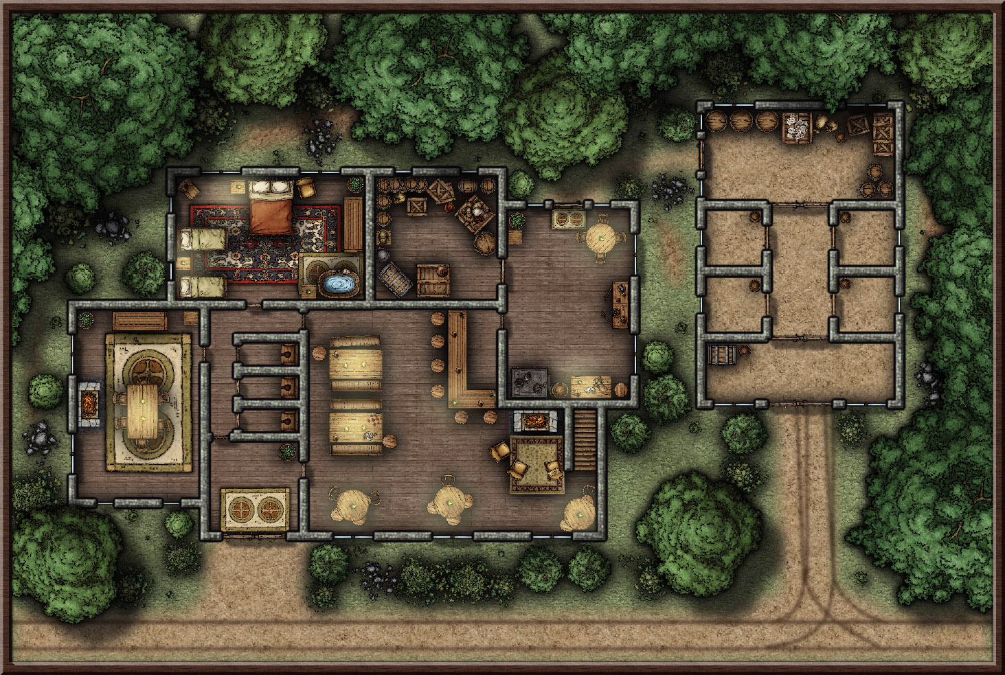
The Shattered Lantern Tavern (My Second Map)

Hi all!

After playing around with the continent side of things I decided to delve right in and make the inn in my starting town, I think it turned out pretty well. Still a WIP but it's really coming along nicely. :)

Suggestions and constructive criticism welcome.

Comments

  • Your second map? I stand in awe. Really good. My only comment is that some of the tables look a bit faded to me, as if the brightness is too high.
  • @Barliman yes the light is a bit of a mess at the moment :| still working out the kinks! (and I haven't even started on the second floor or basement!), and thank you :) I really am having so much fun with this, it's bringing all the ideas I had in my head to life.
  • Very nice, I love the way you did the tracks leading up to the barn. :-)
  • Just wonderful - and that's regardless of whether it is your second or one hundred and second map, it is beaut, as we say in Oz
  • @CharlesWayneRobinson, thank you very much!! They were probably the hardest part to do!! Getting them to blend correctly was difficult.

    @Quenten, thank you again :) and hello fellow Aussie!
  • I think I've fixed the lighting for now, also went with a little lighter shading on the overlay. Might start the second floor after some dinner!
  • LoopysueLoopysue ProFantasy 🖼️ 40 images Cartographer
    I can see that you have a natural talent for maps :)

    Nicely done, pixelkitteh :)
  • @Loopysue, squee! That's very kind thank you :) I have built so many things in my mind, and i use a tablet to kinda sketch them out. I've only been working on my own setting for a few weeks now and when I discovered CC3+ I just HAD to have it! It's seriously amazing, bringing everything I can see in my mind to life.
  • This is really well done! I like it! Are you using any blend modes for it?
  • @Tonnichiwa, thank you so much! I'm actually doing the lighting effects and overlays in photoshop as i am confident with it, im hoping to learn how to do it in the actual program soon. :) Most of the symbols have had their saturation lowered in CC3+ (DD3 + SS4) as I like the desaturated look a lot, and I made the shadows really blurry so that they extended for a long while but very gently rather than a short harsh shadow. The walls have a bevel, blur, edge blur, and glow. After all that I save as a png and import it into photoshop and do the lighting/dark overlay and adjust the colors as needed. All in all it's a few solid hours work per map. Very enjoyable though :)
  • Second floor WIP, obviously the actual 'inn' area :) I thought an array of differently priced rooms would be nice, and rooms for couples and families as well as adventuring parties.
  • @ScottA thank you very much :)
  • DogtagDogtag Moderator, Betatester Traveler
    edited May 2017
    Loopysue pointed out:I can see that you have a natural talent for maps :)
    Agreed! These are amazing. As Quenten also pointed out, these are not merely very good "first maps," (which they are!) they're simply very good maps. Not only have they been well-done from a technically proficient aspect, they're also well laid out. I particularly like some of the small details, including — and perhaps especially — the ones you added along the tree line. My chief criterion for a map is whether it evokes a desire to explore or adventure there and you've captured that very well.

    I do notice that some of your wall corners in the barn/stable have little "notches" in them. If this was unplanned, it's typically the result of meeting the endpoints of two paths at a corner. As we draw in CC3, the paths are essentially a single pixel wide but when CC3 applies the line width to it, half the width goes to one side and half to the other. the result is that the endpoints meet but the widths extend out. There are a couple of ways to fix this but it's also easy to avoid in the first place, by starting and ending walls before or after corners instead of at corners. They're barely noticeable in this map so you may want to just leave theme as they are but I thought I'd let you know how to avoid it in the future if you want.

    Again, this is just amazing. The layout of the bedrooms is well thought out and beautifully executed. I like that some of the suites have a mix of beds. Nice touch, that. The whole thing really makes me want to trek over, toss some coins to the innkeeper, quaff a few draughts, and then trudge upstairs and sleep away the dust and aches of the day's journey. *doffs cap*

    Thanks for sharing!
    ~Dogtag
  • Nice work! I especially like the little touches to detail! Looking forward to your contributions to the Atlas! We could use some fresh talent :)
  • ScottAScottA Surveyor
    I agree with Dogtag about the details. I am a fiend for details, myself, and think that's what makes a good map great. And doing it properly without overdoing it is the trick, and you are spot-on. I love it. My first map of an inn was something very similar, and you put me to shame! lol!
  • I am late with the praise- but a truly wonderful map!
  • @Dogtag, thank you for the point about the walls! It was driving me crazy but for this particular map I think I can get away with that one bit in the barn haha! Your comment was very well thought out and I greatly appreciate it. I'm very glad you like (and noticed) the details in the rooms and along the trees, I truly am a stickler for detail and as this inn is located in a village in the middle of the forest it was important that it have a wooded and cozy feel both inside and out. Any time you want to trek on over, you're welcome! :)

    @Lorelei, thank you very much! I'm glad you enjoy the details, I feel like they really bring the whole thing to life :) Also I am very excited about joining the Atlas so thank you again!

    @ScottA, again thank you :), I really do appreciate the lovely comments, but I doubt I put you to shame haha! I'm sure you have just as much, if not a whole lot more, talent than me!

    @crb31, it's never too late ;) thank you very much, I am glad that you like the maps!
  • JMunsonIIJMunsonII Traveler
    I think somebody's been making maps prior to CC3... ;)

    Nice work! :)
  • Haha! Funnily enough I was yes! I have a tablet and I have been drawing them by hand. I have to say this is much easier... and the quality is much better!
  • Such a great map. Any chance of plonking it in the Atlas somewhere - it is truly beautiful. And no skullduggery obvious either (unlike my own inn) ;)
  • ^ just replied to your other comment but yes! I think I will add them to the Atlas :) when I get to making a town map I'll plop them down, maybe in Ethra somewhere as that's what I'm currently working on.
Sign In or Register to comment.