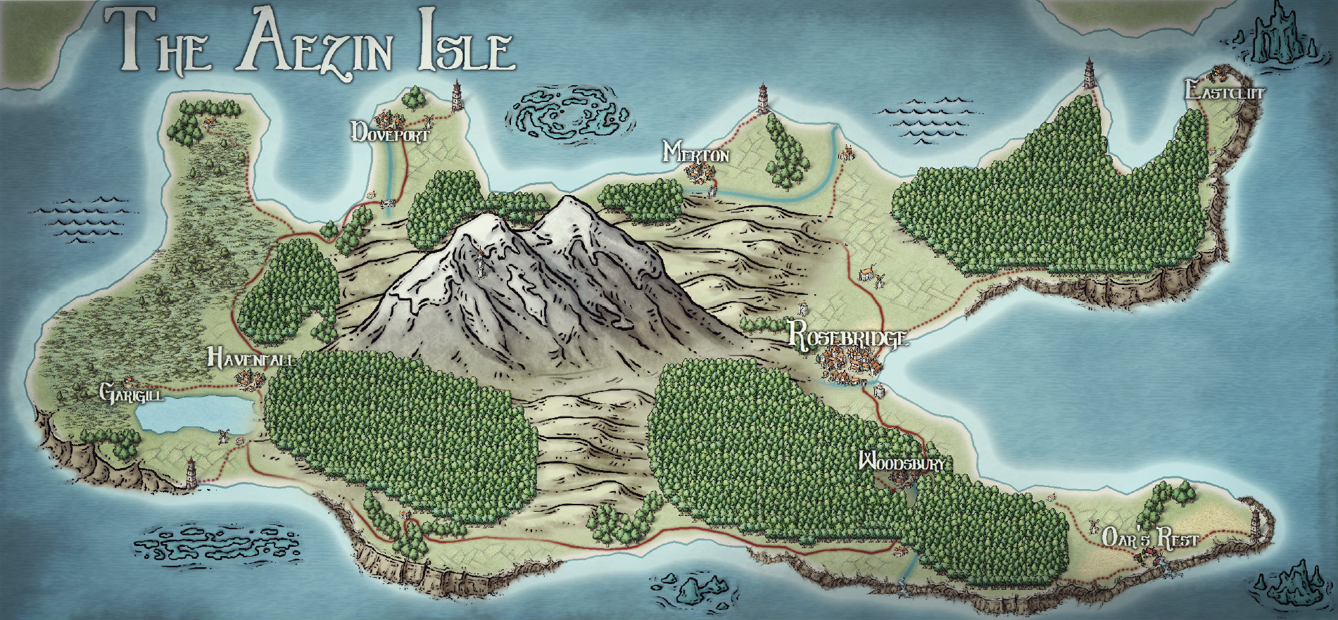
Continent - The Aezin Isle (My First Map)

I just got the 3 value bundle thingy and have been having an absolute blast! I've managed to map the continent I'm working on for my first homemade campaign setting. Constructive criticism is welcome. :)
«1

Comments

  • LoopysueLoopysue ProFantasy 🖼️ 40 images Cartographer
    Hello pixelkitteh.

    Welcome :)

    That's a fine map you've made there - even more impressive if you've only just started :)

    There seems to be a shadow effect of some kind around some of the edge of the map. Is that intentional?
  • Hi Loopysue!! Thank you very much! And yes it's an overlay I did afterwards (in photoshop) to make it look worn, not too sure it worked though :| I'm playing with different overlays!
  • LoopysueLoopysue ProFantasy 🖼️ 40 images Cartographer
    Oh that's ok. I just didn't know if you did it on purpose or not ;)

    A lot of PS effects can be achieved in CC3. Have you tried using the sheet effects yet?
  • No I haven't! I am still trying to work most of the program out :) having fun experimenting though. Now that I know I'll have a go with sheet effects, thank you!
  • Really nice, especially for a first map. I can easily imagine adventures there. :)
  • Thank you Barliman! :)
  • My advice to everyone, is get the Tome of Ultimate mapping and work through the tutorials - they are really helpful. But you have to do the tutorials, reading is not enough
  • Sounds like a great idea Quenten, I've had my eye on it!
  • Updated version of the continent map, it's coming along :)
  • JMunsonIIJMunsonII Traveler
    Wonderful map so far. :)
  • Good map, but I am a little confused - is this a continent (in which case the mountains are way too large) or an island (in which case, all is well). Perhaps a scale would help. It's just that you keep using the word 'continent', but the map is Aezin island. My poor head is obviously missing something here
  • pixelkittehpixelkitteh Traveler
    edited May 2017
    Thank you very much JMunsonII, this is my baby at the moment haha! My little island campaign. It's actually quite small but has a lot of details. The settlements are all villages except for the capital of Rosebridge.

    edit: I'll add an updated map shortly.
  • I've been working on smaller regional maps of this continent at a better size (along with a million other things because I am really enjoying map making right now!), so here's an update of the south eastern region :)

    HQ here
  • LoopysueLoopysue ProFantasy 🖼️ 40 images Cartographer
    That's a great map, and has the potential to be brilliant, but I think you might need to reduce the offset on the drop shadow on the tree sheet :)

    Possibly you have it set as a 'percentage of...' (one of two options in the effect dialogue box). If that's the case you need to tick 'Map Units' instead. Whichever - the trees are casting shadows as if they are 500 ft in the air.
  • Posted By: LoopysueThat's a great map, and has the potential to be brilliant, but I think you might need to reduce the offset on the drop shadow on the tree sheet :)

    Possibly you have it set as a 'percentage of...' (one of two options in the effect dialogue box). If that's the case you need to tick 'Map Units' instead. Whichever - the trees are casting shadows as if they are 500 ft in the air.
    OH MY GOD THANK YOU! I couldn't work that out!! It looks so stupid from really far away but fine close up, I didn't even realise that was why... Thank you...
  • LoopysueLoopysue ProFantasy 🖼️ 40 images Cartographer
    No problem :)

    I've done it more than once myself when using drop shadow. I think the default set up is one of the 'percentage of...' options ;)
  • Posted By: LoopysueNo problem :)

    I've done it more than once myself when using drop shadow. I think the default set up is one of the 'percentage of...' options ;)
    Yeh it is :|and me being a noob didn't realise that was why it was looking weird when I zoomed in and out!
  • LoopysueLoopysue ProFantasy 🖼️ 40 images Cartographer
    I still do it sometimes myself, and have to tut at myself when I see the exported map ;)
  • DogtagDogtag Moderator, Betatester Traveler
    edited May 2017
    Posted By: LoopysuePossibly you have it set as a 'percentage of...' (one of two options in the effect dialogue box). If that's the case you need to tick 'Map Units' instead. Whichever - the trees are casting shadows as if they are 500 ft in the air.
    Actually, something I learned while converting the annuals, is that you probably do want the effects for your overland maps to use the Percent of Drawing Extents Width option for effects units. However, you may have to adjust the effects values.

    That's what Ralf asked me to do when I converted the annuals, because those effects settings were designed for CC3 and they were configured for Map Units. The other effects-units options are new to CC3+. For overland maps, if you switch from Map Units to Percent of Drawing Extents Width, try dividing the effects value by ten (10). You can also try doing so if the effects are already set to use Percent... but they look off (which sounds like it might be the case here). You may need to tweak it but that's generally a good conversion.

    Ralf explained it this way. Overland map symbols are not intended to represent things true to scale. An overland tree symbol is not meant to convey a single tree, or at the very least, not a tree at the size shown on the map, which could be 1 or more miles/km in size. Using map units (miles or kilometers) to set the effects can therefore be tricky. Overland symbols are typically scaled for maps that are 1000x800 map units (mi or km). This is true, even if the map itself is smaller or larger (e.g. 500x400 or 1500x1200). A percentage of the width is 1/100th, and 1000/10 = 100. Therefore, divide by 10. (Side note: Ralf actually said to multiply by 0.1).

    Using the Percent... option lets the effects engine scale the effects to the map. It generally — though not always — preserves the look of the effect at different zoom levels. The same is not true when using Map Units. To be fair, for a few styles, I spent a lot of time making the conversion because dividing by 10 didn't quite do the trick. And, for some styles, I found it was best to leave them at Map Units. But for the vast majority, the "divide by 10" method did the trick.

    For battle maps, dungeons and cities (and floor plans and deck plans, etc.), you would typically use Map Units. Symbols in those maps are to scale, so the effects should also, generally, be to scale as well.

    In the end, of course, it comes down to personal taste and there is no "right" or "wrong" way to do it. But if you want to try to keep the effects at a more or less consistent (or at least similar) appearance, depending on the zoom, you may want to give the Percent of Drawing Extent Widths option a chance. Also, you can always save your settings first, before you make the changes so it's a snap to restore them. Or, of course, save the map, make the changes and then, if you don't like them, close and re-open the map.

    Cheers,
    ~Dogtag
  • LoopysueLoopysue ProFantasy 🖼️ 40 images Cartographer
    I use the map units option because I have a habit of changing the drawing extents ;)

    What is the other percentage scale meant to be for?
  • DogtagDogtag Moderator, Betatester Traveler
    edited May 2017
    Posted By: LoopysueI use the map units option because I have a habit of changing the drawing extents ;)
    Sure but, with few exceptions, most of the maps we've seen from you, since the initial two worlds in your story, have been city maps or smaller. Map units make sense for those maps because everything on the maps is to scale. For the few other overland maps you've made, you might find that the Percentage of Extents Width option might yield some very nice results, given your penchant for zooming.

    Then again, your maps might be better served by Map Units anyway. It happens. :-D

    ~Dogtag
  • LoopysueLoopysue ProFantasy 🖼️ 40 images Cartographer
    That's true - that I've only ever done 3 or 4 maps that are overland :)

    I always start my city maps on a Herwin Wielink template, though, because I use a lot of HW water. Maybe that's why the percentage thing never really makes much sense to me - because I'm drawing cities on overland templates ;)
  • @Dogtag, thanks! You've given me a lot to think about, I'll have to play around with the settings!
  • Posted By: HadrianVILooks great!
    Thank you :)
  • DogtagDogtag Moderator, Betatester Traveler
    edited May 2017
    Loopysue asked:What is the other percentage scale meant to be for?
    As I understand it, Percent of Drawing Extents Width scales the effects to the map scale. This often (but not always) helps preserve the look of the effects as you zoom in or out.

    On the other hand, Percent of View Width actually scales the effect to the current zoom level itself (regardless of the actual map scale). I haven't really played with the two settings enough to identify the differences. I basically took Ralf's direction and ran with it. I had to change the effect units option and then covert the values for every effect, on every sheet, of every overland style, for Annuals 1 through 7, so I didn't bother comparing them at the time.  ;-) :-D

    But now that I'm done with the annuals, I might tinker a bit to see how they differ.
  • Would be good to see this written up like you say in the Tome when it is revised one day (stop groaning Monsen).
    As I do more overland maps than not, i will see about changing my effects from Map Units (which I mainly use) to Percent of Drawing Extents Width.
  • DogtagDogtag Moderator, Betatester Traveler
    You may want to check out p.69 of the new Tome.
Sign In or Register to comment.