Continent: Harrondor Game Campaign Map WIP
 Calibre
🖼️ 39 images Mapmaker
Greets all,
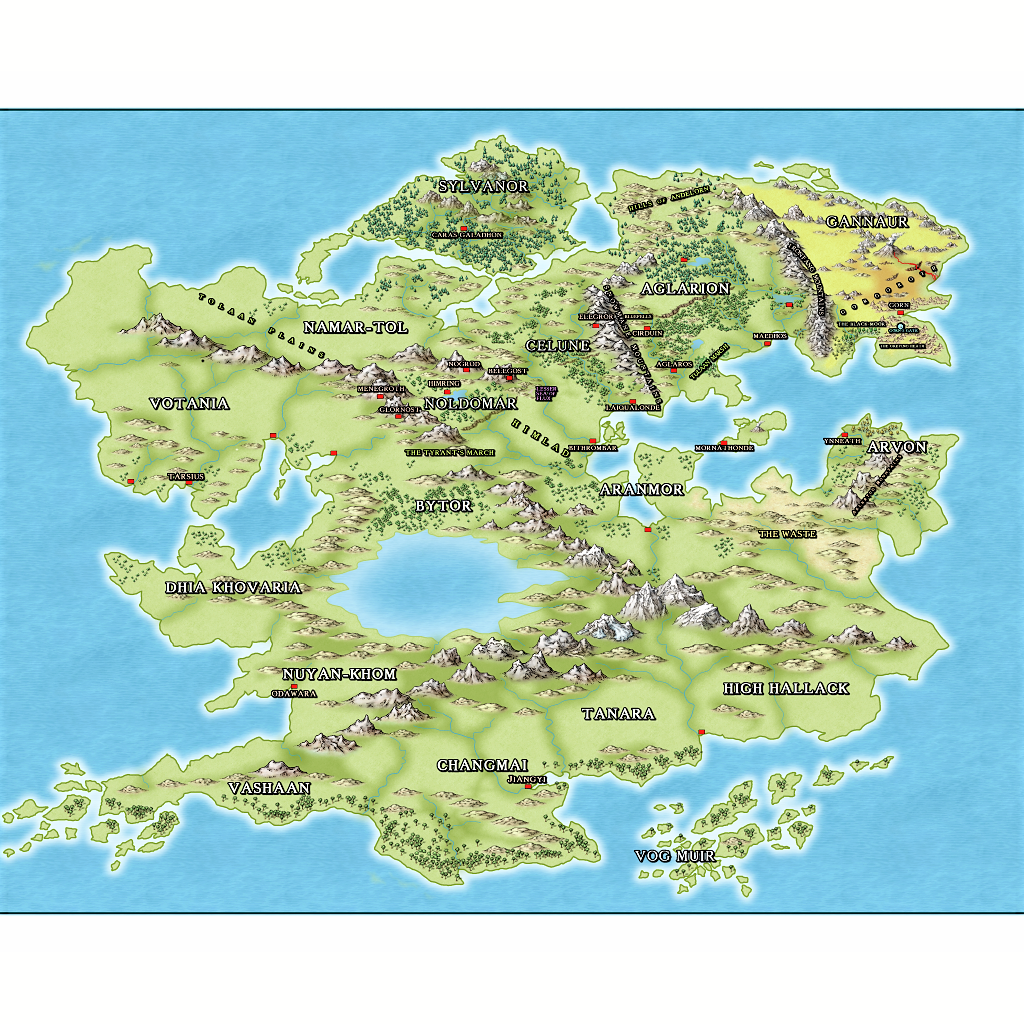
Here's what I've been working on for awhile now. As you can see, though I've been trained as a typographer, I'm having issues with text label placement, style, color, etc. Very frustrating as I'm coming to discover that advertising design typography doesn't necessarily mean you know how to place/utilize text on a map.
Here's my scheme:
Nation names in white, bold, dropshadow
City names in beige, normal, dropshadow
Terrain features: yellow green, normal, dropshadow
Strange features: purple and as above
Gates: blue and as above
Unfortunately, even after enhancing in various paint progs, I can't get a high resolution png unless I pull out enlarged areas and post those. So, I'm going to try and include the FCW here as well.
Advice of all sorts will be very much appreciated
Cal


Comments
"Vog Muir?" That's the name of a very early Rolemaster setting. Is that island chain based off the module?
I use names I've got particularly strong memories about, like Arvon and High Hallack; some of the others are manipulated from Quenya or names in fantasy stories I really like.
I'm running it on a MUSH but using Skype for the players who are challenge by typing as fast as I can heh.
When necessary, I just load a section of the map previous rendered out into skype and everyone can view it.
Thanks for the compliment. It looks so much better without the labels or with labels but enlarged heh.
I'm looking at all the wonderful work done on here by you brilliant mappers, especially those done in the Community Atlas, for inspiration
Cal
About the resolution, Calibre...
The resolution can be greatly increased by clicking the options button in the bottom of the save as dialogue box when you export it.
I'm sure that as a trained Typographer you understand all about pixels and antialiasing. The only thing you have to be careful of is that you don't go over about 10,000 pixels on the longest side of the exported map.
You can get even better results if you use one of the two Save as Rectangular... options. This allows you to select the rectangle you want to export, and will work beautifully to cut out any wasted space around the edges if you remember to use the options dialogue to tell CC3 that you want to render a rectangle of those proportions.
For example, if your map has proportions of 1:2, when you Save as Rectangular... you can set the dimensions of the rectangle to be exported to 5000 and 10,000.
I'm known for my slightly eccentric explanations, so please just shout if I'm talking garbage
Loopysue, I appreciate your instructions. Yes I do know how to do that.
What I really need help on is text/labelling. Right now, I can't stand the text heh. It's driving me insane to even look at this. :S
PS: thank you for complimenting my artwork.
Cal
The effects like shadows and glows can be found on the TEXT sheet, and adjusted by either deleting them, or clicking the EDIT button next to the effects list.
Curved text can be achieved by drawing an arc or a smooth line along the curve you desire on your map, and then adding text to it using the Draw/text along line menu.
Not sure if that was what you were after?
1: Changed the Font sizes, removed drop shadow and altered the text outlines.
I chose red for the nation labels though I experimented with various greens and black.
I removed the labels for mountain ranges. Researching on this forum showed majority of you
guys on maps of this scale don't normally apply mountain range labels (could be wrong here).
Also, I realize I'm borrowing a lot of the names on the map; some of them I've constructed, as I said above,
from Quenya (such as Noldomar: 'land of the Noldor' which are a tribe of High Elves, etc). Some of the
names come from favorite fantasy novels I've read over the years, and so on. But the background story,
theme, histories for this world are my own. Why didn't I just create my own names as well? Because I like
the names and this map is never intended for any sort of publication: it's for my private RoleMaster game
I run on my MUSH. My players are certainly aware of my plagiarizing of my favorite authors heh.
Here are my questions:
How's the red outline working?
Should I reduce the size of the nation labels?
I've used 2 celtic type fonts...do they work ok together?
What about text color for the city/area names?
I'd like any advice about the text labelling you guys feel like sharing as I value your opinions greatly
thanks
Cal
Otherwise I like it, and the names really rock :)
Overall, however, I love this map.
The red outline? Hmmm.... I can't decide. Its definitely different, but I have a feeling it might look better in dark brown (if you don't like black)?
I've never been keen on coloured text, but that's only my personal taste speaking out. I would probably be outnumbered by the people who like coloured text
Overall this is a huge improvement on the original
I'm not a fan of the red outline either. You might try something a little less stark and perhaps something to create a little opacity behind each name to help them stand out without being too strong.
I'm fighting my basic typography training:
1: I used more than 1 serif font and did not use a sans serif font. Normally, you're supposed to pick a serif font that evokes the theme/mood/intent of your design, then pick a sans serif font to compliment. These days, however, all the old rules are usually ignored for special effect, reach a younger target group, etc.
2: I used more than 3 colors for type----really bad heh. My instructors would be fuming. But, as above, nowadays, it's all about grabbing attention.
3: Less = More; starting to get text heavy :S
I replaced red outline with brown. All text you see off typical alignment is text on a curve, even angled text.
thanks
Cal
You're quite welcome. Thanks for the compliment. I haven't got any annuals yet, I can't decide!
Cal
Thanks, Quenten.
I'm slowly putting mountain and river names in. Maybe I'll break down and put this on a site somewhere so a larger/clearer version can be seen heh.
I fight a battle in my mind every time I put a label on this map heh. I was trained in graphic arts/advertising design and well, I'm a traditional artist as well---though I'm NOT working in my field at all these days. But I still remember most of my training.
Typography was one of my favorite areas of study! But, it's been so long and all the old rules seem to have changed these days heh.
Cal
Thanks. Yes, text heavy. I've resized all text so many times I see the labels with my eyes closed. Working on it.
Cal
Thanks! High praise indeed. I've taken your suggestions to heart
Cal
Gotcha. Yeah, it was starting to hurt my eyes as well. I reverted to brown :P
Cal
How do you think the brown + white is working?
Cal
Cal
EDIT: I can see them now. For some reason this thread is taking a very very long time to load. It was nearly 10 minutes before I could see the last two maps, but now I can - Excellent.
I think they are tons better, even though you have had to reduce them significantly to upload them, and the smallest text is just a bit too tiny for me to read. I can still imagine what the full sized image looks like
Yeah, it's hard to show it. Guess I better put it on a site somewhere.
Cal