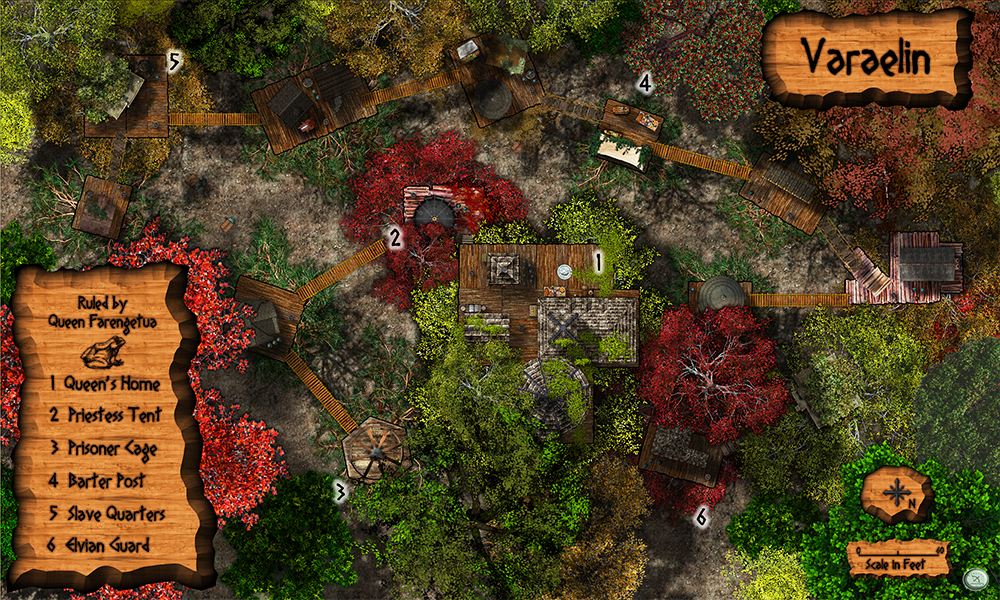
Varaelin - an Elvian village
 Lorelei
Betatester 🖼️ 46 images Mapmaker
So this was an experiment....I had an idea of creating a village in the trees of the Witchwood where the Elvians would live while hunting the forest for free men and guarding the Maze of Eldath.....Im not completely sold on this. One moment i LOVE it, and the next i almost want to delete the whole thing. Any input? I tried my best to give the illusion of "tree living" but this was certainly a challenge. If it proves to be a success I will do a similar one for the Atlas project using the CC3+ core and add-on symbols and fills.....
PS - Compass and Scale just for Dogtag

PSS - Adjusted version below thanks to some great critique!
Link to High Resolution Varaelin
PS - Compass and Scale just for Dogtag
PSS - Adjusted version below thanks to some great critique!
Link to High Resolution Varaelin


Comments
If there were some way to blur the forest floor a little, to give that bid of added depth perception, I would do that - then it would really pop out, and off, I think...
There are, however, some bridges that drop a shadow on the platform they connect to, which negates the effect.
I have no clue how this can be fixed. Maybe it would be easiest to draw the shades manually and then disable (some) of the effect shades?
High res link
It really does make a difference:)
Maybe you could increase the length of the shades to further emphasize the height. Also: Do the platforms drop shadows? When looking at the barters post it looks like they don't. Is there a way to offset shadows?
But as usual, i am pretty fast, and getting ahead of myself, and ourselves, lol.
Meanwhile, i think this might be okay to send the file to my players. I've noticed that they ALL have their tablets along with them during game sessions so we began to put my maps up on my TV (using Chromecast) and Roll20 (as printing them all out all the time and using minis can prove expensive to a group of players with varying "fun money" to spare) - so I've been updating my Obsidian portal page for them as we progress and they get a copy of the map once they visit the place to reference at all times in and out of game. It seems to be working out great....and saving me tons of printing ink or time at the local copy shop!
You did a very nice job with this village!
Nice work.
Love it now!!!
I use a 42" TV to display world, regional, and city maps including interiors. I never bother making true dungeon/cave maps because the players never get to see the entire map until after they've explored it and by that time they are ready to move on; so for dungeons I use graph paper for the DM and either Dwarven Forge sets or the Chessex mat for the players to map it out. If it is a battle where area details matter I'll do a battlemap. It took me a while to find a balance between mapping time and real life.
Don't know if it would really work. I just have a hunch...