Community Atlas - Continent C - Kentoria
Hello,
I've been slower on continent C than I expected. But then I did not expect to get sick...
Here are my first thoughts about it.
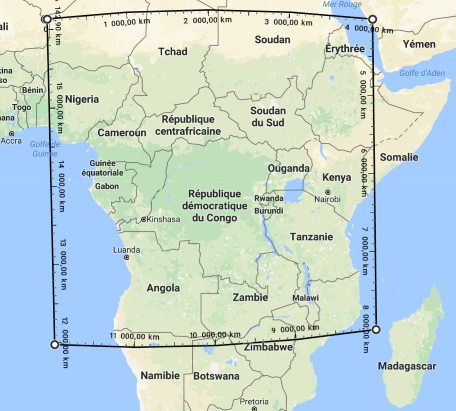
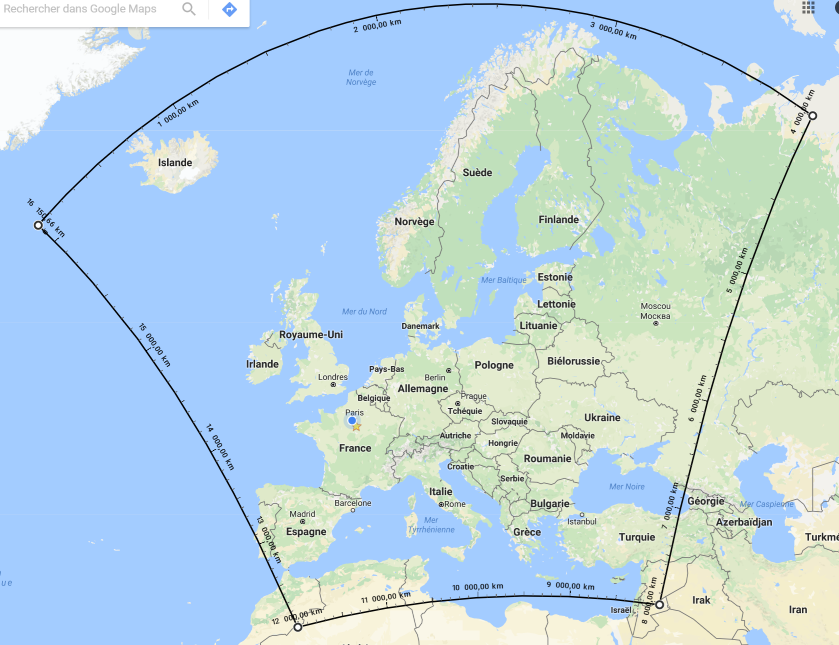
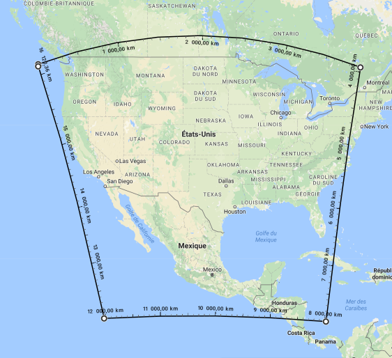
First, I wanted to make myself a better idea of the size of this continent, it's mostly spherical, with a 4000km diameter. So I went to google map and tried to draw "squares" with a side of 4000km. I used places I know well (Europe) as well as a place on the equator, where my square would be square.
And my conclusion is that this continent is much bigger than I expected first, so I will have to change what I planned to do with it...


Comments
I just wanted to get the coast, one depth of sea, and one level of mountains (there are not that many mountains on this continent). I created a map with the good size, then copied the required objects from the export to the blank map, and it worked. I then traced over the sea depth level (with the fading effect, it was useless to have something too detailed anyway), and used the "change like draw tool" command to adapt the sea contours, and the mountains.
So, what did not work well? Even without effects, with no symbols, and working on a quarter screen, this map is already very slow to draw. To get some information, I used the "info" command on my main landmass. I can see I have 4 entities (I would expect 2, the border and the fill, and before I did the "change like draw tool", I had 3). I looks like I have 2 superposed identical coastlines, since I have 2 polygons on relief, and 2 on coast/see. I don't really know why this happened, but I've been able to erase the duplicate (I had to enter all duplicated id, that I knew from "list", on the erase command. If anybody knows a better way to erase one instance of a duplicated object, I would be thankful).
Even after removing the duplicates, it's still too slow (about 2s on 1/4 screen), so I tried to reduce the number of nodes (currently, my main coastline has about 7500 nodes, this look like too much). The problem I have is that if I do it, it only affects 1 of the 2 entities that make my landmass, and they go out of sync... Does anyone know of a way to solve that issue?
First, what did I like in this map? This landmass has two features that really attracted me: It creates an internal sea, almost enclosed, and at the same time, there is a land right in the middle of this sea.
I thought this sea would be a boon for sailors: Easy travel, probably not too much wind, a rich marine life (it's quite shallow) that can provide lots of food. Just like the Mediterranean sea that was the cradle of many civilisations.
And then, with such an interesting interior sea, who would bother about the external one, so dangerous, so barbaric? So I pictured a very old civilisation, ancient and wise, but also isolated from a changing world, turned only onto itself, it's own problems. A civilization on the verge of decadence. Think a mix of ancient Greece and Atlantis.
This is where the land at the centre of the sea plays its role. If it's at the centre of the only true Sea, then, it must be at the centre of the world, and be the centre of civilization! So I envisioned a federal state covering the whole continent, with the centre of power on the map centre. To make things more interesting, the central power will have less control the farther you are from it, and some states will be virtually independent. But most cities will be on the coast of the interior sea.
I hope this is now clear why I chose Kentoria to name this continent, since it more or less means "centre" in ancient Greek (unfortunately, I could not find a reliable Atlantean dictionary on the web
Next step, do some real mapping!
Monsen: I did not know this would recreate the outline. This is really handy! I think this would make good material for a command of the week
Quenten: You are quite a trickster! (and this is a genuine praise!)
I was trying to use the method described by JdR in his tutorial for the blend mode overly in order to render the relief of this map. But I just realized something: For this to work, one needs to import a large bitmap representing shadows created by the relief, so I guess this method is out of scope for this level of the atlas. Am I right?
As I said in a previous message, the map was very heavy and slow, but with your help, I've been able to reduce the number of nodes (my main landmass went from 7500 nodes to 1300. In doing so, it created two kinds of artefacts, shown bellow:
[Image_7733][Image_7734]
I named those defect the hollow and the spike. The spike if by far the most visible, I even had a spike of about 500km...
So I edited my landmasses node by node to remove those tiny defects.
Next step was to draw some navigation lines, and since we are at the centre of the world, the centre of those lines is of course the place of the capital city
[Image_7735]
I'm not happy with the effects on those lines, I wanted something more subtle. I'll have to
shamelessly copyget some inspiration from Continent H5 and it's wonderful sea with nice lines.Like the concept of the nav lines showing the continent as the centre of the world. Now you need a Delphi with an omphalos which the ancient Greeks took as the centre of the world.
If you want something more subtle, you could change the colour into white or a fair gray maybe.
I fully realize "my" continent is one of the last remaining without a map, which would have outraged its inhabitants!
So, in order to placate them, here is my current progress. I find it really hard to draw large scale mountain ranges, they tend to look boring, I'm not really satisfied, I might restart anew (maybe with a larger scale, but then I might lose the sense of size of this continent).
Here is an update, with the river system mostly worked out for the main island, and some changes to the mountains.
There is a lake at the center that is blatantly against what lake most classically do, as well as very regular river shapes, but it is right on purpose, aligned with the notion of a highly civilized people that has, through a combination of technology and magic, totally mastered its environment.
As always, comments and criticism are welcomed!
I would, however, distort the circled canal system a bit. Your symbols add a slight 3D effect to the map, therefore you don't have a 90° on top view but a slight angle. Because of this, the canals would not appear as a circular shape. The distortion can easily be done with the scale tool. Just select every relevant canal, press CTRL and reduce the vertical scale a little bit. Maybe you, then also want to rotate it a bit, but its hard to say whether this is necessary or not. However distorting it, would make a notable difference.
So my plan was to try to redo the mountains with a more top-down view, following the bevel mountains tutorial.
But not now, since I'm going in vacation, one week in Toronto (to speak about the C++ programming language) and two weeks in Quebec, walking along the country, and hopefully seeing nice animals (from a safe distance, even more hopefully).
I'll attach an example from Crestar.
If you need any advice on the lighted bevel mountains, please let me know:)
I finally found some time and motivation to work on this again. Unfortunately, I used the February challenge as an external source of motivation, but I thinks it realistically can't be finished before the end of the month... But still it made me rework on it, so all is fine
I reworked this map thoroughly, in order to have better looking mountains, and most importantly remove the 3D effect that the symbols were producing, thus changing the shape of the coastline. I think I'm pretty much done with that (thank you once again HadrianVI for your nice tutorial), I've added some forests, here also without symbols, but I had to restrict myself to a less than perfect texture. I think it turned out fine, even if I might still adjust the effects a little bit.
[Image_10435]
What remains to be done is mostly:
- Fill the empty areas
- Draw the walls that my psychotic dwellers built on the sea to protect themselves from the "barbaric" outsiders
- Add some cities, some roads
- Add some text
- ...