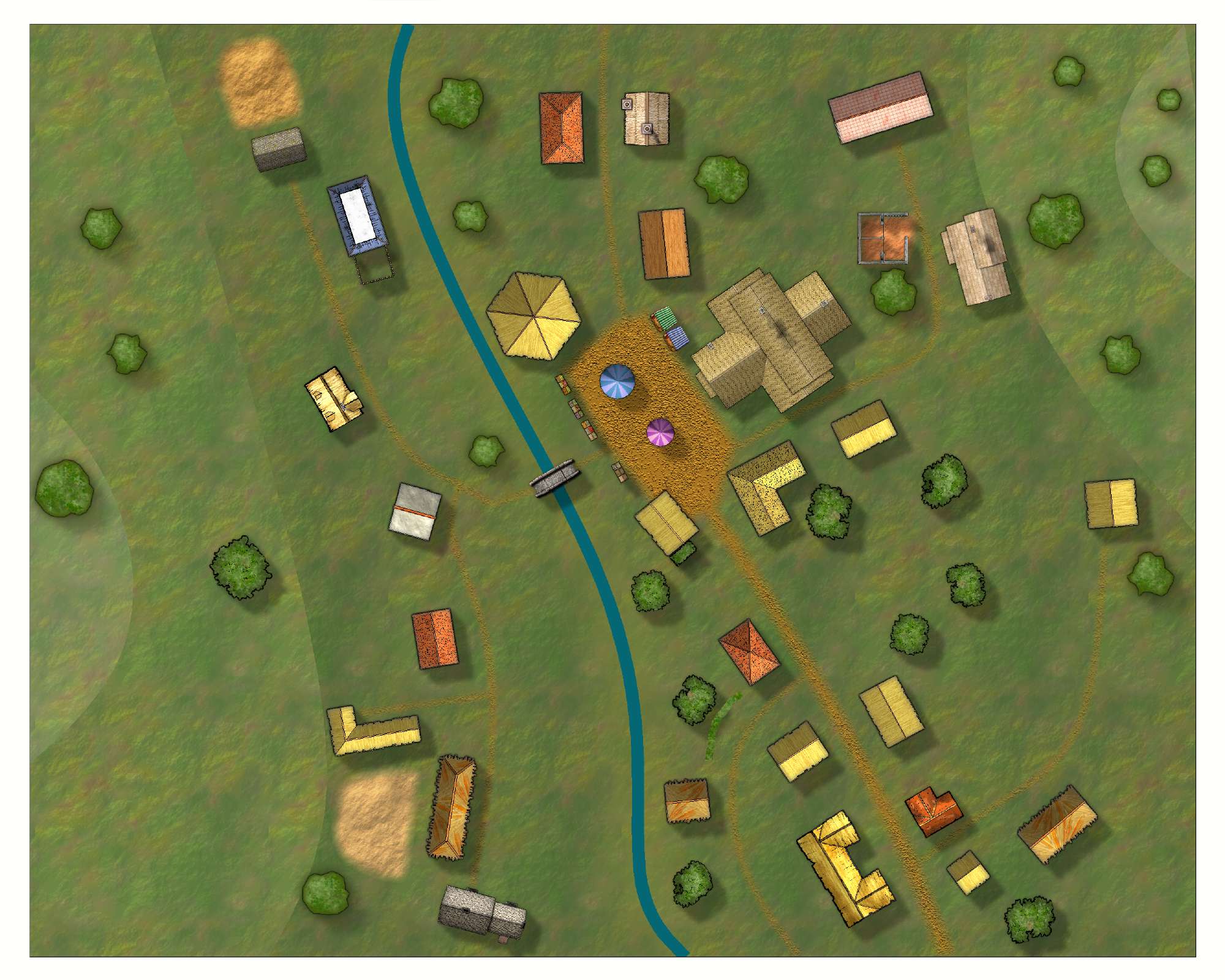
first attempt with CD3+
first attempt at a village map
used the CD3 tutorial as a guide
I want to do a bigger city map, but am a bit overwhelmed on where best to begin on something like that. I have an outline in my head but putting the roads/buildings together to look more like a city, just need a bit of guidance/advice/encouragement
thanks
used the CD3 tutorial as a guide
I want to do a bigger city map, but am a bit overwhelmed on where best to begin on something like that. I have an outline in my head but putting the roads/buildings together to look more like a city, just need a bit of guidance/advice/encouragement
thanks


Comments
You may want to create separate sheets for each level of terrain so you can get an edge fade for each level you draw. If you place them all on the same sheet, the edge fade effect only gets applied to the outermost edge, so you get sharply defined edges in the middle. If you choose to do so, I recommend naming them similarly, such as TERRAIN GRASS 1, TERRAIN GRASS 2, etc. This also has the added bonus of making it easy to rearrange the order they are in the map simply by moving the sheets up or down in the list as needed.
It looks like you have a small hedge row by the river, toward the bottom. If so, you may want to move it to the SYMBOLS sheet (or one of them, if there are several) so it will cast an appropriate shadow. Better yet, maybe make a HEDGE sheet and give it a shadow and a small bevel effect.
I like the mix of buildings and colors. They keep the map from looking like a dull satellite image.
As for tips and advice on making cities, you may want to check out this other discussion about that very topic.
Cheers!
~Dogtag
excellent advice on the terrain, thanks! i'll give that a shot tonite
and thanks for the thread link - that's exactly the kind of guidance I was looking for!
edge fade doesn't really seem to work for it. I did use some transparency effect. what can kinda give an effect like its in a streambed or something along those lines?
- There already appears to be some sort of greenish glow on it. you can adjust the intensity if you want.
- You can also "outline" it with another glow if you want, with a dark color (maybe a shade of the same blue) and a fairly high strength around 30-50% and a small blur radius of 2-3 map units for example.
- Or, even better, you can try a reverse bevel to give it a "sunken" look. Keep the values low for that, if you try it. 1-3 units, and strength and fade values around 20-50% apiece maybe. Obviously everything needs to be fiddled with. Be sure to check the "invert colors" box though.
Cheers,~Dogtag