WIP: Erdan revisited
 Medio
Surveyor
Considering i´ve been harrasing some of you with questions, it seems fair to show what i´m wasting my time with...
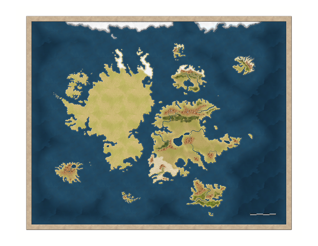
Some years ago i draw Erdan (my RPG world) map. Unfortunatly my friends and i had to stop due life circunstances but lately we have decided to keep rolling so ... i wanted to do an improved overall campaign look and that included maps!
The world one is the first i´m doing (i will move on to another style for regional maps). This map will be done in CC3 as the style is not compatible by CC3+, 13th Age annual.
As there are some things i dislike, expect some redrawings. Any criticism is welcomed. Even destructive one!
There you go...


Comments
Cheers,
~Dogtag
Next step: rivers.
Still far from the ending but i´m liking what i´m seeing. Still waiting for criticism
It would be easier to comment if we knew what scale we were talking about with regards to the 'wiggliness' of the rivers, for instance
Best wishes,
Sorpaw
Rivers as you can see, are not too long. Largest river could be around 3.000-4.000 Kms which is relatively short compared with Earth´s Nile (7.000 Kms), Amazon (also around 7000), Yangzi (6000? or so), Missisipi-Missouri, etc... Even the McKenzie should be longer.
It´s just for showing you all how i´m faring with the map and the steps i´m getting. It has two advantages: first, you can help me improve the map and two, some of you could learn a bit (not much about this, i´m afraid as i´m not an artist as some people here) about mapping. Feel free to ask about how i did anything in the map.
I will do later regional maps for the realms the players visit.
I think you may need to rescale the rivers to make them a bit more convincing. At the moment they have a rather broad and very smooth curvature to them, whereas at the scale of your map they would be much more wiggly and travel down narrower channels (ie less of the massive sweeping from side to side over a couple of thousand miles at a time) - a bit like this:
EDIT: Though I'm not going 'all proper' on you and insisting that rivers should look real - not if you like them the way they are
The real problem about doing the rivers is that i cannot do them too tight or they won´t be well seen in the main view. I don´t want either to show too many afluents as it would make the map a bit blurry. The effects make the rivers take more space than they should (ofc in a satellite view they shouldn´t be well seen) but i´m afraid i will have to live with it. Will try some tests with less wide rivers.
What i need to improve, though, is the river curvatures are too smoth. Some real life rivers are similar to what i draw, like the Amazonas (with more afluents ofc), others like Nilo or Missisipi are a bit less straight.
Next year i will recheck them.. thanks about the tips!
EDIT: was checking my notes, Erdan is a bit smaller. The area shown should be "just" 14000 Kms.Nothing changes but i should say it.
There are no rules that say you have to stick with what you're given
Vegetation and hills next.
One step closer to complet!
I dedicated non less than four hours to check forest mixtures. It happens to me at most maps, i usually need lot of time to find a forest that i can like. So maybe expect some changes on forest textures aswell he he.
Several textures have been added and some minor shapes have changed to be more fit.
On next update i will probably reshape many things - hills, mountains, forests - so they look better, and then will start thing about the last steps: labelling, compass, map frames, some minor extras, etc...
Map starts to look like i wanted.
I hope your father is recovering.
Leaving the cartography away (which in a fantasy map is debateable depending on which morphology your world got... mine for example there was a breakup that´s why the continents look like a single one which was fragmented), there are some aspects which define a good looking map, at least for me.
Coastline, mountains/hills, forests, textures and details.
What i´m trying to do is to make them all mix well together. I want a satellite view map but not just a "real" satellite view one, i wanted it to have that "videogame map" look which the 13th Age style fits perfectly. I wanted also a bit darker map than my last Erdan map made with Fantasy Worlds style, as my world has become a (even more) dark place than when my players played, some years ago. I wanted that to be reflected on the map without losing the colours (tried a B&W map but i did many of those many years ago on my other campaigns).
The coastline is made relatively fragmented due storyline. I´m tempted on refining it a bit more, thanks to the Dogtag tutorial i´m now confident it wouldn´t be the timesink it would be with node editing.
Still need to work out a bit more the mountains and hills. Maybe they will get a more defined look instead that blurry one. Testing these days using the original hill bitmap with colour changed (PS wise) to the colour you can see now, but with more details. The effect i used to create the wastelands parts could work to show them in the way i want. As i said, will be testing them later.
Forests... as i said, they took me many hours to reach this result. I wanted a different aspect as the 13th Age which ends to be too blurry and the texture used wasn´t the one i wanted. Overall i still use the 13th Age forest style but with different texture and sheet effects numbers. I´m using two sheets on small and big forests so the effects look more smilar, but still the small ones look abit too blurred. When i tried to make them sharper, i didn´t like the outcome. I will test a bit more and will see what i do.
Textures... there are a good count on them. I just need to refine some and make them even more blended. I will also probably change the outer seas texture so the waves effect dissapears or changes.
Symbols: there will be city symbols and maybe sea routes. Not sure. I will create two maps, a political one and a geology one.
Details: planning to do a compass (or get some from my symbols library), a different and darker border, maybe some symbols/drawings on the border and also maybe some details/symbols on the map. Usually such details don´t fit well with satellite view maps but i will test them.
Still a lot of work to do.
I dunno why but i added a cartouche without deciding the border itself (which won´t be the annual style one).
I won´t promise i will keep the coastline or the textures, specially the forest and mountains ones
Next steps: finishing the textures, final touches on mountains/forests/hills, and start doing the details - city symbols, traderoutes and adorns in general.
Looking good, Medio
I like the cartouche.
Next (and last) steps: working a bit on the sea, maybe add sea routes, add capital cities, check if there is enough room for kingdom names and work on details, compass, etc...
As for the bigger resolution image, sure thing. I'd wait for the finished version but if you want I can mail you a bigger image.