The World of Barden
I am new to CC3, CD3, DD3 and everything Profantasy but I thought I would share the world of Barden with you.
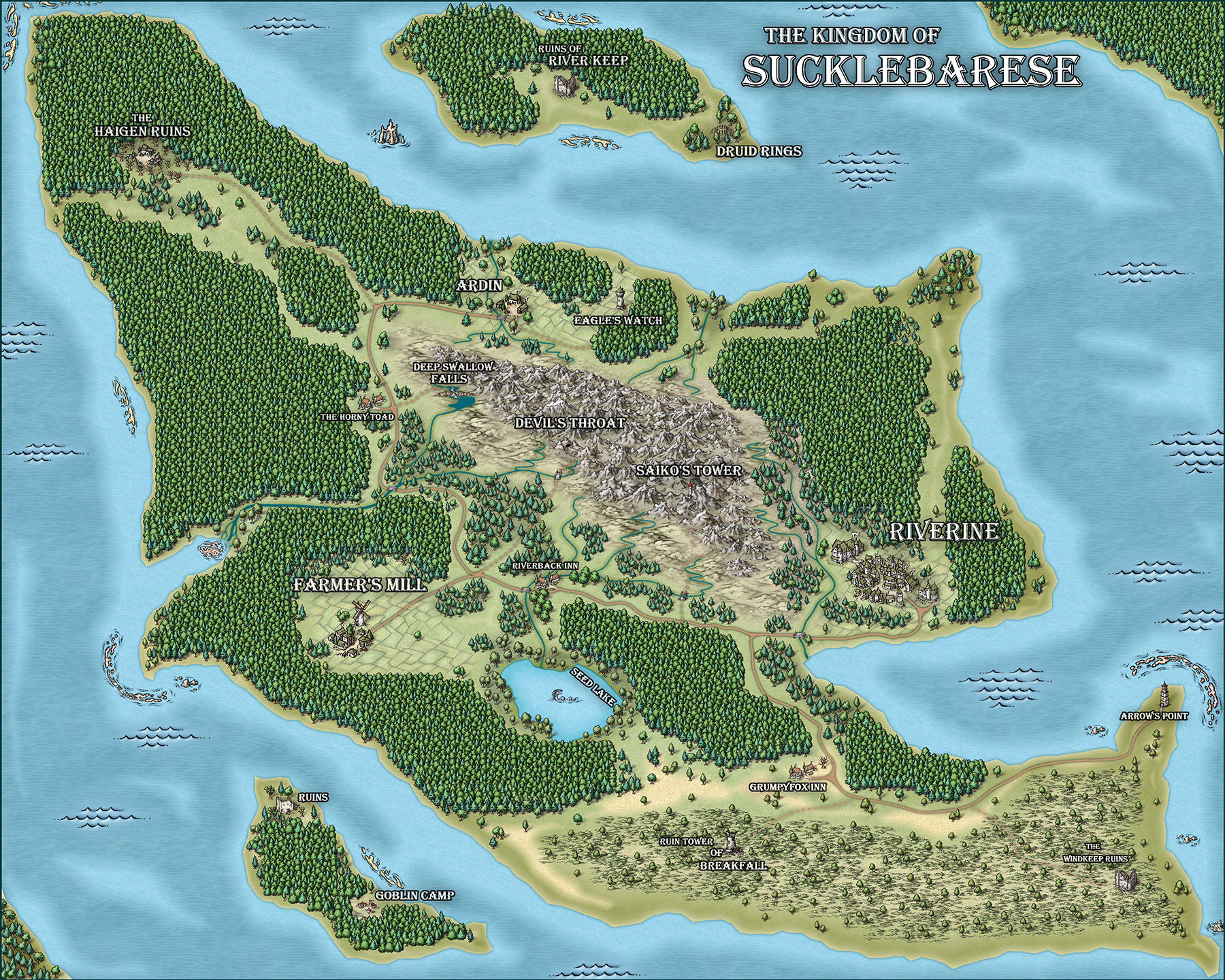
Here is the first Kingdom I have made for Barden. Anyone can use the maps if they wish, not sure they are that good, but hey I bought CC3+ on Black Friday and I'm just getting started.
Here is the first Kingdom I have made for Barden. Anyone can use the maps if they wish, not sure they are that good, but hey I bought CC3+ on Black Friday and I'm just getting started.


Comments
A very nice first work, I must say!
Edit: And you've already made 4 maps, with 3 different styles, in so little time... I'm really impressed.
I do have a question though if anyone can help me out that would be great.
Let's take the map above # 10 Begger's Inn, how do I make the road and the wood of the Inn blend better so it looks like a more natural entrance? Right now I have a fade inner on the wood and it looks... eh. Would a small black glow make it do this? I haven't tried this mind you I'm just thinking out loud.
This is the map for the first bridge out of Riverine
I found out how to use lighting and this is my first attempt at lighting.
If anyone has tricks or ideas they think I should be aware of that could make my maps look better I'm all ears.
I'm going to try my hand at map lighting again. Any tricks for that? I think lighting that cave was the hardest part of all this.
You'll want to change the scale of the fills a little bit in your city map map though, both the land and the sea textures have a very visible repeating pattern. It can easily be made better by changing the scales for those fills in the fill style dialog.
One small suggestion. On the interior maps, the shadows on the furniture are longer than the wall shadows. This causes the illusion that the furniture is floating higher than the walls. I think shortening the furniture shadows to be less than the wall shadows would fix this. As an alternative, since there is a ceiling light source implied, a black outer glow on the furniture might be better since there might not be a directional shadow.
Thanks for sharing!
Really sweet work. What's the scale of the overland map?
Thanks indeed for a peak into your world.
Cal
@Monsen, I was wondering how you changed that. I'll give that a go next time.
@Shessar, Yeah I think the only one I have the shadows done somewhat decent on is the Riveroak Tavern. That was the last map I did for the city. I kept forgetting I need to change the effects on the symbol sheet if I change them on the Wall sheet. I'll be sure to double check that from now on. I did figure out how to make my own preset so I'm hoping it will look better from now on. Thanks for pointing that out. I might have overlooked it in my next round of maps as well.
@Barliman, The scale of the kingdom, from the bottom point to the top point is 75 miles. At least on roll20 that's what I have it set as. It's a small kingdom basically to get the campaign rolling. I know some of the scaling is off, like the river on the kingdom map not coming up to Riverine among other things. I'll work on that for the next kingdom so it's a little more accurate. I'll say one thing though, now that I have FT3 I won't be making the world maps first without it. That was my biggest problem. I made the world map before getting CC3 and had to try making this kingdom's scale relative to the world map I had made.
Anyway, thanks again Monsen,Shessar and qwalker for the ideas, I'll be sure to add these into my future maps.
I hope adding future maps to this thread is alright.
CC