Swamplands...looking for some inspiration again
 Lorelei
Betatester 🖼️ 46 images Mapmaker
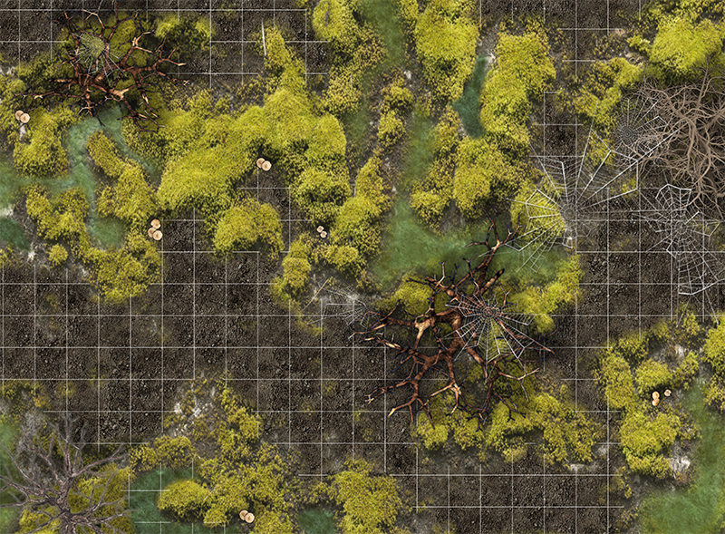
Hey all. Just worked this up this morning instead of the paperwork for work i should be doing as my "home office day", but my morning coffee just compelled me to sit down at my computer and work up a map. So eventually my players will find themselves in a region where it is quick murky and swampy. Here is a WIP on some swamplands. Im trying to work out a way to make my paths looks a bit muddy....any suggestions on technique? I've got loads of fill styles to work with but none that are really like "MUD". Anyone have something like this? i just don't know exactly how im going to make it look more like a swamp and less like a botanical garden path....lol


Comments
I like what you are doing here but to me it looks a little dry. Maybe you could load a bitmap of water and put some spots of water in, then make them transparent so you can still see the water, but you would also be able to see the stuff underneath it. Hopefully that described it well enough.
I think the spiderwebs stand out a bit too much but since they are symbols, there isn't much to be done about that, and it isn't a deal breaker.
There is one thing that bothers me, and again it is the nature of the medium. Your land looks like a top down map because the symbols have an outer glow rather than a directional shadow. The pebbles in the water/mud have a directional shadow that looks out of place with the rest of the map and makes it seem like I'm looking at it from an angle.
Please don't take my comment as criticism. It isn't. It is just THE major drawback of the photo-realistic style. Different photographers taking photos at different times of day and artists using different glows and shadow offsets, can create a map that looks like pictures were cut out of magazines and pasted to make a picture.
Our brains make many assumptions based on shadows, time of day, height of an object, light source position, and the material the object is made from; so choosing art with consistent shadow direction can make a difference in the believability of a photo-realistic map. It is why I love the ProFantasy symbols so much and find myself using them more often. Unlike most user art, they have no shadows and allow the user to determine shadow size and direction.
Just something to consider when working in this style.
Also, the mud in my trail is off a bit....something about it...there's an angle maybe? i dunno.
Thanks for the critique....i'll keep it in mind on the next map. For a quickie map for my players its all good. They don't even appreciate my maps a fraction of how much i do
That's why I try (and mostly fail) to make my own sybols. Sadly, I'm seldomly able to find enough references to work from (ever tried to find a bird's eye photograph of a cow in acceptale resolution, for example?) and usually I'm not good enough to work up a presentable result without.
I have to apologize, but I'm kinda relieved that I'm not the only one that's happening to. :-D