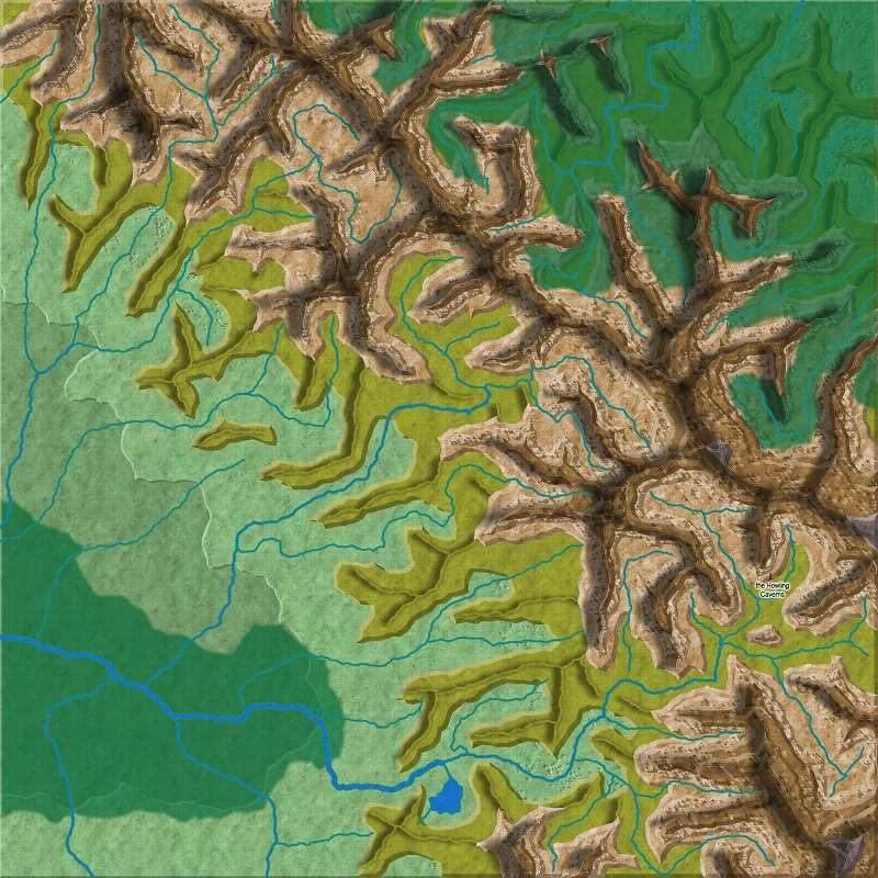
Experimenting with Shaded Relief using CC3 standard overland
I've been experimenting with trying to create shaded relief on topographical maps using standard CC3 standard overland which has been my preference for a long time now.
I'm looking for some hard critique or advice on how to improve or any strategies anyone's discovered.
First question: Has anyone used the Shaded Relief from the 2008 annual. Do you have to use a specific drawing style to utilize it or could it be used with the standard overland style? Is it really cool?
Below are a few examples of different attempts to accomplish topography and just to give some insight into what I've attempted so far.
1. I create a sheet for each elevation milestone that I want to use such as "1000' " "5000' " etc... With these sheets, I've been playing around with different bevel settings mainly trying to find a good one. I get some weird effects however sometimes when I try to do this, though I haven't tried to do it since my update to CC3+.
2. I create a sheet for different ridgelines like "low ridge" "mid ridge" etc... I then try to find ways to blur the original ridgeline with mixed results and then add directional shadows to them of various lengths depending on how high the ridgeline is.
Any thoughts, advice, etc...?
Would love some feedback and especially suggestions.


Comments
As pdj points out, Texture Overblend can be replicated with fill styles. Texturize, on the other hand, applies a lighted texture to the current image. An image of just noise values can be used to get a paper-like texture, while more structured elements can be useful for adding things like wave textures over solid-color oceans and so on. http://forum.profantasy.com/comments.php?DiscussionID=5280 shows the Texturize filter in use to make the forests on the map more interesting.
Trying to use Texturize on large and structured elements like hills and mountains can be challenging because the effect is aligned to the current viewport rather than any absolute map location. A good use of texturize might be to apply a decorative texture without any particular size or orientation ( http://pubs.usgs.gov/tm/2006/11A02/FGDCgeostdTM11A2web_Sec37.pdf aren't particularly decorative for the most part, but they offer some technicalish examples ). I don't suppose that I've said much that you don't already know, though.
The implementation details of the filter are that it take an input image and treats that image as though the pixel brightness values are like heights on a sand table and a light is shining on those heights. This brightness image is then embossed onto the current sheet rendering to give the texturized effect. The brightness and intensity values are effectively brightness and contrast on the brightness image as it is being computed. A too-large brightness value will result in very little effect at all, and a too-small intensity value will also results in very little effect. OK, I think that I'm explaining this badly.
I had actually played around once or twice on a test map with adding textures (whatever the correct way to say it is) to forests. I'm not fond of the forest bitmaps on CC3 standard and I like to do solid greens and make them slightly transparent in the effects so you can see the topography under them as well as roads, etc... I like that. It definitely solves the issue of them being kind of boring as a solid green, but not looking kind of cheesy with tree symbols everywhere.
When it comes to topography, I mainly want to find a texture that makes the land look a little rougher as I get to elevations above the lowlands and I have a good start to look for that now.
The Mountains and ridge lines are where I really crave advice.
Looking at your first link: http://forum.profantasy.com/comments.php?DiscussionID=5280
How did you get the mountains on your map to look like that???? I know that might be standard knowledge for some more experienced map makers, it continues to elude me. As you can see from the above maps, I have guessed or stumbled my way into trying to use effects to depict that sort of thing and its not quite what I think it should be.
Thank you