My first "City" attempt - WIP
 Lorelei
Betatester 🖼️ 46 images Mapmaker
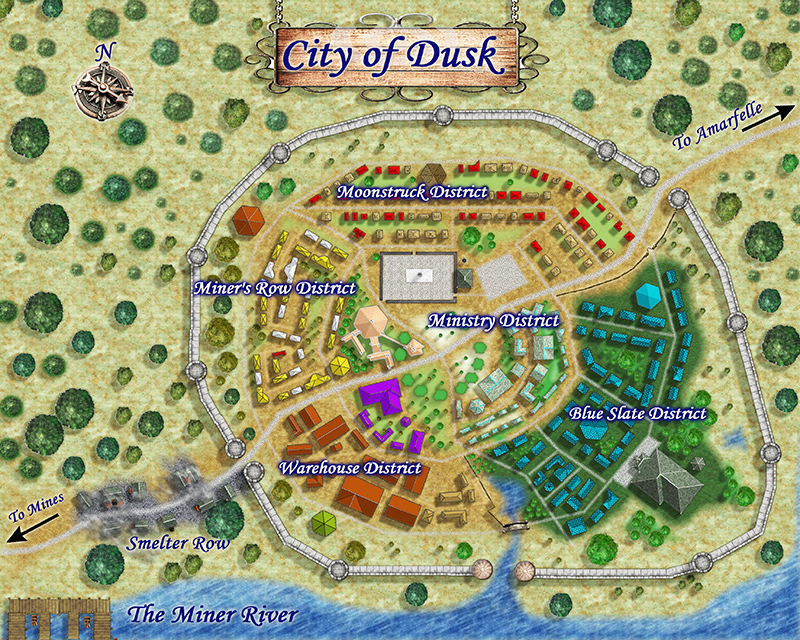
Sorry for bombarding the boards with all my works, but i've been off from work with an injury and have been spending the last 5 days leading a life of luxury and writing new material, creating new maps, and working on maps i've been working on for the last few months. So, other than my villages, of which i have several, the only large town/small city map my players have needed is one i high-jacked from the Jon Roberts Style Annual....I just tweaked the .fcw file to my needs, labeled it, and Amarfelle was born. Easy Peasy. I've been working off and on for a few months on my first city using the City Designer. Eeesh it has been a learning process to say the least. Anyway, here is my first city....Dusk, a small city of about 1800 including mining hamlets a few miles outside the city at the mountains base to the south of the River Miner. Im still working on adding a few minor details in case i need to print out a zoom of a district. The pic is kind of light and the colors are not accurate....this is the "print" version, i need to lighten my maps up considerably in Photoshop to print them up clear and crisp for my players.


Comments
But again, many thanks!
So what I do then is load an overland map I like, as an example, and save those symbols as a set. That way when I want to duplicate a nation map style, all the symbols are in one set instead of scattered around in different sets.
I like your use of color for several reasons:
1.) The color makes it easy to find what buildings are for what area of the city.
2.) The colors you used for the buildings complement each other and the colors don't clash with the building colors next to it nor the colors of map features.
Where did you get the hanging sign from? It and the compass add a lot to the map's beauty.