Larysia Cont'd: Ehmeral
 LadieStorm
🖼️ 50 images Surveyor
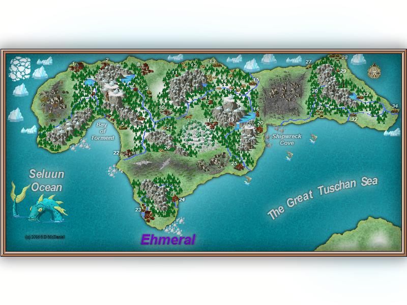
So here is the latest continent added to my world of Larysia: Ehmeral. As you can see, this map is pretty much complete, although I still may do some tweaking here and there. I started making these maps almost two weeks ago, and I am noticing something... My first map took me 4 days to make, the second one took 3 days to complete, the third took 1 day to complete, this one took me almost 4 hours... and it's the biggest one yet.
Ehmeral is in the northern most continent on Larysia... It stays fairly cold 75% of the year. there isn't a lot of variation as far as vegetation here.... it's mostly too cold for anything other than evergreens.

I hope I'm not boring everyone with my map creations. I realize they are fairly rudimentary, and straight forward, and just barely scratching the surface of what cc3+ can do. But I'm pretty proud of them, and these will work very well with my campaign. Just one more major continent to go!
Ehmeral is in the northern most continent on Larysia... It stays fairly cold 75% of the year. there isn't a lot of variation as far as vegetation here.... it's mostly too cold for anything other than evergreens.

I hope I'm not boring everyone with my map creations. I realize they are fairly rudimentary, and straight forward, and just barely scratching the surface of what cc3+ can do. But I'm pretty proud of them, and these will work very well with my campaign. Just one more major continent to go!


Comments
For instance, in your own map, I didn't know you could make an area so dark with that particular map style because I have never seen anyone do it before. So when you did it I was like " what is that?...what did she do? "...
As far as your maps go, I like them. I think you have gotten really good at using that particular style because to be honest it is not one of my favorite styles yet you use it very well. What you have done with it has made me realize that I may have to go back to some of the earlier styles and see what kind of things I can do with them now that I know more about cc3 and cc3+ than I did two years ago when I first started using that style.
I noticed that you keep uploading the maps to another website, yet you can actually upload them to here if you want to. The site takes up to size 1250 png. If you convert it to a png then upload it to here we would be able to see it up close and get a better view.
The way I do that is to go to file. Then go to Save as...then in the save in spot I make sure it is to my desktop. Then in the Save As Type spot I make it PNG Bitmap File. Then in the options part I make the width and the height 1250. I then go back and save it to my desktop. then come on this site and upload it from my desktop and then when it is done I delete it from my desktop.
as far as making your map better, I am not sure. Better is so subjective, I would have just made it different. For instance, in this particular map I would have probably used that symbol for flowing ice all along the top, and then used a few of the icebergs along the very bottom of the ice flow to show that some have broken away and are floating down. That is the only thing I would have done different. Is that better? no, I don't think so, just different.
Thanks for sharing!
~Dogtag
As for those dark places... they are just the evil lands dark terrain fill, with an inner edge fade effect. I'm so new to this map making process that I didn't realize I shouldn't use them! (lol) but I needed dark, 'dead' areas... and the evil lands terrain fill gave me what I needed, so....
I uploaded my maps to photobucket so my players can see them. Most of my players live about an hour away... so they have to be able to have access to the maps