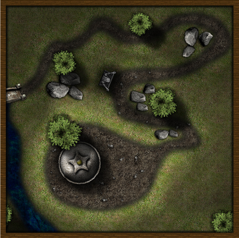
Shrine on the Hill
So here's my first try with CC3+ (or rather DD3+) and the Symbol Set 2a and I really like the style and mood of this Symbol Set :-D
However, I'm not yet quite firm with how to produce a sense of depth with CC3(+), because with Photoshop i'd just paint in some soft black Overlays and adjust the opacity to make parts of the map darker if I want ... so I found it difficult to produce a sense that the path winds up a hill, where the shrine sits atop. I'm not entirely displeased with the result I got, however. What I did was misuse the Sheet "outside shadow", give it an opacity of around 40% and an edge fade of about 15units, then use the floor tool to blot down solid black areas roughly where I wanted the map to be darker. Then created "outside shadow 2" and repeated the same for the most bottom areas. If you guys have better solutions for this task, I'd be thrilled to read of them.
Thanks for reading and looking at the map :-D


Comments
I think you did a nice job. Is this a battlemap or just a nice, small-area view? I see some real fun fight opportunities, especially with the bridge, water, rocks, statue, and that steep drop along the SW(?) edge of the hill!
Cheers,
~Dogtag
In some aspects, it looks as if it a lighted area versus a hill.
I think that for me, it is the fact that so much of the map is dark.
It may look more like what you are trying to portray if the shadowing was just around the hill (to create depth) and not on the other portions of the map (Such as across the road, the water, and in the bottom right corner.).
I hope this helps.
:-)
The top is supposed to be flat for the pilgrims praying at the shrine, etc.
The map is thought as a battlemap, e.g. if the PCs do disturb the remains of the ancient honorable warrior entombed inside the shrine, are surprised by a wandering moster while praying, or what you can think of. Since we use FantasyGrounds2 for playing, I usually don't put a grid into my maps for there's a grid option in FG and I think the maps usually make for a better showcase without it.
Having thought about CharlesWayneRobinson's suggestions (thanks a lot) I tackled the shadows once again with the result showcased below (although i chickened out and did this layer with Photoshop - sorry).
I only see two areas to tweak (Although this is still a great map!):
1. The low ground is so dark - it seems unnatural.
2. Top left - the shadow crosses the image as a straight line which seem unnatural given the curves of the height along the road (You may consider revising the shadow line).
Again, great map! :-)
Hope that helps somewhat
It looks like you placed the trees and rocks and then added the shadowing effect to try and create the feeling of height.
Since sunlight comes from above, dark trees and dark rocks side by side with light trees and light rocks make it look like an "artificial light effect" as opposed to a "height" effect.
It is one of those subconscious things where your brain says "something is off" and then you rack your brain trying to figure out why your brain is sending you this message.
Sometimes, it is just the small things that make a big difference. :-)
PS: You may want to light up the river as well.
Hope this helps. :-)
There are strictly speaking four layers ... the background (with everything on it except the "shadows", the trees and the frame), then the three things mentioned in ascending order. Additionally, i did a shadow layer onto the trees to make the "lower" trees a bit darker then the "higher" trees.
I've lightened up the rocks a bit now, as well as the river and tweaked the upper left shadow line. Additionally, I saturated the background layer a bit more and changed the color/saturation of the trees a bit. To top it off, I decided to be bolder with the shadow lines (I think this is the jist of what khalestine suggested), while reducing the overall opacity of the shadow layer.
Hopefully, I didn't twist too many buttons now ...
I don't have any more suggestions MarMorStein.
Great Work!
When you'te talking 'layers' to design diverse different heights, you actually mean 'Sheets' in CC3 parlance, right ?
@Denalor
Yes, you're absolutely right, in CC3 the correct term would be "Sheets" (though Photoshop layers and CC3 sheets are IMHO not exactly the same)