

Small Village in Jon Roberts style
 KenG
Traveler
KenG
Traveler
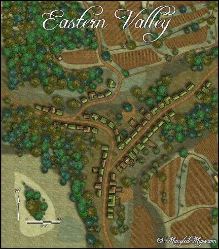
I've been playing around with this style and still really enjoy the way it makes village and city maps.
KenG
KenG
Comments
Out of curiosity, what do you imagine about the hill to the southwest. Similarly, what is the small cleared area in the center of town — the tear-shaped area with the tree in it?
Beautiful map!
Cheers,
~Dogtag
I agree with Dogtag, especilally the -hill?- shaped like a tear must be something particular... Or perhaps more edge fading?
Good eye of those fields I had edge fade not edge fade, inner and it made a difference.
Here is an update of that map.
Thanks,
KenG
Thanks,
Ken
They are easy to make, just time consuming to draw all of the plow marks.
And it only works for Spring. :-)
I love the 'cumulative' effect of the style - that is, choice of earthen colors, diffuse object boundaries, composition/layout and a very natural 'hand-drawn' feel. Often times I think that the sum of various small but important choices results in a distinctive unified style. And I think you certainly did it here. Fine job. And shows a lot of work!
Yeah, the edge fade inner is a winner - i use it a lot as well. If I may ask, is there a shading/texture layer somewhere in your sheet stack like above land/terrain and below symbols?
I would also love to see a similar map with water feature(s) - I think that the inclusion of those colors/textures/shapes might add quite a bit too.
Thanks for sharing and keep up the great work!
-Mike
What I've been trying time and again is hilly terrain and I have failed at that time and again, too.
Anyway, what I was trying to write is that you succeeded amazingly at creating that hilly terrain.