CC3+ Mike Schley Style - Scaleable?
I have started remapping one of my older maps into the Mike Schley style provided in CC3+. I'm running into an issue with the scaleability of the effects.
The map I'm working on is approximately 180 x 120 units. I know that the base scale for symbols is 1000 x 800 so when I start a new map in this style for the 180x200 dimensions the symbols are scaled at approximately .18 (.1784 give or take). The template takes care of this correctly and I have no issues with the symbols.
However, the sheet effects don't seem to scale with the template. Is there a quick way to do this (scale sheet effects)?
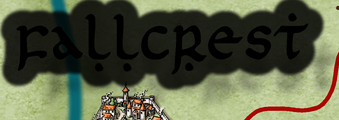
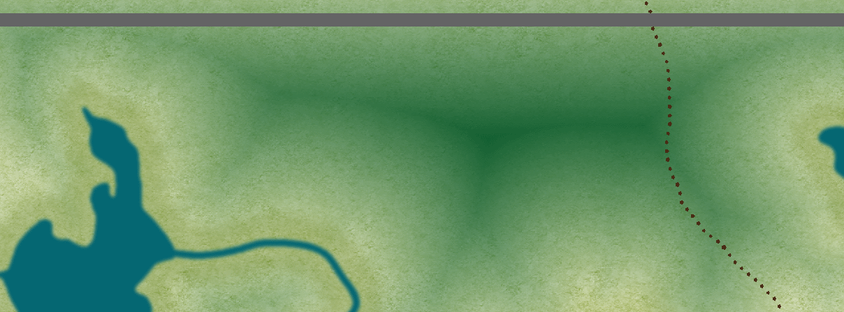
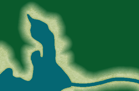
Right now the most noticeable effects happen on the TEXT and LAND FEATURES sheets. Any text on the TEXT sheet has a thick glow border around it. I was able to manually come up with a solution for that one. But the drop shadow is way off to the bottom left of the text. I want to move it more in line with the normal scale of the map. On the LAND FEATURES sheet the edge "crunches" up significantly.
Any help with scaling effects would be greatly appreciated.
Below I've pasted examples of what the effects currently look like (@180 x120 scale), and what they should look like (@1000 x 800 scale).


Comments
Map Units (eg if you want a 10 foot shadow on houses)
Percentage of Drawing Extent (most effects including text glow and and edge fades)
Percentage of Current View (just screen border at the moment.)
The Mike Schley template is set up so that effects such as a glow on the text sheet should be "percentage of map border" and so should scale with the map.
Can you attach the map so we can take a look?