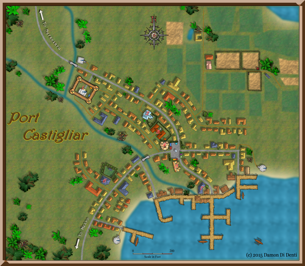
First Map - Port Castigliar
Ok here is my first attempt with CD3. I made this map as im designing a campaign for our DnD group on the Island of Chult, in the Forgotten Realms campaign setting. This will be the groups base of operations. I intend to include a fighters guild, mages guild, temple a local merchants guild, ,a Tavern of ill repute, an Inn, and a fort to impose the local authority. I would like to include a Wall that looks to be under construction around the town to give the sense of growth.
Being a Port town, i wanted it to be large and burgeoning with development and growth.Though I don't think it would large enough to have districts and such, but will get there soon.
I know i need to do some work on my drop shadows and wall shadows for the varying heights of the structures. Anyways i was hoping for any feedback, suggestions or tips. So please let me know what you guys think and what i can improve.
Thanks in advance!


Comments
-------------------------------
R A Jacobs
Learning CC3+ @ Funny-Shaped Dice
If you really want to add realism you should indeed spend some time on wall shadows but it depends on the use intended for this map.
For example the tower of the castle/fort/whatever should be longer than the walls and buildings' shadows. Do you really need such an accuracy though?
@R A Jacobs - Will do, ill check it out. I don't have PS but could prolly get my hands on on a copy, i do have access to GIMP, as do we all... perhaps the same techniques could be applied, albeit knowing the tools functions?
@Joachim de Ravenbel - Accuracy isnt needed for my group and honestly this would probably be fine for our games... but for my personal tastes and learning to play with the software's potential, I want to be able to expand on those tiny details and such, that can make a map go from good to great.
-------------------------------
R A Jacobs
Learning CC3+ @ Funny-Shaped Dice
On a side note. i just noticed and i think some of the palms tress are to big for the scale... granted its a fantasy environment and the island is full of dinosaurs, so maybe it works. Hmm.
Initially i bought CC3 for the DD3, and think CD3 was going to be tertiary, but I find im having a lot of fun with CD3 more than i thought i would.
For example, rather than coming up with a map based strictly on my imagination such as "This is my inn called The Brandywine Rest, with two rooms and a cellar", it helps if I use existing resources as a basis for my designs. Looking at a photo I end up thinking, "Hmm how would i capture the lighting here" or "I like how they stacked the barrels outside the back door of the inn" etc. Then i look up or try to figure out on how to add those details or the best way to capture my vision in the program.
...Heck, even a drive through the country or an urban city invokes thoughts of inspiration.
As another example, In my map above i noticed the wall shadows are going from SE to NW... however in the Forgotten Realms the Island of Chult sits almost directly on the equatorial line of Toril, so the shadows realistically should either be W-E or E-W, depending on the time of day. Granted this level of realism isnt needed for my gaming purposes, but it directs me to learn the Global Sun Effect.
Of course in time, I'm hoping my experience with the tools will translate into instinct so i can work mostly from my imagination. But as you implied, it's helps to have "little goals" to get over the first steps of the learning curve.