CC3+ Text Issue
Hello all,
I just got CC3+ a few days ago and love it! I really can't say enough about the changes - truly outstanding. And the performance is markedly better as well. All around a great step forward.
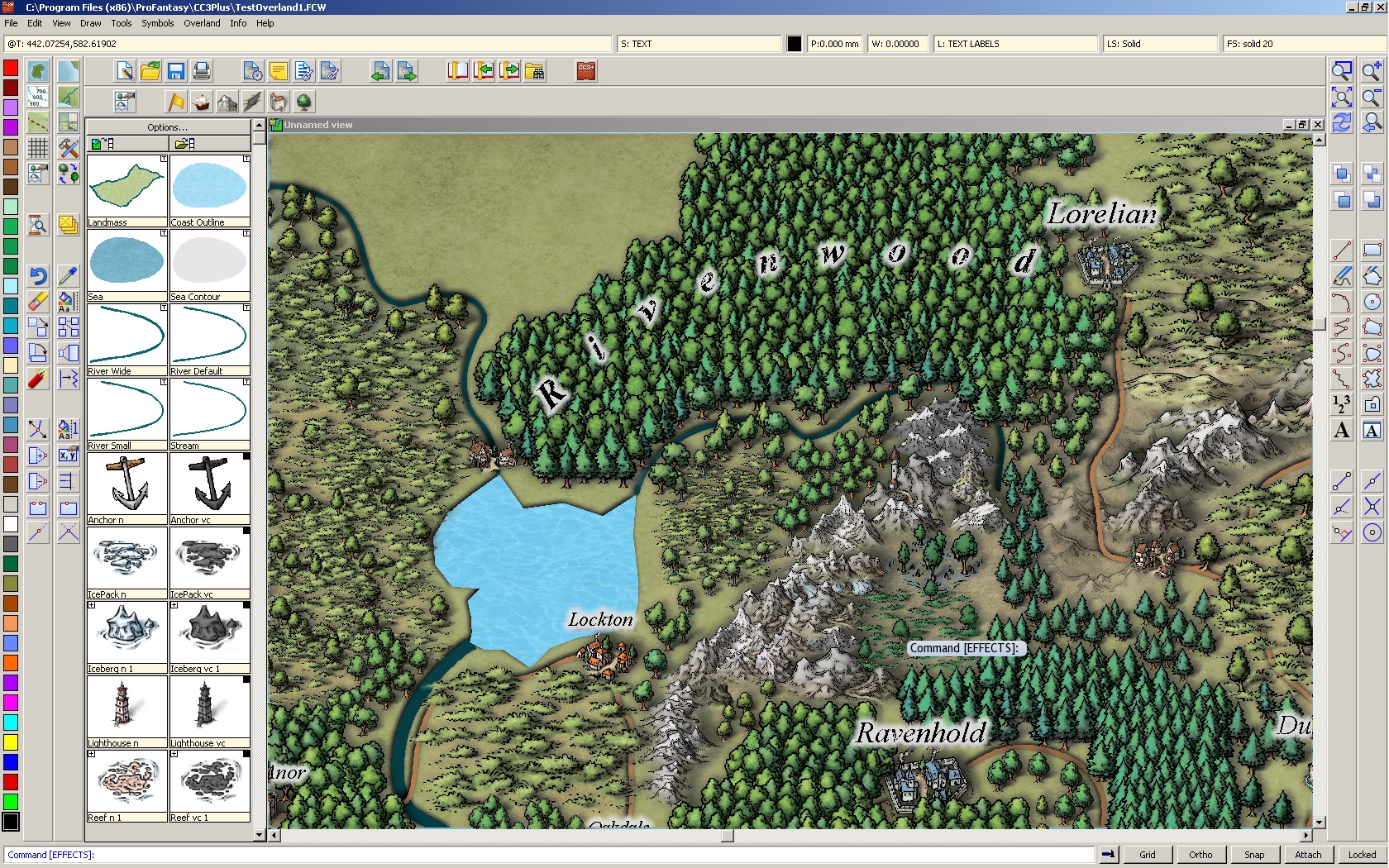
The issue I'm seeing is illustrated in the map section screenshot below of a 'quick-and-dirty' test map I'm working on. The text (inserted on the TEXT sheet and TEXT LABELS layer) exhibits what appears to be an interaction with the underlying tree symbols. As you can see the text itself should be completely black but there are sections of white which seem to correspond to the outline of the underlying tree symbols (on a new layer I added called SYMBOLS - TREES). It only seems to manifest if I have the Glow effect turned on. There are 3 sheets below the TEXT sheet (GRID, SCREEN and MAP BORDER). I've tried hiding those to no effect. There is one sheet between the TEXT sheet and the SYMBOLS - TREES sheet. However, I've tried hiding that to no effect and also, there are no symbols on the at sheet below the text in question. If I hide the SYMBOLS - TREES sheet where the trees are, the issue goes away.
TheCC3+ version listed in Help -> About is "Beta Version 3.65".
It may be something I've done or am doing but I don't think I've noticed this on other maps.
Let me know if there is any more information I can provide. And, again, thanks for the hard work on CC3+
Thanks,
Mike


Comments
Hmm, interesting. I was unaware of clear type fonts! Good thought there. Ya learn something new every day.
I checked and they are not currently enabled on this machine. It's a Win7 64-bit Home Premium (AMD FX-6100 6 core with 10G RAM and an ASUS HD7850 graphics card, btw).
Thanks for your quick response!
Yes, that fixes the issue. I had tried changing the font and style (italic/bold/underline etc) last night but had not thought of changing the color.
I apologize for wasting your time if this was 'user error'. But could you share any thoughts on the nature of the issue so that I could understand and avoid it in the future? Also, I'm just the curious type :-)
Thanks again!
Mike
There are two ways to deal with this:
Either: Change the colour or fill styles of the entity on the top.
Or:
1. Add a new sheet in the drawing before the TEXT sheet called TEXT MASK (or whatever). Hide all the sheets except the TEXT and TEXT MASK sheet
2. Right click on COPY, do COPY to SHEET, select all the text, and choose the TEXT MASK sheet.
3. Do Change Colour, Prior, Do it, and choose colour 6 (or another colour you don't otherwise use)
4. Show the sheets
For me, using a slightly different text color works fine for now but the other workaround may come in handy later.
Thanks so much for taking the time to explain the issue.
-Mike
I had text blending oddly earlier this month with roofs that had ridgelines turned on. I changed the text from black to off-white and it was fixed but I didn't know why. Thank you, Simon for the explanation about identical colors.