Finding A Procedure For Texture Climates - Progress
 Terraformer_Author
Newcomer
Well - although I have mastered the art of making Image Climates for Fractal Terrains, Texture Climates are another story...
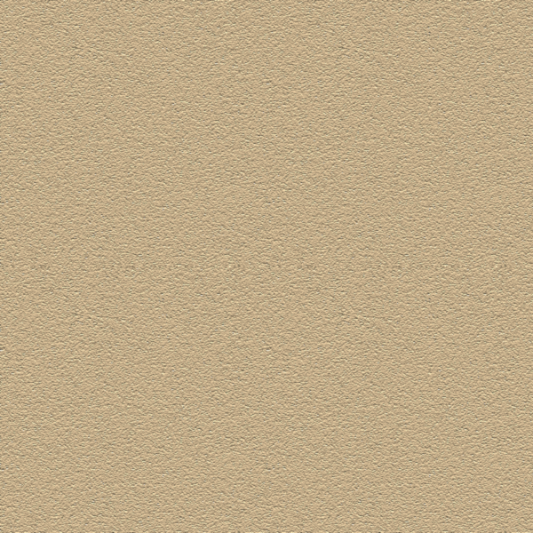
I am trying to develope a repetitive procedure for creating Texture Climates hopefully in order to not only be able to create textures based upon actual satellite image COLORS - as opposed to the full images - since the full images are NOT seamless, and thus, look like crapola due to the straight "x axis" distribution of tiling textures inherent in the new "Texture Climate" function, but to do tutorials for others that require a minimum amount of natural talent to execute. It is literally like trying to fit a sqaure peg into a round hole. Below is a single "Desert" texture tile that I have developed using a procedure in GIMP:
I am trying to develope a repetitive procedure for creating Texture Climates hopefully in order to not only be able to create textures based upon actual satellite image COLORS - as opposed to the full images - since the full images are NOT seamless, and thus, look like crapola due to the straight "x axis" distribution of tiling textures inherent in the new "Texture Climate" function, but to do tutorials for others that require a minimum amount of natural talent to execute. It is literally like trying to fit a sqaure peg into a round hole. Below is a single "Desert" texture tile that I have developed using a procedure in GIMP:


Comments
It is now apparant that these tiles have to have more color variation, but HOW? Should I try layered masking? Should I go back to attempting to "force" full images as opposed to just their colors into it?
This is going to take time. The colors are correct - but some colors clash big time, while other colors are just too similiar to be noticeable at all...
Here are the Tiles in my test folder as they stand now - each 600x600, I know that some of the colors look the same but they are in fact,not. They were sampled from the correct climate zones on a "truecolor" world map courtesy of NASA'S Big Blue Marble website.:
1) I tend to do images as a power of 2: it's a leftover tic from long ago
2) 256x256 was the size that I could find reasonable swatches of relatively nondescript but representative terrain on MODIS 1km images.
3) making seamless images via shift and clone is quicker with smaller images.
4) swatches needed to have fairly constant luminance so that the terrain shading wouldn't be overwhelmed.
5) the shipping swatches are the product of an afternoon's work, if I recall correctly.
There isn't any visible difference between deep trench and open ocean on satellite photos. Deeper than a certain depth (100m or less), the ocean color is determined almost entirely by the garbage suspended in it rather than depth. The shallows swatch in the default texture set are sampled from the Bahamas shelf; the ocean and trench swatches are completely arbitrary colors because the "real" open ocean color is a bit darker than the trench swatch.
Use of the MODIS imagery resulted in a slight blue cast to the images as is usually seen in raw satellite photos. It's nothing too bad, but it's definitely there. Using higher-resolution imagery might give better results by allowing for bigger swatches from the same general area, but doing so might be a bit area-specific. Certainly, bigger swatches would reduce the obvious tiling.
I've been working with a MASSIVE True Color Earth mosaic map from NASA'S Big Blue Marble site (resolution on this specific map is - believe it or not - 21600 x 10800 - causes my computer to hang quite a bit from time to time and I'm using a 64bit with a threaded processor, Windows 8, and about 4gig Ram DDR3) and I have also been moving between regional satellite photos of just about everyplace that you can think of that I have collected (fat image folders to be sure!).
I have considered using huge swatches of full images, but it's apparent that - I don't think that - they'll look quite right. Cloning images is a tricky thing because I've messed up seams before trying to "improvise" too much, I'll try to get around that - but it's still a fall back option. I'm guessing that to get this right (in my own mind) - you have to think in terms of tiling and repititious patterns (keeping the right ones and avoiding the wrong ones). I'm thinking that if I can crunch together a procedure on making decent textural patterns and agreeable colors - luminance might not be an issue to worry about - if I can find a "trick to it".
I can keep swatch size down by figuring out how to make the images integrate better - have a better sense of "organic flow" - by improving textural and color approaches. Next I'm thinking about layering a difference cloud as a transparency mask over the base image (tileable cloud - seamless) - and then placing an ever so slightly blendable color over that - per swatch - to get the illusion of localized color variations on the swatches.
I'm not sure if that would help - but it's worth a go.
I'de also like to get the texture finish on these a little finer to.