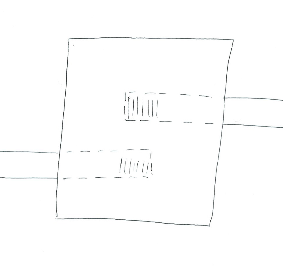
Show hallway running under a room

Not sure how to do this, or if its even possible, but figure someone here will know. Also, forgive me if this is already posted here or if the answer is obvious, I'm new to the apps and couldn't find an answer in the forum. So here's the problem:

I have a single level dungeon that I'm designing. One of the rooms is elevated slightly from the others and is entered through one of two doors located on the room's floor (sort of like a basement bulkhead). To help visualize this, I've attached a drawing, but what I would do if hand drawing it would be to show the room where it is, and then draw the two hallways normally until they reach the room wall, then continue with dashed lines and maybe a dashed set of stairs until they reach the doors in the middle, suggesting that they are actually below the room's floor.

Any suggestions from those in the know?

Thanks

Comments

  • It depends on visual style you want to achieve. You explained how would you express it in a hand drawn form. In other visual styles you can play with transparency, in Perspectives Pro you can show elevation quickly. You can assign some drawing tool (with fills) that show there is a corridor under the room, etc. It depends a lot on the visual style you aim for. :)
  • I did that in one of my dungeons. I'll see if I can find the png.
  • JimPJimP 🖼️ 280 images Cartographer
    edited February 2014
    example one. Corridors BN, CA, BQ were drawn after the corridor that goes 'under' them.
  • Please note that I only have the big 3 (CC3, DD3, and CD3), so I'm looking for a way to do this (preferably with the nice 3d graphics stuff in them) using only stuff in those 3 apps. I should've mentioned that before :)
  • JimPJimP 🖼️ 280 images Cartographer
    edited February 2014
    example two, a cave on both sides of a cut out passageway. The cave part is 10 feet down from the corridor. These two are in CC2.

    Arrows next to doors are direction the doors open. Rooms are numbered and corridors have letters.
  • These examples were done with CC2 and DD2.
  • JimPJimP 🖼️ 280 images Cartographer
    edited February 2014
    Here is a trap area, sideways, from a sketch I made and imported into CC2. Done with CC2 and DD2. Transition from level 3 to level 4 of Dwarf Home on my Crestar site.
  • Posted By: sauron11Please note that I only have the big 3 (CC3, DD3, and CD3), so I'm looking for a way to do this (preferably with the nice 3d graphics stuff in them) using only stuff in those 3 apps. I should've mentioned that before :)
    Who's the intended audience for this? Is it meant to be a battlemat used in actual play, for a VTT, or just for your own reference? Have you thought about just drawing the "under" rooms on another layer/sheet?
  • If anyone wants me to post the CC2 map, so you can see more how I did them, just post here and I'll do that.
  • DogtagDogtag Moderator, Betatester Traveler
    Hi Jim,

    I, for one, am always happy to see the FCW for someone's map so I can learn how they did stuff. If it isn't too much trouble, please do post them.

    Many thanks,
    ~Dogtag
  • Hard to say what the intended audience is at this point. It's a new group with mostly new players, so we're trying a few variations on how to handle mapping to see what's best for our group. I have one map being done "old school" and just drawing the walls out in advance on a flip mat (filling all other relevant details in as we go), another that is a reference map for me that has the 3d DD3 stuff that I need to track during the game (but not every bed, barrel, and body) where the players will be filling in details on a flip mat as they go (and probably get a copy of the pretty map after they finish that particular dungeon). Then there's this one, which I'll be printing out as a tabletop battlemap to see how that goes. Each map has its own adventure of roughly equal scale allowing us to test how much fun is lost by being able to guess at things yet to come, and how much is gained by really pretty maps. Once we've been through them, we'll decide what works best for us all as a group and go that way. No matter what the choice though, I'm likely to still draw the crazy cool map for my own reference - at least once I know how, I'm likely to do that, lol.

    Having said that, I like some of the 2d examples I've seen in the reply, and they would work great, but I'm trying to do this 3d if possible. I've shown the bit of the map in question (though as I learn how to do more cool things, I'm likely to make a new map, though this particular room would remain with the same problem). Specifically, the circle room sits on top of the 2 hallways leading up to it and the trap doors inside each lead to one of those halls via short stairs. Since this is the only room in the entire dungeon that isn't at the same elevation, and is only a few feet higher (maybe 8-10 feet at most), I don't think moving it to its own level makes sense in this case.

    I'd appreciate any ideas anyone has on how to do this better, and thank you all for the help so far.
  • edited February 2014
    Here's my quick & Dirty Solutions: I used the transparencies "Solid 10 White" & "Solid 20 Bitmap", both if not already in your catalog are found under "CC3/Bitmaps/Transparencies". After drawing the basic floorplan including adding the underground passages --on top-- of the basement floor so that the pattern is slightly different, I covered the parts that were to be readily visible (the access points such as ladder & stairs) & the passage continuations outside the basement with a solid box of "Solid 20 Bitmap" so that it appears slightly darker than the Basement floor. The part of the passageways that are obscured by the basement floor I "suggested" the outline by covering that section with a box of "Solid 10 White". Those two steps are the key the rest is decoration.

    The decoration consists of adding perspective walls by using the brick bitmap fill for walls with angles & emphasis of corners, edges, etc. using a black line. All of these I added on the "Floor" sheet. I added the ladder symbol & the stair symbols, etc. The Stair symbol for going down into a passage I made sure that I layered it under the wall edging & the "Solid 10 White", etc but above the "Solid 20 Bitmap" & the actual base floor by putting it on the "Floor" sheet. Took me a very brief time to do this including some experimenting time for fun. Feel free to contact me if you want the original drawing or you have questions.
  • DogtagDogtag Moderator, Betatester Traveler
    You can make copies of the floor and wall sheets and place them above the regular floor and wall sheets. With a transparency effect on the copied sheets, you can give them an "x-ray" effect to the sheets below. I did a quick proof of concept that turned out like this:

    image

    Is this the sort of thing you're thinking of?

    I had to tinker with the default sheet order and I tweaked the effects a bit too, but I've attached the FCW so you can see what I did.

    Cheers,
    ~Dogtag
  • DogtagDogtag Moderator, Betatester Traveler
    LOL! I posted too late! Sven, your map looks great!

    ~Dogtag
  • They both look great, I think dogtag's is exactly what I'm looking for with this particular map, and Sven's is perfect for others. Thanks all for the help.
  • DogtagDogtag Moderator, Betatester Traveler
    Sweet, thanks Jim!

    ~Dogtag
  • DogtagDogtag Moderator, Betatester Traveler
    @Sven - That was a really cool solution! It was late here when I posted and saw your map so I really just skimmed your text with my sleep-craving addled mind. Now I had a chance to give it a good read. Neat!

    ~Dogtag
  • Posted By: Dogtag@Sven - That was a really cool solution! It was late here when I posted and saw your map so I really just skimmed your text with my sleep-craving addled mind. Now I had a chance to give it a good read. Neat!

    ~Dogtag
    Thank you very much for your kind words Dogtag & Sauron. Dogtag, I believe the technique I applied to mine would also work on the closer scale that you were using, so your looks really good & I'll have to play with using the style. Most of my work consists of Historical battlefields or Theatres of War, with occasional forays into TOE's & game diagrams for illustration (see the upcoming: GHQ TacNews or "All Quiet on the Martian Front"). I've never seen any mention in the CC3 documentation, Annuals, etc of the "Solid ## White" series, but just wandering through the bitmaps, & icons using the file-browser in my OS I have found all sorts of nifty & unknown stuff!

    My website to give you a better idea of my focus: https://sites.google.com/site/vikingjarl/

    Ves thu hael,
    Sven
  • Posted By: DogtagThe maps on your site are very nice, but it's hard to top that picture of you with the lion cub!image

    ~Dogtag
    Thanks for the kind words on my maps. I really like that shot of me & the cub. He ignored everyone else including his handler for the rest of the day & followed me like I was a big lion according to his trainer. However the picture of me shooting a 150 yard shot dead center with a blackpowder muzzle-loading rifle also gives me fond memories.
    Sköl,
    Sven
  • Posted By: DogtagSweet, thanks Jim!

    ~Dogtag
    You're welcome.
Sign In or Register to comment.