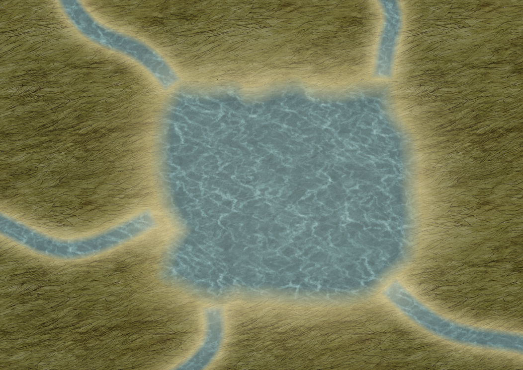
Better rivers and lakes? (Sheet Effects - Herwin Wielink style)
I notice that in the examples provided in the annual, the rivers and lakes do not even use the style in the default Herwin Wielink sheet effects. Instead, the CA71 uses no effects on lakes and rivers.
This makes sense, as the Lake layer has double glow, which looks very odd with blue water. I assume it looks better with the green water. Unfortunately, I can't get it right with the blue.
However, I am having a lot of trouble with the rivers' and lakes' sheet effects.
The rivers and lakes look ugly and rigid without any effects at all. Glow effects seem to make them look bad, and on rivers...any attempt to do surrounding yellow (sand) glow is too strong, even at 0 strength. Lakes however, can use this yellow glow to look like sand surrounding it, and it looks alright when combined with fade edge inner.
However, the problem with that is the rivers, for some reason, are surrounded by yellow glow even though only the Lake is suppose to have that effect. Not sure why the river has the effect surrounding it when it is inside the lake. If it isn't inside, and is instead "On" the lake using the "On" connecting tool, it doesn't connect enough to look like the rivers flow into the Lake.
The rest of my map looks phenominal, from the mountain ranges to the farmland. Why do rivers in CC3 look so...bad? They look like someone just erased some texture to reveal water underneath, but didn't even use a transparent eraser. It's a hard eraser look.
Anyways, this is the best I can come up with, mainly by ignoring the default River/Lake effects and creating my own using edge fade inner:


Comments
Which do you think look better, with or without the "sand" glow?
Thank you very much! Now I know how important the colors are.
I used a double glow of a darker sky blue color. One inside, one outside.
I don't think I'm experienced enough to answer your question, but I have a question myself, after seeing your work here.
How do you get rivers to attach so smoothly to the lake? Whenever I try using the "Attach On," button with rivers, I get at least one corner of river's end not attaching with the lake, giving it a jagged, disconnected look.