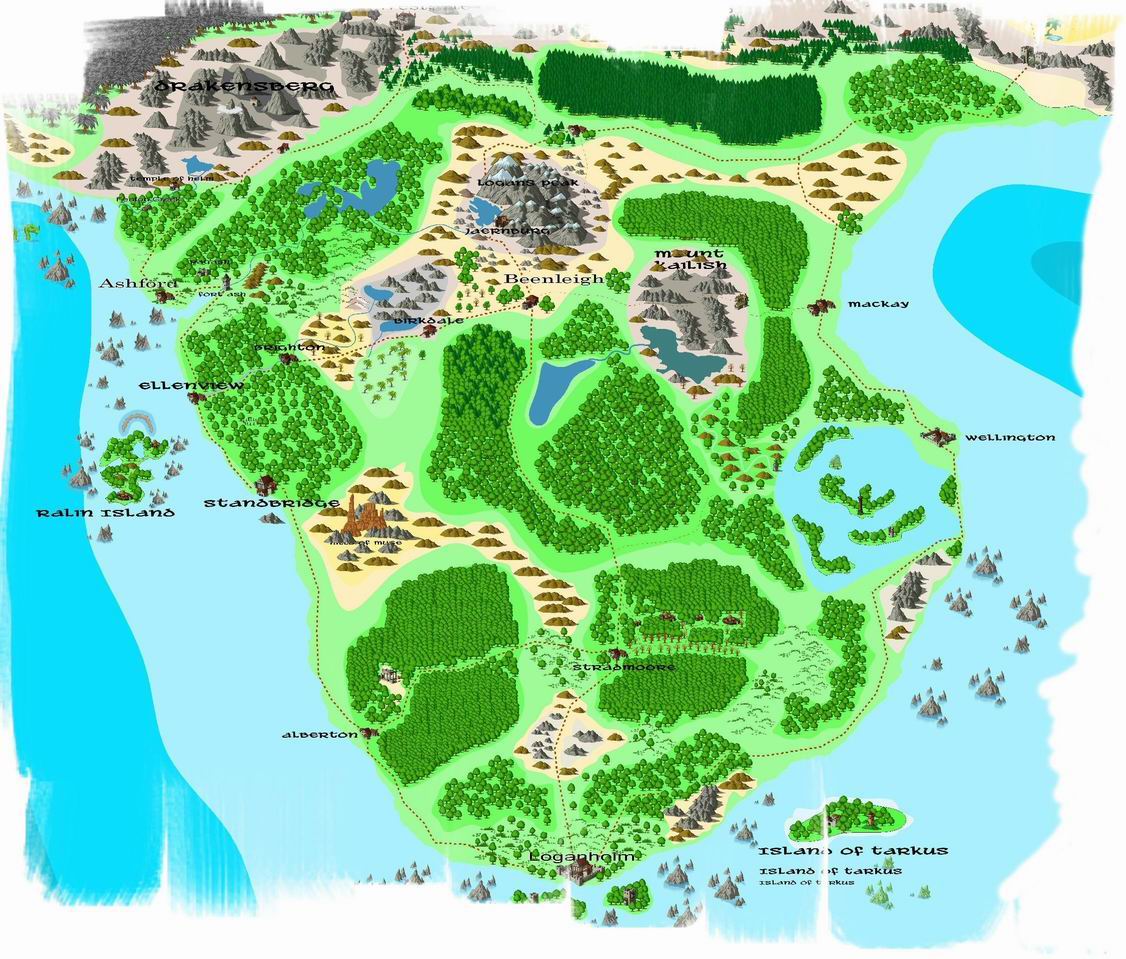
Loganholm Campaign - Overland Map
Hey, this is my overland map.
I would love some comments on this one, especially since I have been struggling with this for a while and it still seems to be very "basic".

The map has slowly been converted from CC2 to CC3 symbols which has been an improvement, but there are still alot of work to be done...:-( but not sure where to start ...
I would love some comments on this one, especially since I have been struggling with this for a while and it still seems to be very "basic".

The map has slowly been converted from CC2 to CC3 symbols which has been an improvement, but there are still alot of work to be done...:-( but not sure where to start ...


Comments
This looks awesome.
The only suggestion I have would be to "feather" the edges of the dense forests a little more - use some of the more broken up tree symbols on the edges, otherwise you can tell where blocks of trees were "stamped on". Also, if you put some of your contours (both landmass and sea) on different sheets, and apply an effect to blur the edges, it would look cool (though slow to repeatedly re-render).
I think I'll take a lesson on this on the sparser use of symbols, I tend to crowd them in.
Ah, love the advices - will have to try that ...
The region seems heavily wooded so I would probably put some more single tree symbols and small copses more or less randomly through this part of the map.
Another thing you could do is turn off the outlining on the sea contours. I find that seas look better without this. Conversely though I tend to favour the coast being outlined. Though this is all a matter of the style you like. Another possibility is to replace the white background with a parchment fill, it does depend on what sort of effect you are going for though.
On the whole though I liked this map it is easy to follow, has interesting features and gives a real sense of what this country would be like.
nice map BTW
thanks for sharing...