WIP Traianopolis Black and White city style

My first attempt at a B&W city map
Must say I really love working with this style and the selection of buildings available is really good.

Have to work on the effects and finish the city, I cant seem to get the citywalls with shadow without screwing them up completely. Any ideas?

I'm going to work on the harbour and finishes the city next. The program is still running fine with this huge city which is great news !
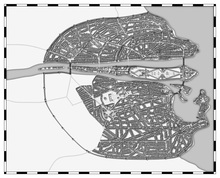
Image Hosted by PicturePush - Photo Sharing

Comments

  • Have not done cities yet, but this looks very promising. Nice work. It must have a hell of a population :)
    JSM
  • Very well done.
    Working on a B&W city myself but not this huge.
    Must be a lot of work.
  • Posted By: jigsawmanHave not done cities yet, but this looks very promising. Nice work. It must have a hell of a population :)
    JSM
    In case you want to make cities there are great tutorials by Gandwarf and Clercon.
    Posted By: Henrie61Very well done.
    Working on a B&W city myself but not this huge.
    Must be a lot of work.
    Its actually relatively quick as long as you use the street tool extensively. Your map inspired me to make this one actually hah
  • DogtagDogtag Moderator, Betatester Traveler
  • New version, added 3 seperate walled area and attempted to create a moat but that didnt go too well.
    Good thing about Christmas is that I have plenty of time to finish this map :)

    Image Hosted by PicturePush - Photo Sharing
  • Coming along nicely.

    Usually when they wanted a moat for a city based on a river they made sure the river split at the desired points.
    So you could try to draw two smaller rivers that run around the city.
  • That's actually a great idea. It will make it look more natural as well. I'll just extend the city walls a little.

    I would've been easier to do the moat first now I think about it but oh well, how is Zibor city coming along?
  • Zibor city (its onle a working name) is coming along slowly.
    A bit of progress but not that much.

    Maybe some work later today. Will post an update.
  • This is really cool...love the harbor design
  • DogtagDogtag Moderator, Betatester Traveler
    It's amazing to watch these maps as you build them.

    ~Dogtag
  • 10 days later
  • edited January 2013
    Done, took quite a while to tweak the fields and do the effects.

    I've made 2 versions a lighter version (less shadow) and a darker version. Notice the difference in actual shadows is only 25%. It surprised me how this small changes the look of the map completely.

    Which version do you prefer? Any ideas on how to improve this map?


    Lighter
    Image Hosted by PicturePush - Photo Sharing
    Darker
    Image Hosted by PicturePush - Photo Sharing
  • Great Work! I definitely prefer the darker version which gives us a little bit more contrast. Actually, if you have access to photoshop, you might want to consider throwing it in there and adding a bit more contrast to the whole map to really make it pop. (Not sure if there's an easy way to do that sort of thing within CC3.)

    The only other thing I would like to see is the name of the city somewhere on the map. Also, maybe a label for the names of the river and ocean (however this might just clutter the map up...)

    Either way, really really cool map.
  • KenGKenG Traveler
    I prefer the dark one also, it gives a better contrast, but both are great . As for ideas the only thing I might suggest is to give the water a bit of dimension.
  • Thanks for the comments. I personally prefer the darker map as well.
    I'll tag this city later when I have decided which city on my this is.

    As for the water, I really have no idea how I could give it a bit of dimension to be fair. I have actually never used photoshop in my life, might have to start using it :)
  • Gratz, think this turned out very well.

    Like the way you did the moat. Now I have to do one also :-)
  • 1 month later
  • edited March 2013
    A new texted version, I used GIMP to darken it further and added some texture.
  • DogtagDogtag Moderator, Betatester Traveler
    The texture and the watercolor-like filter are neat, but I'm curious why you darkened it so much? I love everything else about your amazing map but, honestly, I think it looked much better when it was lighter.

    Otherwise, as I mentioned, it's amazing. Bravo on a masterful map. It's the kind of map that makes you want to explore every nook and cranny to find new details.

    ~Dogtag
  • Thanks for the response , I was basically testing filters. But yes maybe it is too dark now. I fixed some shadows just now and i'll make a new and lighter version tomorrow
  • Posted By: anomiecoalitionActually, if you have access to photoshop, you might want to consider throwing it in there and adding a bit more contrast to the whole map to really make it pop. (Not sure if there's an easy way to do that sort of thing within CC3.)
    To make this style look darker and giving it more contrast simply increase opacity on the wall shadow.
    The standard is 35% for this style and if you raise it to 50% and increase length is already shows a remarkable difference.
    Just figured this out actually.
Sign In or Register to comment.