Symbols Project : Tree Painting And Crappy Colors?

Hi guys.
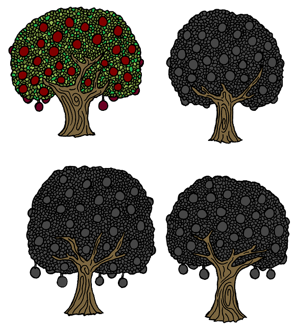
Ok - so - I'm beginning the process of painting the tree drawings that are stacked in my physical (real) ink drawing folders, and I ran into a little problem. After I scanned them in and cleaned them up in MS Paint - they looked great - that is - until I started colorizing them. After trying a dozen color combinations, for some reason - they still don't look right. The colors aren't wanting to contrast properly. Does anybody have some ideas on what's going on here? Here's some orchard trees that I've started on - and you can see what I mean. Am I using colors that are too dark or what? It just seems like the colors are just bleeding into each other to where it's hard to break up the individual parts of the tree. If I try a lighter shade of green on the tree leaves - or a lighter shade of color for the trunk(s) - it's not going to look right - just fishing for ideas...

Comments

  • edited December 2012
    Ok - I changed around the colors and added some shading, to me it looks "not good", nevertheless - please submit input - Lol :)
  • I like the top left color one. The one with the multicolored leaves. What's wrong with that?
    JSM
  • Posted By: jigsawmanI like the top left color one. The one with the multicolored leaves. What's wrong with that?
    JSM
    Well J, If you were to scale that tree down to a small enough size to be practical on the map, the details will "bleed together" - and it will look kinda like mush i think. The colors are too similiar in tone.
  • I'm not very talented, artistically speaking, but I kind of prefer the second one, it has more volume. But I think your line is too thick on the leaves, and whatever you do, I'm afraid it will badly interfere with the drawing when you scale it down.
  • What does a mass of green, with some lines hinting at leaves, and red areas for the fruit look like ? The trunk looks okay to me. The lines around each leaf and fruit are very thick.
  • Hope you don't mind TA; I pulled the second image into photoshop and played around a bit. I increased the Brightness, Saturation and Hue for this one. Thoughts?
  • I liked it. But it is a bit too much bright. A little more darker and would be great IMO.
  • edited December 2012
    Posted By: ShessarHope you don't mind TA; I pulled the second image into photoshop and played around a bit. I increased the Brightness, Saturation and Hue for this one. Thoughts?
      Shessar - On one hand - that DOES improve it a little because the trunk, leaves, and fruits are more discernable - but on the other - "maybe" - it might be a tad bit too bright. That's the problem - it's like they're cursed or something, lol. I can't seem to find a good balance. So - is it Tree#1, Tree#2, or Tree #3? Lol.

      And no - I don't mind you experimenting with these orchard tree images, where else in the heck do you think I'm going to get my ideas from anyway? Lol ;) I have a stack of multiple tree drawings that I have to find a color plan for. Heres the original full resolution tree sheet - experiment at will, but let me see the color ideas so that I can get a grip on a good M.O. for these (Don't forget to crop and scale down the tree (s) before posting - BIG IMAGE!).
    • Posted By: GatharI'm not very talented, artistically speaking, but I kind of prefer the second one, it has more volume. But I think your line is too thick on the leaves, and whatever you do, I'm afraid it will badly interfere with the drawing when you scale it down.
      Posted By: JimPWhat does a mass of green, with some lines hinting at leaves, and red areas for the fruit look like ? The trunk looks okay to me. The lines around each leaf and fruit are very thick.
      Yes - the lines ARE thick (Gel ink is an aggressive soaker, and a Kohinar custom fine line pen is around $40.00 last time I checked) - but scaled - it shouldn't look all that bad?
    • I'm going with the saturation 50+ on leaves only Shessar. I'm moving this into Windows Paint for RGB sampling. The saturation on total 50+, and the Saturation on total 75+ I'm going to use as a color pallette for tropical plant and palms and such.
      Thank you my friend!!!
    • Yeah, that saturation +50 on the top right looks good to me.
    • jslaytonjslayton Moderator, ProFantasy Mapmaker
      edited December 2012
      When shrinking them down to smaller sizes (assuming that you're going to make smaller versions), try a MAX function and blend with the image before shrinking it. The black lines will be reduced in intensity a bit, as is shown in the attachment. The left side is just straight reductions of the +50saturation on leaves, the right side had a maximum + 50% blend with the original image to tone down the dark areas before reducing. It did soften the lines a bit, though.
    • edited December 2012
      Posted By: jslaytonWhen shrinking them down to smaller sizes (assuming that you're going to make smaller versions), try a MAX function and blend with the image before shrinking it. The black lines will be reduced in intensity a bit, as is shown in the attachment. The left side is just straight reductions of the +50saturation on leaves, the right side had a maximum + 50% blend with the original image to tone down the dark areas before reducing. It did soften the lines a bit, though.
        Ok Mr. Slayton - are you referring to an operation in GIMP - or in CC3? I'm using GIMP, MS PAINT, and CC3 for these. Let me know and I can fill in the blanks from there (I'm a quick study).
        What you just pointed out is critical info for me - Yes, I'll have to scale before moving them into CC3 - and AFTER transparency layering with the wand (GIMP).

        Could I get an abridged check list procedure on doing this possibly? Thank you sir.
      • jslaytonjslayton Moderator, ProFantasy Mapmaker
        I was using Photoshop for these. http://wtanaka.com/node/7705 describes a way to achieve what should be similar to the maximum effect in Photoshop but using GIMP.

        Make sure that you chop out the background before shrinking to ensure that the alpha channel at the edges smooths along with the rest of the image.

        What I did here was to do a 1-pixel maximum (which picks the lightest color in a 1-pixel radius) to reduce the heaviness of the lines, followed pasting a 50% opacity version of the original image over the top to get back a little more of the lines. Then I just did a size reduce. One thing that you might want to do after the skrink is to hit the image with just a little bit of the unsharp mask, but that will punch up the lightness of areas, so it might not be ideal in this particular case where there are so many edges.

        Another way to reduce the line thickness is to scale up the image by 50%, do the 1-pixel maximum, and then shrink the image back to original size. The attachment does just this process on the first one and then shows some reductions. The lines will be a little less muddy on reduction this way, I think.
      • Interesting that most of the comments are about the leaves -- for me the challenge is the contrast of the apples. Maybe a gradient from the center to something less contrast-y at the edges (medium gray?) would help.

        If you haven't already, you should try making this a symbol now -- my experience is cc3 seems to over-weight the lines, making sure that they show up as much as possible. I worry that on this symbol, the green of the leaves will get covered with the black of the (over-emphasized) black lines between them. Emphasizing the lines makes sense in most map situations, just not this one.

        Steve
      • edited December 2012
        Posted By: sdavies2720Interesting that most of the comments are about the leaves -- for me the challenge is the contrast of the apples. Maybe a gradient from the center to something less contrast-y at the edges (medium gray?) would help.

        If you haven't already, you should try making this a symbol now -- my experience is cc3 seems to over-weight the lines, making sure that they show up as much as possible. I worry that on this symbol, the green of the leaves will get covered with the black of the (over-emphasized) black lines between them. Emphasizing the lines makes sense in most map situations, just not this one.

        Steve
        As far as the leaves are concerned - #1, ALL of the tree drawings that I've done are drawn like that - So it would be horrible to toss them in the can of misfit doodles. #2, I'm hoping that this might actually create a more robust - but not "yucky" effect on maps once they are scaled and properly applied. I would make them symbols already but I'm OCD at following an agenda - and mine is "draw them first - then transparify them - then scale them - then import them into CC3 and catalogue them".

        Also - about the fruit - I have been experimenting with that. Here is an image of my latest tree test:
      Sign In or Register to comment.