Palace Complex ("Telar in Norbia" Dungeon 31)
Unfortunately, my real world responsibilities have kept me away from mapping lately. So my progress on this map has been a little slow, but figured I'd share what I have so far. This is a palace complex in a semi-ruined and abandoned city in a desert environment (my obsession with the desert continues) derived from an old dungeon magazine adventure. The palace itself is the large building to the south and the other two buildings are a tomb (NW) and Scrying Chamber (NE). I'm still making my way through the dungeon dressing phase and haven't been able to work on the background or frills yet. The map border itself will have to be increased to give me some room for background stuff and a key.


Comments
But neither seemed to really do enough, so I thought what if I turn this into two maps and include roof tops. *(If I decide to continue on this roof route, I'm going to need to rework my sheets...and I have ALOT of sheets on this map already, so ignore the doors that appear on the roof of the lower level map and how those roofs don't fully cover the outer wall)
Comments and suggestions are welcome...particularly if you have ideas about how to better depict the two heights. I'm thinking that maybe i'll try to change the sun direction in this map so that shadows go north rather than south (assuming that a global change in sun direction would automatically change all my other shadow settings...haven't experimented with that before). Maybe this will help to illustrate the height difference.
I would suggest you only show the roof of a building when the roof is at or below the currently-displayed level. Further, if there is nothing of note for a given level of a building, fade the building and maybe show only the walls with a dark, "shadowy"-type fill.
So, for example, at ground level, the main palace would just be a wall outline with a shadowy fill, possibly faded. This typically denotes "below the current level" to me so maybe don't fade it. If there isn't anything at ground level for the palace, however, you can show what is at ground level (maybe a rock or sand fill, within the foundational walls.
At the next level, if there is only one level for the smaller buildings, you show the roofs for those buildings and the floorplan for the palace. Maybe fade the rooftops, but the rooftop image should also convey that we are now "above" those structures.
If there is another (higher) level to the palace, then I would definitely fade the rooftops or leave them out altogether.
Just a thought.
~Dogtag
EDIT: Re-uploaded the images so they're only 800px wide. The last ones were H U G E ! And these images are just for illustration ("illustration," ha ha ha... I crack myself up). Detail isn't important on the mockups.
The added twist, is that those lower buildings are actually supposed to be shaped like a pyramid and have an upper chamber (that is either secret or real difficult to access.) So, i'm really going to need to work out the overall presentation...preferably on one image, but its increasingly looking like I'm going to need several. Maybe 1 will be similar to what you illustrated above, 2nd being similar but with just the pyramid top floor, 3rd with the palace complex and pyramid roofs. But...first i need to finish dressing this thing.
Thanks again
You know, with complex vertical level layouts, such as the pyramid-y kind of thing you described, you might consider a small map, near the key, that shows a less-detailed, cut-away side view to help orient the reader.
~Dogtag
In the meantime, you can see some of Joachim de Ravenbel's original work on that style right here in the forums! Check out his original mind-blowing forum posts here. He doesn't explain how he did it in the forum but he did post lots of amazing pics, which might at least serve as inspiration.
~Dogtag
Thanks Dogtag!
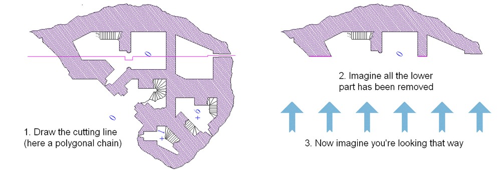
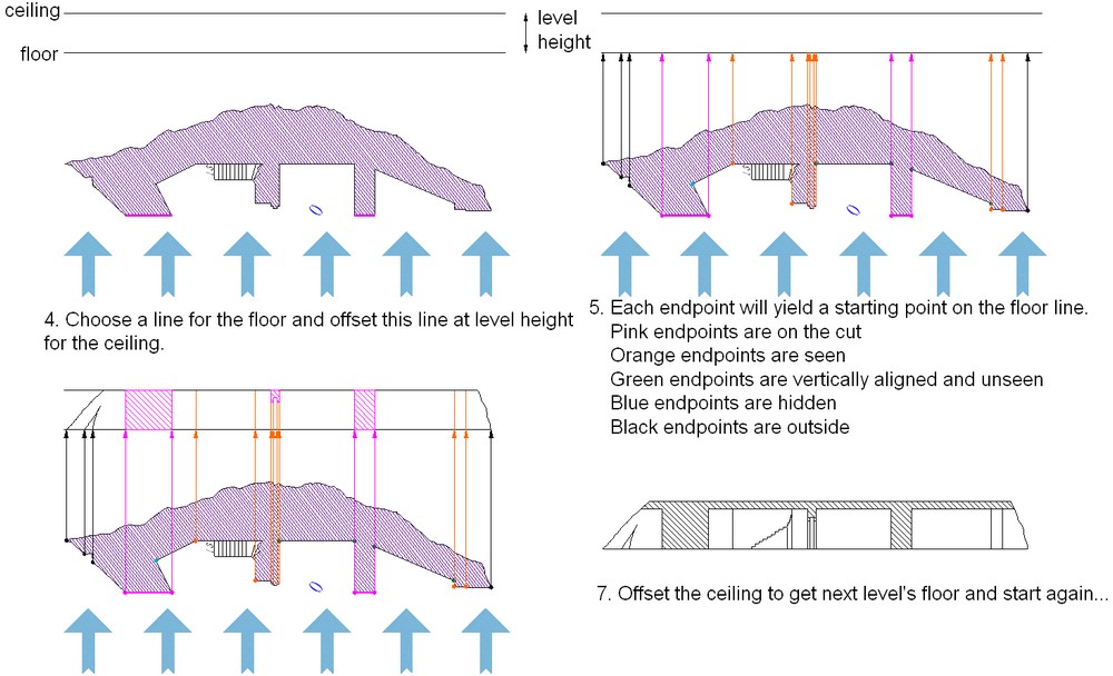
The basic for doing elevation is drawing a cutting line throught the floorplans and project anything from one side of this line. Doing elevations can give you quite some insight about the realism of your building.
In that case you need to make those *roofs* sharper, they look like they are curved. I understand you try to do a color gradient to suggest the slope, but you need to make the top straight, something like :
(sides are shaded polygons on a separate sheet with a glow, inside, black, effect.)
Thank you, for sharing your work with us. It's truly inspiring (as you can read above)!
@anomiecoalition
I agree with what JDR said about the pyramids. What he posted looks much more angular, though his sample doesn't go to a point. If the pyramids are like the ones at Giza — like an old d4 caltrop — then you might want to extend the diagonal all the way across from corner to corner.
~Dogtag
In the mean time, here is my latest attempt at the pyramid roof. I tried Joachim's suggestion, but wanted a softer diagonal line cutting across it. Couldn't figure out how to do it, so I settled on a more "blocky" pyramid design. So i created 6 sheets each having a variety of effects (glow, bevel, texturize, and shadow). Pretty happy with it, but eager to here what people think. (in particular...i may want to play around with the underlying color of the shapes and/or the texturize settings...not sure if I want to make it a little lighter so it better matches the square base of the pyramid).
Ow. I think I broke my brain just touching that thought. Either way, though, the map looks wonderful.
~Dogtag
The main roof is nice too, thought it still looks curved to me, which I have nothing against, though...
Great work!
The shadows might be a tad longer, though. Especially on the main palace building.
The lines on the right step pyramid roof in the second picture are export artifacts or intentional?
~Dogtag
If I may say so, the only thing that disturbs me a little is how the tiling of the floor doesn't match the grid...
About the grid, it doesn't show on the top of the stairs. Do you want it so ?
Again, top grade map!