The Imperial Citadel of Karalion (WIP)
The Karalion Empire is one of the major powers in our fantasy campaign world. Since politics will become more and more important I thought it time to map the Imperial Citadel including the throne room.
The Citadel was/is the nucleus of the Imperial Capital around it and was built almost 3,000 years ago. After its foundation as an outpost of a predeceeding half-elven civilisation a fortified settlement grew around it. Over the course of time, the inner part of the settlement became the Imperial Castle encompassing palaces/living areas, gardens, thermae, places for religious worship, kitchens, the Imperial Diet, the Imperial Mint and garrisons for the palace guard within high walls.
The Citadel itself "merely" houses the throne room, several council chambers, rooms for audiences, the chancellery and administration of the imperial household, living quarters, the armory of the emperor, minor court yards (most propably four) and maybe additional rooms / functions.
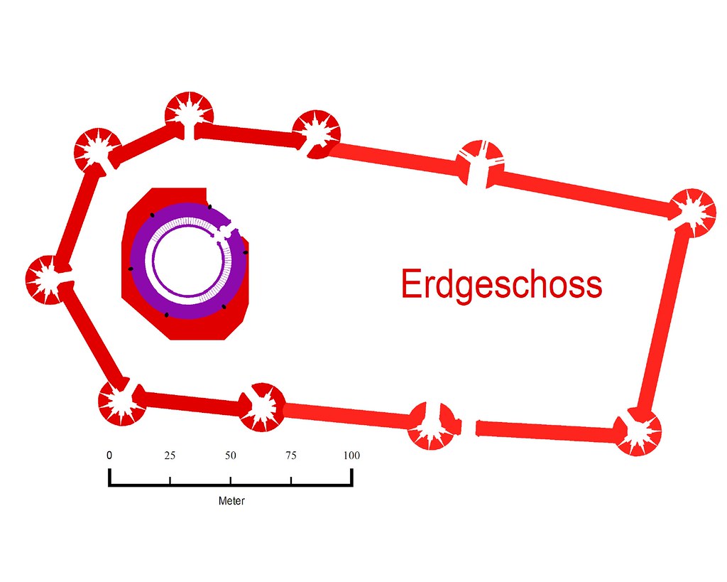
I have started making the walls with the CA46 "Castle Walls" annual:

The different shades of purple and red signify the different construction phases starting with the keep and a eight-towered bastion. Later two of those towers and parts of the bastion were dismantled to make room for an expansion of the fortres including a first palace. Further construction phases affected only the interior buildings, not the walls of the citadel.
The Citadel was/is the nucleus of the Imperial Capital around it and was built almost 3,000 years ago. After its foundation as an outpost of a predeceeding half-elven civilisation a fortified settlement grew around it. Over the course of time, the inner part of the settlement became the Imperial Castle encompassing palaces/living areas, gardens, thermae, places for religious worship, kitchens, the Imperial Diet, the Imperial Mint and garrisons for the palace guard within high walls.
The Citadel itself "merely" houses the throne room, several council chambers, rooms for audiences, the chancellery and administration of the imperial household, living quarters, the armory of the emperor, minor court yards (most propably four) and maybe additional rooms / functions.
I have started making the walls with the CA46 "Castle Walls" annual:

The different shades of purple and red signify the different construction phases starting with the keep and a eight-towered bastion. Later two of those towers and parts of the bastion were dismantled to make room for an expansion of the fortres including a first palace. Further construction phases affected only the interior buildings, not the walls of the citadel.


Comments
Btw: Those black ellipses at the keep represent columns of black stone at the surface of the keep.
To fill any shape use the CHANGEFS command (or right-click the Change Properties button and select Change Fill Style) and select the shape(s). The fill style dialog will appear.
You might not have the right fill styles handy so you can browse the bitmaps or better yet import your map in a new one created with the template (wizard) you want.
Just create a new map based on the template and select Insert File from the Draw menu then select your FCW file.
Thanks for the tip, JimP. I already downloaded these textures quite a while ago.
I still have to decide many details, but I made some little progress. This is, what the original bastion looked like:
It is based upon the Late Bronze Age fortifications of Nuraghic Sardinia, especially upon Santu Antine (http://de.wikipedia.org/wiki/Nuraghe_Santu_Antine), Su Nuraxi (http://en.wikipedia.org/wiki/Su_Nuraxi_di_Barumini) and Arrubiu (http://de.wikipedia.org/wiki/Nuraghe_Arrubiu). I not yet happy wtih the layout of the interior rooms and stairwells of the bastion, but for the moment it suffices to illustrate the history of the Citadel.
The area with the black marble tiles floor is where the throne room is planned to be. I know it is quite large, but it is still smaller than the Basilica Ulpia or the Cologne Cathedral.
This part still needs floor and furniture as well as a decision upon the style of the stairwells to the upper and lower levels.
The small council chamber is the meeting place of the cabinet. It is also used for private audiences and the like:
The antechamber to the great throne room is an atrium style room with some kind of roof lantern or glas dome:
The blue construction lines indicate important lines of sight (the horizontal one lead to the throne), the pink ellipse shows, which part of the room is open to the sky. The columns support a gallery/matroneum.
As before, pink construction lines indicate a gallery. The chair is just a place holder for the position of the throne.
Next steps are the construction of the raised dais for the throne, the small columns around the hearth and some mosaics on the floor.
For the steps I used a black outer glow since a Wall Shadow, directional wouldn´t work on a dais.
Not to sure of the black marbled floor. It seems to dominate the picture.
For the rest, WOW.
Meanwhile I added a first draft of the Imperial Banquet Hall (might double as waiting / staging area for councilors, diplomats, courtiers and the like) on the opposite side of the Atrium:
Btw.: The red lines are - once again - construction lines indication walls I still have to draw.
And youre right about the hedges, they don't look right.
You could either loose the edge around them or plant them with flowers, then they would be flower boxes.
But yeah...this is looking fantastic.
Still not sure about it.