[Finished!] OutdoorTiles
Hi everyone,
this is my first post in this forum, so let me quickly introduce myself: My name is Nils, and I'm from Hamburg/Germany. I'm into role-playing games for many years, mainly playing fantasy and Cthulhu RPGs. I've been using CC2 for a while and after getting all the new software at last year's SPIEL exhibition in Essen I now started creating maps in CC3.
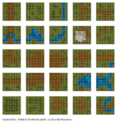
So... I want to use CC3 to create tileable maps for fantasy outdoor encounters (I noticed there was another thread started in this forum for modern RPGs). Basically, each tile should fit on a DIN A4 sheet of paper, which - using a 5ft square grid - would result in tiles measuring 7 by 7 squares.
Anyway, when I started to draw these tiles one by one I found they lacked a connection. I had some tiles but quickly noticed that the theoretical unlimited variations actually overwhelmed me. Therefore, I instead tried to create an overall map which would then be divided into a manageable set of tiles featuring standardized roads, rivers and other things which would allow me to re-combine them in various ways. The result is a large map of 35 by 35 squares (5ft each), divided into 5 by 5 tiles. (Click the thumbnail for larger version.)

So far there are no interesting things like trees or bushes or other things, but these will of course be added later. The roads and rivers are somehow unnatural, but I feel they should fit to the grid more strictly due to the intended use as a battle map. By the way, the theme of this tile set is "A Walk in the Woods".
What do you think about this approach? I'm looking forward to your comments!
Best regards,
Nils
this is my first post in this forum, so let me quickly introduce myself: My name is Nils, and I'm from Hamburg/Germany. I'm into role-playing games for many years, mainly playing fantasy and Cthulhu RPGs. I've been using CC2 for a while and after getting all the new software at last year's SPIEL exhibition in Essen I now started creating maps in CC3.
So... I want to use CC3 to create tileable maps for fantasy outdoor encounters (I noticed there was another thread started in this forum for modern RPGs). Basically, each tile should fit on a DIN A4 sheet of paper, which - using a 5ft square grid - would result in tiles measuring 7 by 7 squares.
Anyway, when I started to draw these tiles one by one I found they lacked a connection. I had some tiles but quickly noticed that the theoretical unlimited variations actually overwhelmed me. Therefore, I instead tried to create an overall map which would then be divided into a manageable set of tiles featuring standardized roads, rivers and other things which would allow me to re-combine them in various ways. The result is a large map of 35 by 35 squares (5ft each), divided into 5 by 5 tiles. (Click the thumbnail for larger version.)

So far there are no interesting things like trees or bushes or other things, but these will of course be added later. The roads and rivers are somehow unnatural, but I feel they should fit to the grid more strictly due to the intended use as a battle map. By the way, the theme of this tile set is "A Walk in the Woods".
What do you think about this approach? I'm looking forward to your comments!
Best regards,
Nils


Comments
Theese are a good example of the kind of tiles I would like to use/make.
My only critisism is the the water looks to unatural.
thanks for your constructive comments! (I had a disk crash, and it took me a while to recover my files...) Anyway, I agree that the river is too straight and rectangular. Too simplistic, really. But I found a great example on Ralf's website, which inspired me to make the river more like this:
This time I tried not to fix the river too much to the grid. I also added some basic vegetation.
Best regards,
Nils
I've been working on the outdoor tileset a bit, thought you would like to see the update (again, for larger version click image):
The next steps would be to add some more bushes and trees and I'll think of some details to make it more interesting. What do you think?
Nils
Would love to use them in my adventures.
More trees an bushes. Have somewhat mixed feelings about that.
Maybe it would add to the overall look but not sure wjat it would do for the playability (is that even an english word? :-)
My advice would be to leave the tiles as they are, they look great now and will do great as OutdoorTiles.
If you feel the need to go further with them.
Copy these tiles into a new set and go from there.
I'm not sure whether this still belongs into Work-In-Progress... Anyway, I found the time to finalize my OutdoorTiles, and this is what I made:
I decided to go for trees and bushes after all, because these tiles are also for people who do not own CC3 or a similar software, so they'd need a finished set without the need for further customization (although I like the idea). I believe the maps are still playable (let's assume this word exists :-).
I can't wait to see how they work out in printed form!
Nils
These turned out great and yes they can be used to play :-)
~Dogtag
thanks for all your helpful feedback along the way! I'm currently packing the seperate files into something downloadable and will post the link here once I'm done.
@Dogtag: Sure, I've got nothing to hide. :-) There is a bitmap fill style in DD3, I think, which I used at first, but that gives just a filled polygon. So I loaded the PNG file of that fill style into PhotoShop/Gimp and using the masking tools I separated the individual marble tiles which I could then move and turn. The ragged edges where done using fractalization tools. The result was one single PNG image which I imported as a symbol. Finally, the stones and plants are from the normal symbol catalogues and I added them as you normally would. It was a fair bit of work but I guess it was worth it. :-)
Nils
~Dogtag
I have made a PDF file of the maps and uploaded that to my website for your pleasure:
http://www.nplaumann.de/outdoortiles.html
Direct download link:
http://www.nplaumann.de/outdoortiles-dl.html
I have also printed all tiles on 230g high-gloss photopaper, which - to my surprise - makes for a rather big wad of paper. The colors are a bit darker than on the screen, but the quality is still good, and they should survive a few gaming sessions.
Enjoy! And if you have any comments, please share them - I'm looking forward to see how they work out in real life!
Nils
Edit: Download link updated
And though I understand why you did it. I still thinks its a shame that there is text on the cards.
thanks for downloading the maps!
Yes, as a fellow gamer I agree with you, but as a creator... ;-) I just hope the text does not distract too much from the actual maps?
Nils