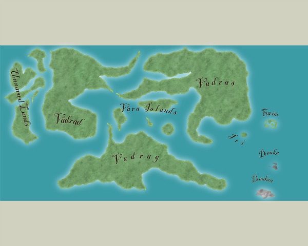
Map of my fantasy world

Here is a map of the world I'm going to be writing stories about/in, I would appreciate feedback on it, if anyone has any, whether relating to what effects I could add or if something about it looks lame or whatever.

Comments

  • I have two coments about your landmasses. The first is that they seen a little too square for my eyes, you probably need more fractalization and coasts less straith. The other point is that your map has the shape of the border. I mean that the landmasses acompaing the frame of the map and it gives a very unnatural feel to the composition. Try to scale down your landmasses and maybe rotate them.

    Lets us know how your work progress.
  • pdjpdj Traveler
    I think your map is really nice, it has the sort of made-up feel of medieval maps that were drawn from
    vague descriptions rather than measurements (example below). It looks splendidly mysterious, just right
    for fantasy. I especially like the way the peninsulas bring to mind unfurled banners, and the curlicues in
    the lettering echo the theme. Cool!

    p
  • Posted By: Mateus090985I have two coments about your landmasses. The first is that they seen a little too square for my eyes, you probably need more fractalization and coasts less straith. The other point is that your map has the shape of the border. I mean that the landmasses acompaing the frame of the map and it gives a very unnatural feel to the composition. Try to scale down your landmasses and maybe rotate them.

    Lets us know how your work progress.
    A friend of mine, who has been working on his own world since we were in high school; used to say: "Once you have your world complete, rotate it 45 degrees, then it's perfect." I've found this advice to be very accurate, over the years. It can take a map that looks "okay" and change it into something special. I think making maps square has something to do with how we're trained to draw/write as kids; This little "cheat" helps me out all the time.
  • Thanks everyone for the comments! Okay, first to reply to the critiques.

    I think they look smooth because they are so big, so you can't see how jagged they are without zooming in...sort of like the pictures of earth. If I do need to fractalize more, though, how should I do that? (I'm a little new to this program and haven't figured it all out yet)
    Posted By: jonasgreenfeather
    Posted By: Mateus090985I have two coments about your landmasses. The first is that they seen a little too square for my eyes, you probably need more fractalization and coasts less straith. The other point is that your map has the shape of the border. I mean that the landmasses acompaing the frame of the map and it gives a very unnatural feel to the composition. Try to scale down your landmasses and maybe rotate them.

    Lets us know how your work progress.
    A friend of mine, who has been working on his own world since we were in high school; used to say: "Once you have your world complete, rotate it 45 degrees, then it's perfect." I've found this advice to be very accurate, over the years. It can take a map that looks "okay" and change it into something special. I think making maps square has something to do with how we're trained to draw/write as kids; This little "cheat" helps me out all the time.
    So...I think you guys mean that if I should make the landmasses not fit the background quite so perfectly and maybe put them at an interesting angle to make it look more natural?

    Thanks for the suggestions ideas, let me know if I understand correctly! ;)

    Posted By: pdjI think your map is really nice, it has the sort of made-up feel of medieval maps that were drawn from
    vague descriptions rather than measurements (example below). It looks splendidly mysterious, just right
    for fantasy. I especially like the way the peninsulas bring to mind unfurled banners, and the curlicues in
    the lettering echo the theme. Cool!

    p
      Thank you pdj! Come to think of it, that is sort of how it looks. :D Definitely a cool style that adds character...thanks for the comments! :-)
    • RunningWolf, my intent was not to suggest that your map is uninteresting or "just okay", I apologize if my comment came off sounding that way. I was adding my "two cents" about the techniques I use to minimize the geometric properties (drawing to the four corners, etc) of the maps I draw. It's a good map, and I look forward to seeing it with mountains, forests, rivers and cities.
    • Posted By: jonasgreenfeatherRunningWolf, my intent was not to suggest that your map is uninteresting or "just okay", I apologize if my comment came off sounding that way. I was adding my "two cents" about the techniques I use to minimize the geometric properties (drawing to the four corners, etc) of the maps I draw. It's a good map, and I look forward to seeing it with mountains, forests, rivers and cities.
      No, you guys are fine, I didn't take it that way at all. :-)

      What I meant was, is, were you saying that I should maybe make the background bigger and maybe tilt the landmasses (all at once and the same angle to keep them the same relative to each other) to achieve a more natural effect? If that's what you meant, I'd be happy to try it, I just wanted to make sure I understood what you guys were saying. :D
      I totally appreciate suggestions and I understood that you weren't saying anything bad about the map, and were just suggesting a couple things (which I had hoped for).

      (by the way, how do I subscribe to my own topics? I thought I did, but I'm not getting email notifications...)
    • MonsenMonsen Administrator 🖼️ 81 images Cartographer
      Posted By: RunningWolfby the way, how do I subscribe to my own topics?
      In the menu to the left (you need to scroll up to the top), there is a link called "Subscribe to discussion". I believe the forum only sends you a single notification, and won't send any new ones until you have visited the forum again.
    • Posted By: Monsen
      Posted By: RunningWolfby the way, how do I subscribe to my own topics?
      In the menu to the left (you need to scroll up to the top), there is a link called "Subscribe to discussion". I believe the forum only sends you a single notification, and won't send any new ones until you have visited the forum again.
      Ah, I got it now. Thank you. :D
    • 9 months later
    • Revisiting the forum, and the map...going to post the results of my tinkering in a few days, I hope!
    • Am curious to see the progress you made.
    • Also curious to see what you got for us next. I really like the continent in the middle, Vadrag! Good job.
    • 24 days later
    • edited March 2013
      Thanks, Leviathus! (awesome name, by the way)

      I'm finally back...I've moved things around a few times, and I think I've gotten a better layout...I'm interested to see what you all think. Also, I'm wondering what I should do next--It could definitely use more detail, but I'm not sure how to go about adding that without doing smaller sections of my world (which I definitely want to do eventually). Still, I would like to make this as good as I can get it...
    • RalfRalf Administrator, ProFantasy 🖼️ 18 images Mapmaker
      I would continue by adding the major mountain ranges at this point. The layout is nice, but the map still seems a little bare.
    Sign In or Register to comment.