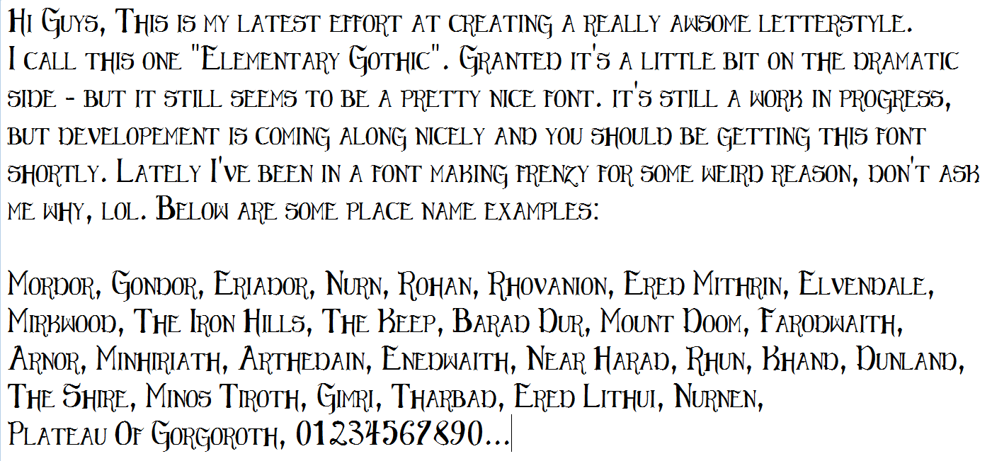
Hey-Guess What? YET ANOTHER NEW FONT IN THE WORKS!
 Terraformer_Author
Newcomer
Hi guys...
I would like to take this time to humbly, and respectfully apologize for this bizarre font making kick that I am in lately, lol. Allow me to explain ; Whenever I switch into a creative mode like this - I have to run with it and "vent the steam" until it runs it's course - and I switch to doing something else, otherwise I'll knaw my own paw off, lol. I blame a childhood head injury incurred during a rock fight, lol :}
ANYWAY (you guys get that this is a poor excuse for an attempt at inciting chuckles, right?) Below is an example of the next map font that I'm working on for you guys - free of charge - which should be posted relatively soon. I call it "Elementary Gothic" - and it looks like it's coming along rather nicely. Stay Tuned.


Comments
I'm also trying to get this to where it looks good if written out on a path curve.
BTW - sorry about not answering sooner - I was asleep, doin the whole "nighty night" thing, lol.
These fonts are all hand drawn and then digitized. I clean them up in GIMP, MS PAINT, and INKSCAPE.